
interdisciplinary ideas
How Can We Use and Interact With Graphs Better? (Data Literacy 101)
Science Scope—July/August 2021 (Volume 44, Issue 6)
By Kristin Hunter-Thomson
Graphs are a big part of visual literacy in the 21st century. They are all around us on the news, in our social media feeds, on our phones, and elsewhere. Although curricular materials include numerous graphs and students make graphs from data they collect during investigations, many students still struggle with reading and making graphs.
Some of the most common frustrations around graphs that I have heard are statements like “I spend so much time on how to label axes and write titles, yet students never seem to get it” or “they always make everything into a bar chart” or “they don’t know how to interpret the graph.” How can our students be exposed to so many graphs and still not “get it”? How might we use and/or interact with graphs better? Let’s dive into graphs and explore various ways we can use them in our science instruction. Note: For ease of reading, I will use graphs as a catch-all term that refers to any visual format of looking at data to support data exploration, analysis, and/or interpretation (e.g., graphs, maps, charts, plots, diagrams).
Why do we use graphs?
Almost all approaches and technologies that represent data are visual in nature. Therefore, it is not surprising that Andrews (2019) explained how humans make sense of data this way: “visual decoding is how readers interpret data pictures” (p. 43). We rely heavily on visual information, and most of our ways of looking at data are predominantly visual; we literally rely on seeing the data to make sense of it.
The act of making a graph takes something abstract (i.e., numbers) and converts it into something concrete and visible (i.e., ink on a page). Cairo (2016) referred to this as “mapping data into visual properties” (p. 123). In other words, to actually see the data we make choices about what to put where on the page (e.g., what graph type, what amount of data, which variables, which axes to use). We are far better at finding patterns and understanding data when we visualize it in graphs than just looking at lists of or hearing numbers. The conversion from abstract to concrete, in combination with our propensity to take in visual information, is why we use graphs to help us explore, make sense of, and explain things with data. It is also why it is so important for our students to keep developing their graphing skills.
It is not surprising that an important first step of working with data is to orient to what is there by looking at it (see Hunter-Thomson 2021 for ideas on exploratory data analysis in the classroom). A great way to do this is to make various graphs of data—be it sketching data by hand or using technology to make graphs. We cannot expect to “get it” with one pass of the data or creating one graph. By looking at different parts of the data, in different graph types, with different values or categories filtered out, we broaden our understanding of what we have and what it may mean. This mucking about in the data is a critical step for helping us to make sense of what is there. It requires time and space to make decisions on how and what to explore in ways that are of interest to us based on what we are seeing on the page.
Oftentimes, we give our students a graph and ask them to make meaning from it. Or we ask them to make a (single) graph of their data. While this emphasis on singular graphs can be necessary due to content learning objectives and/or time constraints, the challenge creeps in when our students only see completely polished graphs and are only asked to make one graph with their data. We create a false understanding of what goes into making a graph and why to use them. One thing we can do to help our students better understand data and graphs is to expose them to graphing as an active process of interacting with the graph to make sense of the data.
What are different ways we can interact with graphs?
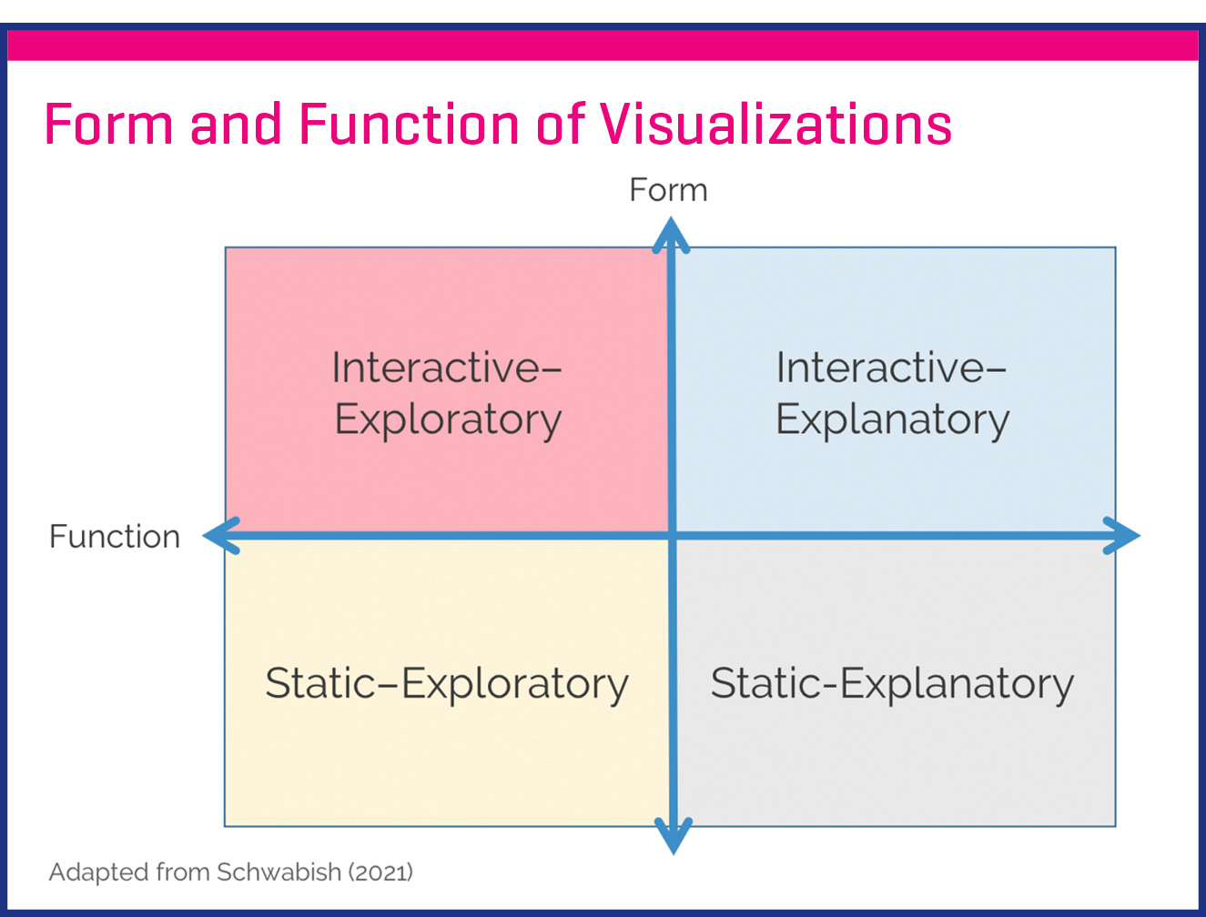
Jonathan Schwabish (2021) asserted that all graphs fall somewhere along two spectrums: form and function (pp. 53–57). The form spectrum ranges from interactive (in which the user makes decisions about what information to see where and/or when by moving data) to static (in which all the information is visible at once to the user, but it doesn’t move). The function spectrum ranges from exploratory (in which users actively explore data in a graph to discover meaning) to explanatory (in which users see the meaning in the data that is purposefully being conveyed). We can think of these spectrums as being perpendicular to one another to create four quadrants: interactive–exploratory, interactive–explanatory, static–exploratory, and static–explanatory (see box “Form & Function of Data Visualizations,” adapted from Schwabish 2021, p. 54). No quadrant is better or correct; rather, we interact with graphs differently for different purposes. Let’s explore some ways we can consider interacting with graphs across these quadrants in our instruction.
How can we use interactive graphing to our advantage?
Interactive–Exploratory
For the interactive–exploratory quadrant, students interact with data to find patterns interesting to them. Oftentimes, we ask students to make graphs using technology that is built to organize, manipulate, and derive data in a tabular format (e.g., Google Sheets, Excel, Calc). While these platforms/programs can make graphs, they are often clunky or limited when doing so because this is not their primary purpose. Fortunately, there are freely accessible options now that are designed specifically for building graphs, exploring data, and visualizing it quickly and easily (see Online Resources for some options to consider). These platforms are designed around making the interface user-friendly, with drag-and-drop data ready for exploration. With simple clicks, the data are instantly transformed into different graph types, without having to retrace multiple steps or reorganize the data (as is common in spreadsheet platforms/programs). Using such platforms/programs can help build students’ data and graph skills as they interact with the data to explore what they could mean.
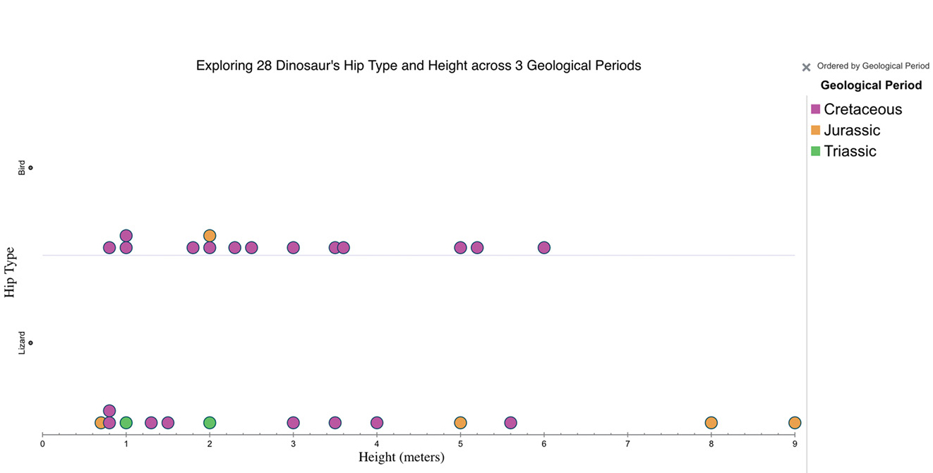
For example, in an Ecology and Evolution unit, we want to compare anatomical features of organisms alive today to those from the fossil record (MS-LS4-2). In addition to looking at images and model replicas of organisms, students could explore data on a range of anatomical features (hip type, height, length, weight, teeth, diet, number of legs) of 28 dinosaur species across different geological periods using data from Tuva’s freely available Dinosaurs data set (see Figure 1 and Online Resources for link). Students can easily and quickly drag and drop data (anatomical variables) in the graphing interface to find patterns across these 28 dinosaurs and then connect them to living organisms.
Interactive–Explanatory
For the interactive–explanatory quadrant, students interact with data to understand pre-identified patterns. Sometimes we do not want the interaction with the graph to be completely open-ended. In this instance, we can use supplemental curriculum materials that have embedded interactive data components. The students interact with the data to determine what they see in the graph in order to make sense of what the data say in relation to the activity questions. In this case, it is the student who makes the decisions about what is visible in the graph, meaning which variables are plotted where, what categories they are looking at within the graph at one time, and so forth.
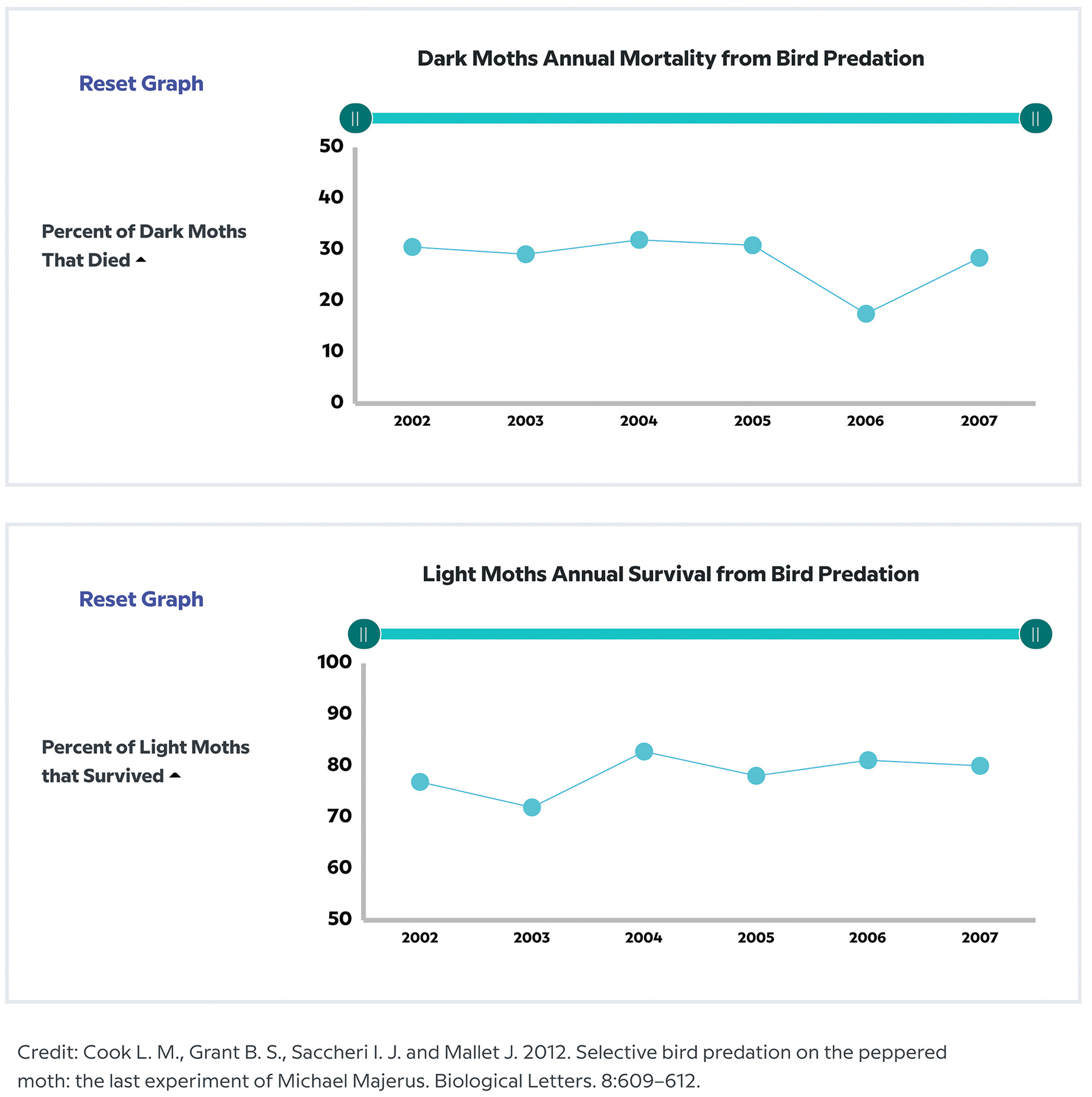
Activities and lesson plans developed by My NASA Data, CODAP, Tableau, and others are centered around having students actively interact with the data as they discover specific, pre-identified patterns in the data (see Online Resources for suggestions). For example, when teaching about natural selection (MS- LS4-6), we could use real-world data about current peppered moth survival rates in England using data in the Natural Selection Data Manipulatives by BrainPOP Science (see Figure 2; Cook et al. 2012). In this case, students work with real-world data to answer scenario-based questions from the data (see Online Resources for link).
How can we unpack and use static graphs better?
Static–Exploratory
For the static–exploratory quadrant, students observe a graph to find interesting patterns. Oftentimes, when we present students with graphs, we have a specific claim or conclusion we want them to gain from the graph as it relates to our content learning objectives. But we can also leverage static graphs in other ways. We can share a range of static graphs with students at the start of a unit or as an Engage activity (Bybee 2015) and ask them to explore what they see on the page within a graph or across the graphs. We could use an adapted version of the Identify-Interpret (I2 ) strategy (BSCS 2012) to have students share “what I see is . . .” and “what it could mean is . . .” or the See-Think-Wonder (Ritchhart, Church, and Morrison 2011) strategy in which students share what they see, what they think is going on, and what it makes them wonder about. These strategies encourage students to explore what they see, rather than focusing on getting the right answer of a particular data pattern; the New York Times “What’s Going
On in This Graph?” is a great resource based in these strategies with real-world data (see Online Resources). Additionally, by sharing multiple graphs (roughly two to four, depending on students’ graph comfort), students need to make decisions of how they explore and interact with the static data, as they do not have enough time to fully make sense of all of the graphs. The students can be less focused on what answer we “want” and more on their own exploration of the data and graphs.
Static–Explanatory
For the static–explanatory quadrant, students observe a graph to understand preidentified patterns. This is how many of us are exposed to graphs. A lot goes into making these kinds of graphs, be it in scientific publications, media outlets, agency reports, or curriculum materials. The graphs that we see are never the one and only graph that was made from the data. Instead, the person working with the data has cycled through a range of graph types, subsets of data displayed, and orientations as they discovered the story in the data. They then made decisions for how best to present the data and story to their audience. Rather than just giving a graph to our students and asking them to develop a claim-evidence-reasoning (CER) explanation from it, use static–explanatory graphs to help students build their data and graphing skills.
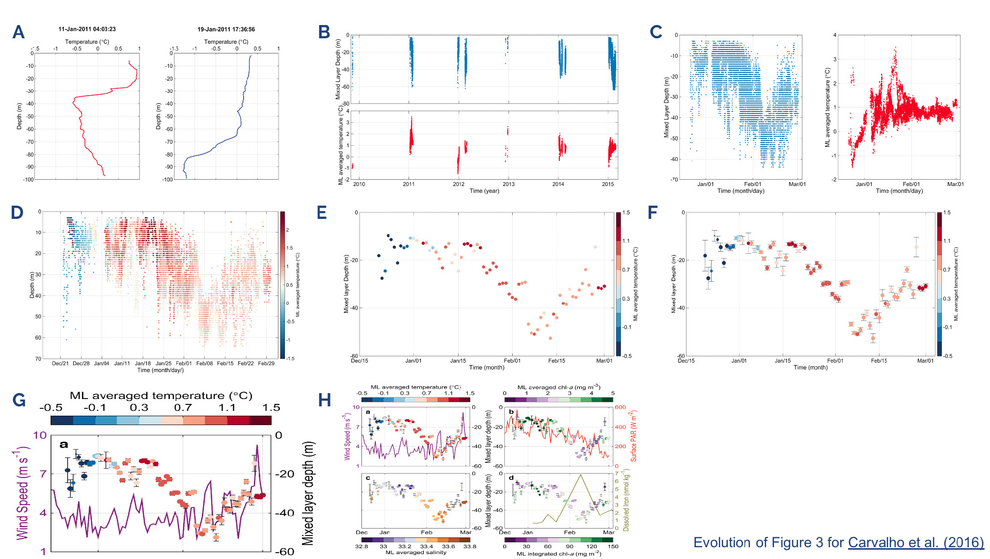
One activity that I have used to help my students and colleagues develop a broader sense of what goes into an explanatory graph is the Graph Evolution activity (see Online Resources for activity write-up and graphs I use with adult learners). This activity takes about 20 minutes. I orient participants to the data with Figure 3A. Then I provide Figures 3B–F and ask participants to work together in small groups to determine if the graphs are related and, if so, how. After about five minutes we reconvene to discuss the graphs and walk through how different graphs were created as the researcher explored the data and developed the final graph for the published study (Figure 3H; Carvalho et al. 2016). Seeing the evolution of Figure 3 can help provide participants with a sense that it is normal not to easily see the story in a first graph. This exercise can also provide a sense of what goes into making the well-polished graphs that we see. I created it by contacting the corresponding author of the article in which Figure 3H was originally published and asking for some of the graphs made as the authors were analyzing their data. You can create your own set of graphs to demonstrate an evolution of a figure.
Another thing that I do when working with a static–explanatory graph someone else created is ask my students to consider why the researcher may have selected the chosen graph. We use the Graph Type Matrix to identify what kind of question the researchers were asking and whether their chosen graph type lines up (see Hunter-Thomson 2019 and Online Resources). Often it does, which reinforces and provides examples of graph choice. Sometimes it does not, which provides opportunities for students to discuss if they agree or disagree with the graph choice of the researcher. Regardless, this is a great way to take 5–10 minutes to reinforce graph choice skills, humanize a graph as the result of decisions someone has made in order to make it, and interact with the graph differently.
Conclusion
If data are what we use to do science, and graphs are how we best make sense of our data, then graphs are an important part of visual literacy for science. Providing our students a wider range of ways to interact with graphs can help them build their data, graph, and visual literacy skills. Like almost every other data skill, interacting with graphs across these spectrums is not something we need to or should do every time we work with data. But, if we never expose our students to the reality that we make many graphs (not just one) when making sense of data, nor provide them opportunities to practice this in supported ways, we are falsely setting student expectations of what goes into “analyzing and interpreting data” (NGSS Lead States 2013).
Building these skills takes time, practice, and repetition. What approaches do you use to help your students make and read graphs? How do your students interact with data and graphs? •
Online Resources
Resources for activities referenced:
BrainPOP Science—https://science.brainpop.com/investigation/natural-and-artificial-selection/player/natural-selection-dm/
Graph Evolution Activity (write-up and graphs)—https://dataspire.org/dls-data-viz-v2
Graph Type Matrix (completed matrix resources, graph-type cards, and empty worksheets for K-5, 6-8, 9-12, and AP/IB/College)—https://dataspire.org/graph-type-matrix-resources
Tuva Dinosaur data set—https://tuvalabs.com/datasets/dinosaurs/activities
“What’s Going On in This Graph?”—https://www.nytimes.com/column/whats-going-on-in-this-graph
Programs designed for interactive data exploration and graphing:
CODAP by Concord Consortium (free tools, data sets, and activities)—https://concord-consortium.github.io/codap-data/
Fathom Dynamic Data Software (free activities, $5.25/year for tools)—https://fathom.concord.org/
My NASA Data Story Maps (free datasets and activities)—https://mynasadata.larc.nasa.gov/basic-page/story-map-collections
Tableau Academic Programs by Tableau Software, LLC (free tools and datasets)—https://www.tableau.com/academic
TinkerPlots by Learn Troop (free activities, $7/year license for tools)—https://www.tinkerplots.com/
Tuva Labs (free tools, most datasets, and activities part of Premium subscription)—https://tuvalabs.com/
Kristin Hunter-Thomson (kristin@dataspire.org) runs Dataspire Education & Evaluation and is a visiting assistant research professor at Rutgers University in New Brunswick, New Jersey. .
Interdisciplinary Literacy Technology Middle School Pre-service Teachers