
High School | Daily Do
Why Is a Covered Planet a Healthy Planet?
Is Lesson Plan High School Grades 9-12
Introduction
In today's lesson, Why is a covered planet a healthy plant?, students use a digital tool to analyze large data sets available from NASA Earth Observations to identify spatial and temporal patterns that can help support (or refute) the claim that tilling the land in spring (Northern Hemisphere) causes an increase in the amount of carbon dioxide in Earth's atmosphere and the growing crops causes the amount to decrease in summer.
This lesson is based on ideas presented in the movie Kiss the Ground. The educational version, Kiss the Ground: For Schools (password: school) is freely available to teachers, educators, schools, and community organizers thanks to a generous grant from the Bia Echo Foundation and Triptyk.
View the Why is a covered planet a healthy planet? NGSS table to see the elements of the three dimensions targeted in this lesson.

Materials
- Kiss the Ground: For Schools (password: school) video clip 16:25–18:28
- Land Cover Classification and Net Primary Productivity slide presentation*
- computer or tablet with internet access (one per student or pair of students)
- NASA Near Earth Observations student activity sheet
*Slides may be projected, electronically shared and accessed by students, or color-printed and distributed to students (one complete set per pair of students).
Experience the Phenomenon
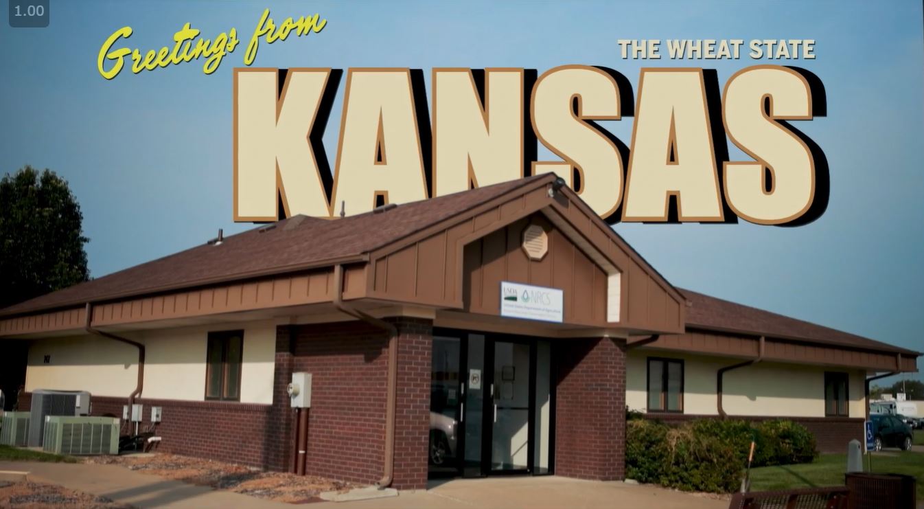
Tell students you have an intriguing phenomenon to share. Cue the Kiss the Ground: For Schools video clip (16:25). Share that the presenter they are about to hear from is Ray Archuleta, a conservation agronomist with the Natural Resources Conservation Service. Inform students that you will play the video clip more than once; encourage them to just watch and listen the first time, then play the clip.
Ask students to individually reflect on the phenomenon Ray Archuleta shared with the Kansas farmers. Give students one or two minutes to record their thoughts (science notebook, electronic document, journal app, etc.), then ask them to turn and share their thinking with a partner. As you move around the room (or virtual space), listen for students sharing the idea that the phenomenon is the change in the amount of carbon dioxide in Earth's atmosphere over a year—in this case, 2006.
Bring students back together and ask for volunteers to share the phenomenon presented in the video clip. Invite the students you heard discussing the change in the amount of carbon dioxide amounts in Earth's atmosphere in 2006 to share first. Consider quickly surveying the class to find out if students agree (thumbs up) or disagree (thumbs down) with these students' thinking. Record the phenomenon in a public space (whiteboard, poster, shared digital space, etc.)
Tell students you are going to play the video clip again and this time you would like them to pay close attention to the data presented in the computer model. This time, start the clip at 17:05, then pause at 17:20 to point out the Carbon Dioxide Column Concentration scale in the lower right-hand corner of the screen. Share with students that ppmv, which stands for parts per million per volume, are units used to describe air pollutant concentrations.
Ask students to work with a partner to answer the following questions and record their thinking in their science notebooks:
- What colors represent the highest concentrations of carbon dioxide? What colors represent the lowest concentrations?
- On this date in February 2006, where in the world do you find the highest and lowest values (extremes) of the carbon dioxide data?
- What patterns do you observe in the data presented on this map? Are the patterns different on different continents? Different over water than over land?
Bring the class back together. Ask students which color represents the highest concentrations of carbon dioxide, grey or purple? Consider pointing to the colors on the scale when asking this question. Next, ask students to share patterns they observed in the data. Students will likely share some or all of the following patterns (suggested teacher follow-up prompts in italics):
- The colors are in "bands" across the map. (Would someone like to add to [student]'s observation? What colors are the bands? Where are the different color bands located?)
- Colors are the darkest over continents. (Would you say more about that? Which continents? Which colors?)
- Concentrations of carbon dioxide are higher in the north than in the south. (Can you quantify how much higher the concentrations are in the north than in the south? Do the concentrations decrease gradually or rapidly from north to south? Why do you say so?)
- The concentrations of carbon dioxide are higher on the east coast of the United States than the west coast. (Can you quantify how much higher the east coast concentrations are than the west coast concentrations?)
Record the patterns students identify in a public space. Tell students that the patterns they described are spatial patterns, which are variations across space (north to south, east to west, continent versus ocean, etc.). Label the patterns that students described spatial.
Inform students that you are going to play the rest of the video clip, and this time as they watch, they should look for and record patterns that occur over time. Point out that patterns that occur over time are called temporal patterns. Play the rest of the clip.
Assign students to small groups and ask them to share the temporal patterns they observed in the carbon dioxide concentration data. Listen for groups to share (revoice) the temporal pattern Ray Archuleta identified in the video: The amount of carbon dioxide in the atmosphere increases in spring (March– May) and begins to decrease in June.
Bring the class back together. Ask students to share temporal patterns their group identified. Call first on the groups you heard discussing carbon dioxide concentrations increasing in spring and decreasing in June. Help students separate the pattern from inferences students make and the claims made by Ray Archuleta in the movie clip. For example, you might ask, "Is that something you observed, or something you think (or think you know) is happening?" Record the patterns students identify and label them temporal.
Now ask students, "What is the explanation for the spring increase and June decrease in global carbon dioxide concentrations that Ray Archuleta shares with the Kansas farmers?" Students will likely say that tilling the ground causes the carbon dioxide concentrations to increase and the growing plants (crops) cause the concentrations to decrease. If most students seem unsure, play the video clip from 17:15 to 18:28, then ask the question again. This time, tell students to share the answer with a partner before asking them to share with the class. Record this claim below the phenomenon (recorded at the beginning of the lesson).
Construct an Initial Explanation
Say to students, "Why do you think tilling the ground in spring causes the amount of carbon dioxide in Earth's atmosphere to increase and the growing plants cause the amount to decrease?" Give students independent thinking time to explain how farming causes carbon dioxide concentrations to increase (tilling), then decrease (the growing plants). Encourage students to use words, pictures, and/or symbols. Do not ask students to share their explanations at this time, but assure them you will return to the explanations.
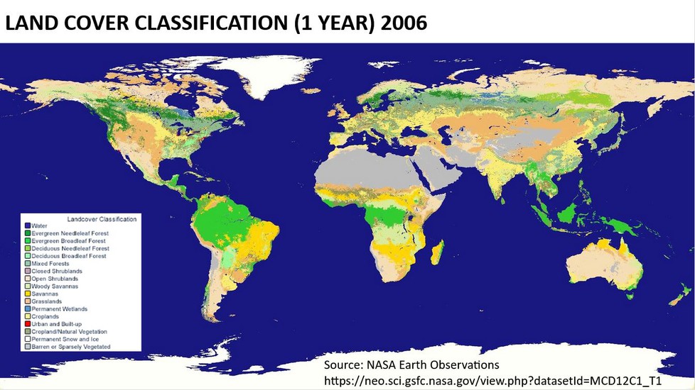
Share the Land Cover Classification map with students (world view) and tell students that this map presents land cover data for the year 2006. Ask students to work with a partner to identify patterns they observe in the data presented in the map. Consider using the previously provided prompts to help students describe the patterns they identify more accurately.
Bring the class back together to share the patterns they and their partner identified with the class. Students will likely share the following:
- Different latitudes have different types of land cover.
- The pattern of land cover types is similar on all of the continents (located at similar latitudes).
- There is a lot of barren land in Africa and the Middle East (at about the same latitudes).
- There is not a lot of cropland.
- Most cropland is located in the United States, Europe, India, and parts of China.
Ask students what type of patterns they identified: spatial or temporal. If students are unsure, direct their attention to the class list of patterns identified in the carbon dioxide concentration data.
Say to students, "Most of us noticed that very little of Earth's surface is covered in croplands. What additional information do we need to support Ray Archuleta's claim that tilling the land causes an increase in carbon dioxide concentrations and the growing plants cause a decrease?" Give students independent thinking time to review their initial explanations and record their ideas. Then ask them to share their ideas in small groups.
Bring the class back together and ask each group to share one type of information they think is needed to support Ray Archuleta's claim. Accept and record all ideas. Student ideas may include these:
- Does photosynthesis cause the amount of carbon dioxide in the air to decrease?
- Do crop plants use more carbon dioxide than other types of plants?
- Is the change in carbon dioxide concentrations over one year the same every year? (Is it always the same pattern?)
- Can we look at a recent land cover map and carbon dioxide concentrations for the same year and tell if more (less) cropland caused a bigger (smaller) decrease in carbon dioxide in June?
Introduce Net Primary Productivity
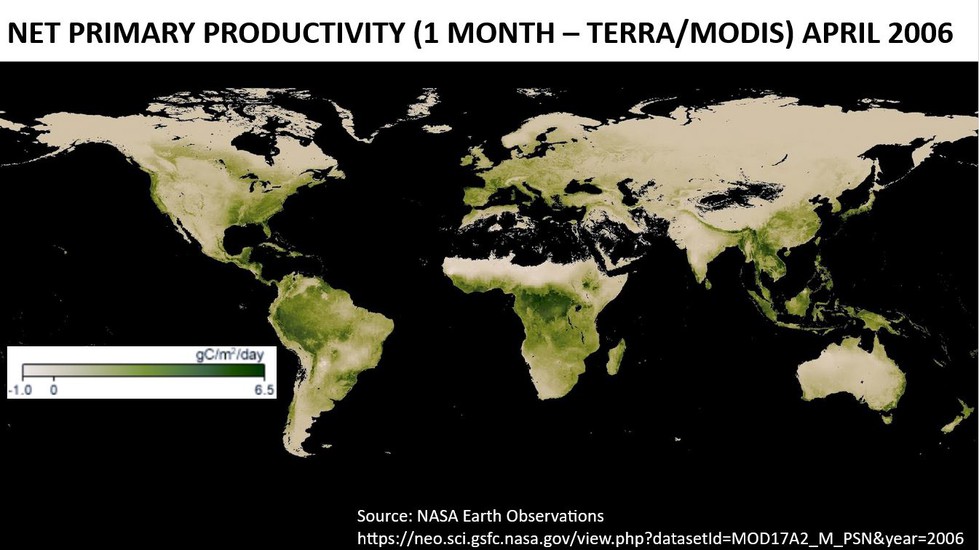
Tell students you don't have access to all of the different kinds of data they identified, but you do have net primary productivity data for the year 2006.
Before you describe net primary productivity to students, ask them, "Do you agree or disagree with this statement: Plants use and produce carbon dioxide?" Ask students to individually write their response and reasoning in their science notebooks. Do not poll students yet. Next, share a very short clip (0:00–1:48) from the Amoeba Sisters' Photosynthesis and the Teeny Tiny Pigment Pancakes. Ask students to revisit their response: Is there anything they would add or change based on the information presented? Now, poll students: "Do you agree (thumbs up) or disagree (thumbs down) that plants use and produce carbon dioxide?" If all students don't agree, take two shares from students who agree and two shares from students who disagree with the statement. Encourage students on both sides to use their knowledge of photosynthesis and cellular respiration and information presented in the video clip to support their claims. Poll students a second time; most students should agree that plants use and produce carbon dioxide.
Introduce the Net Primary Productivity April 2006 map (data set) to students. Explain that net primary productivity is the difference between the amount of carbon dioxide taken in by plants (photosynthesis) and the amount of carbon dioxide put out (cellular respiration). Ask students, "What does a positive net primary productivity mean?" Give students a moment to share their answer with a partner before sharing with the class. Students should say a positive net primary productivity means the plant is using more carbon dioxide than it is producing. Ask them, "What does a negative number mean?" Students will say the plant is producing more carbon dioxide than it is using. Then ask one final question: "In the United States, what time of year would you expect net primary productivity to be the highest? Why?" Again, allow students to share their thinking with a partner before asking them to share with the class. Students will likely say that net primary productivity will be highest in the summer months; their reasons may include these: The summer months have more daylight; the number of plants is greatest in the summer; and/or plants have the most leaves during the summer.
Analyze Net Primary Productivity Data Using Digital Tools
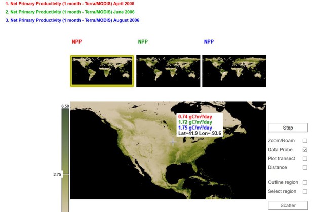
Show students the Net Primary Productivity maps (data sets) for April, June, and August 2006. Tell students you would like to narrow the focus to analyze data collected over the United States to compile evidence to support or refute the claim that farming affects the amount of carbon dioxide in Earth's atmosphere.
Point out the purple star added to the three (North America) maps. This purple star marks the approximate location of central Iowa, which is identified as cropland on the Land Cover Classification 2006 map. Present the three maps in rapid succession and ask students to notice the changes in net primary productivity just in the area surrounding the star among April, June, and August. (Alternatively, set the slide presentation to Grid view so students can view all three maps at once.) Students should notice the area is greener (shows higher net primary productivity) in June and August than in April. Ask students to independently quantify the change in net primary productivity between April and June. Then ask for three shares from the class. The numbers shared by the three students will most likely be different. Next, ask students if they can quantify the change in net primary productivity between June and August. Students will likely say either they can't quantify the change, or no change occurred.
Tell students, "We can see the net primary productivity changes between April and August, but how big is the change? We need a way to quantify the data to create a more convincing argument that tilling increases the amount of carbon dioxide in the air and the growing plants decrease the amount."
Share the NASA Earth Observations student activity sheet with students. Tell students that this website provides digital tools they can use to easily quantify the changes in net primary productivity among April, June, and August 2006 for any location on the map. The activity sheet provides instructions for accessing and analyzing the data represented in these three maps.
Allow students to work individually or in pairs to access and analyze the net primary productivity data for April, June, and August 2006. The following checkpoints are recommended for students who are new to these digital tools:
- Question 11. Ask students to share their noticings and inferences with you, a partner, or a small group. Are students able to use the Data Probe to find a location by latitude and longitude? Do they recognize the data are color-coded to identify the month they represent? Do they correctly identify a temporal pattern between April and August 2006?
- Question 14. Assign students to small groups after they complete question 14 to share the spatial and temporal patterns they noticed with their group members. Then ask them to work together to complete Question 15 (students need access to the Land Cover Classification 2006 map). Bring the class back together and ask the groups to share temporal and spatial patterns they observe between the net primary productivity data and land cover data. Make a class record of these patterns; encourage students to use these patterns to select the location for a second transect.
- Question 16. Instruct students to share the criteria they used to select the location of a second transect with a partner. As you move around the room (or virtual space), ask students, "How will the data you collect along this transect help support or refute the claim that farming affects the amount of carbon dioxide in Earth's atmosphere?"
-
Question 18. This question can be used to formatively assess students' understanding of the science ideas built in this lesson. Consider instructing students to complete this question independently. You might ask students to revisit their initial explanation and use the evidence they have compiled to add to or change their explanation.
Additional Guidance. Students will analyze the three data sets (maps) at different paces. Encourage students who arrive at checkpoints ahead of their partner/group members to return to the main net primary productivity page and read About this dataset, found near the bottom of the page. You might also assign students to repeat the analysis for additional years. Land Cover Classification data (also found under the Life tab) and Net Primary Productivity data are available for 2001 to 2011.
Putting the Pieces Together
Ask students to return to their small groups and share their conclusions. Then bring the class back together and direct their attention to the space where you recorded the phenomenon and claim at the beginning of the lesson. Ask students to share a piece of evidence they or someone in their group gathered that supports (or refutes) the claim Ray Archuleta shared with the Kansas farmers: Tilling the ground causes the carbon dioxide concentrations to increase and the growing plants (crops) cause the concentrations to decrease. Create a bulleted list of evidence below the claim.
You might ask students to share if they feel the evidence is sufficient to support the claim. What additional data would they access and analyze to make a valid and reliable claim?
If time allows, play the entire Kiss the Ground: For Schools movie (password: school) to share with students how their explanation of the phenomenon of carbon dioxide concentrations in Earth's atmosphere changing over the year 2006 fits into the larger picture of reversing climate change.
Acknowledgments
KISS THE GROUND: FOR SCHOOLS—available now for free to all schools, students, teachers, and community educators—is a 45-minute-long educational version of the critically praised exo-documentary, KISS THE GROUND, produced and directed by Sundance award-winning documentarians Josh and Rebecca Tickell. KISS THE GROUND: FOR SCHOOLS has new scenes not in the feature film, including a series of person-on-the-street interviews with Rosario Dawson and a scene in which Tony Tenfingers, a Lakota Elder, describes the importance of the once-prevalent buffalo for Native American peoples. KISS THE GROUND: FOR SCHOOLS is also available with subtitles in 18 languages including English Closed Captions, Spanish, Mandarin, and Hindi.