
Interdisciplinary Ideas
Data literacy 101
What can we actually claim from our data?
Science Scope—February 2020 (Volume 43, Issue 6)
By Kristin Hunter-Thomson
Are you ever surprised by the claims your students make from data? Does it seem like they are pulling things out of the air that have nothing to do with the data on the page? If so, do not fret because you are not alone! Knowing how to make a claim from data is a big first step (see Hunter-Thomson 2019 for data-related suggestions), but knowing what you can and cannot say from your data is another skill our students need to learn when working with data. In fact, this skill is core to students’ understanding of how to “distinguish observations from inferences, arguments from explanations, and claims from evidence” (NGSS Lead States 2013). So, let’s explore this more to think about how we can help our students be more successful with this.
What is “inference space” anyway?
You may have heard people use the term “inference space” when talking about data (but do not worry if you have not). In science, we work with data to answer our testable questions, but what we can say from the data is dependent on what data we have. In other words, there is a boundary on what we can include in our claims from the data. We can only make conclusions or predictions from the data that we have and this boundary is the “inference space.” This can feel a bit vague and abstract, so let’s look at an example to see what this means in practice.
If, for example, we are working on our weather and climate unit, exploring how weather can vary over time in one location (MS-ESS2-5), we could use a graph such as Figure 1 to help students get a sense of the range of average August air temperatures in Indianapolis, Indiana, over 14 years (a time period close to students’ lifetimes). In other words, this is our “inference space” from the data. Through these data, students can develop a better sense of what is typical weather for August in this area, and start to build an understanding of a local climate pattern (common August air temperature in this location over time). This is what we can connect from or relate the data to in terms of broader concepts.
Graph of average August air temperature over 14 years to help students determine typical air temperatures (weather) for one summer month in Indianapolis
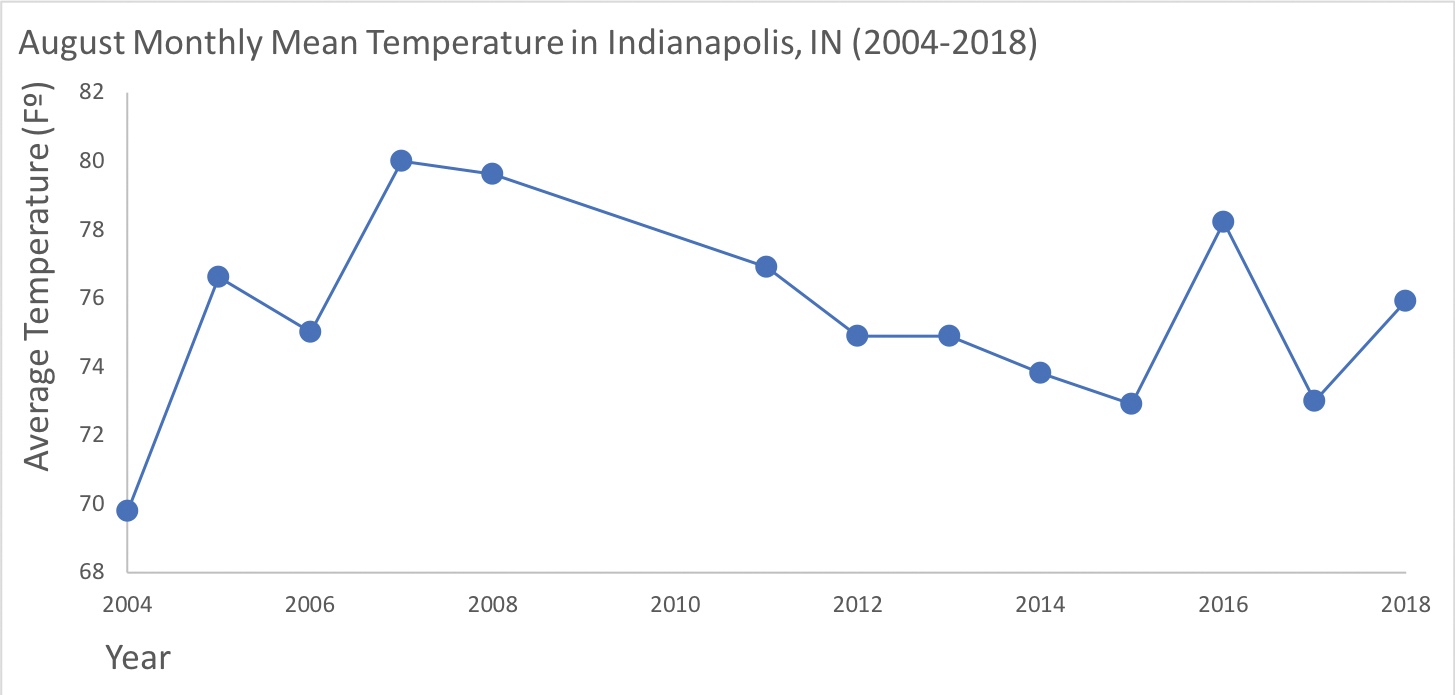
What can be tricky for students is knowing how to talk about their claim and relate it to what we can say about a broader concept. In my experience, students often overconclude from the data in their claims, meaning they make claims beyond the “inference space” of the data. For example, when asked to make a claim from these data in Figure 1, students may make erroneous claims such as:
August temperatures everywhere are …
This is too large of an inference from the data because we only have data from Indianapolis, Indiana, so we cannot make a claim about August temperatures for other locations from these data.
August temperatures in Indianapolis are …
This is too large of an inference from the data because we only have data for 14 years in Indianapolis, Indiana, so we cannot make a claim about August temperatures for other years from these data.
Yearly temperatures in Indianapolis are …
This is too large of an inference from the data because we only have data for August; we cannot make a claim about air temperatures in Indianapolis for other parts of the year from these data.
August temperatures in Indianapolis are…because of climate change…
This is too large of an inference from the data because we only have 14 years of data. This timescale, while it can feel really long for our students, is not long enough to determine if the patterns seen are related to global climate change (i.e., different from the normal climate conditions, which requires around at least 30 years of data; NOAA 2019).
Note: I do not think that students need to learn the definition of “inference space.” I worry that learning the definition may make the concept more confusing. However, I do think that students can learn the concept, so that they can apply the skill of staying within the “inference space” when working with data.
We want to teach students how to understand the concept of inference space and practice the skill, but where to start? Two strategies that I, and teachers who I work with, have integrated into data-based activities to help scaffold this for students are (1) asking for evidence for and against a claim and (2) asking for what students can and cannot say from the data.
Asking what students can and cannot say from the data
One strategy for teaching this skill is to explicitly ask students to articulate what they can and cannot say from different graphs (that all relate to a similar topic), rather than just asking for a claim for a graph (Bybee and Landes 1990). The following activity leverages this technique.
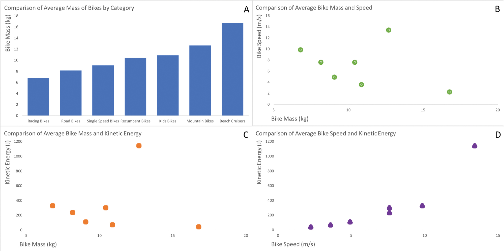
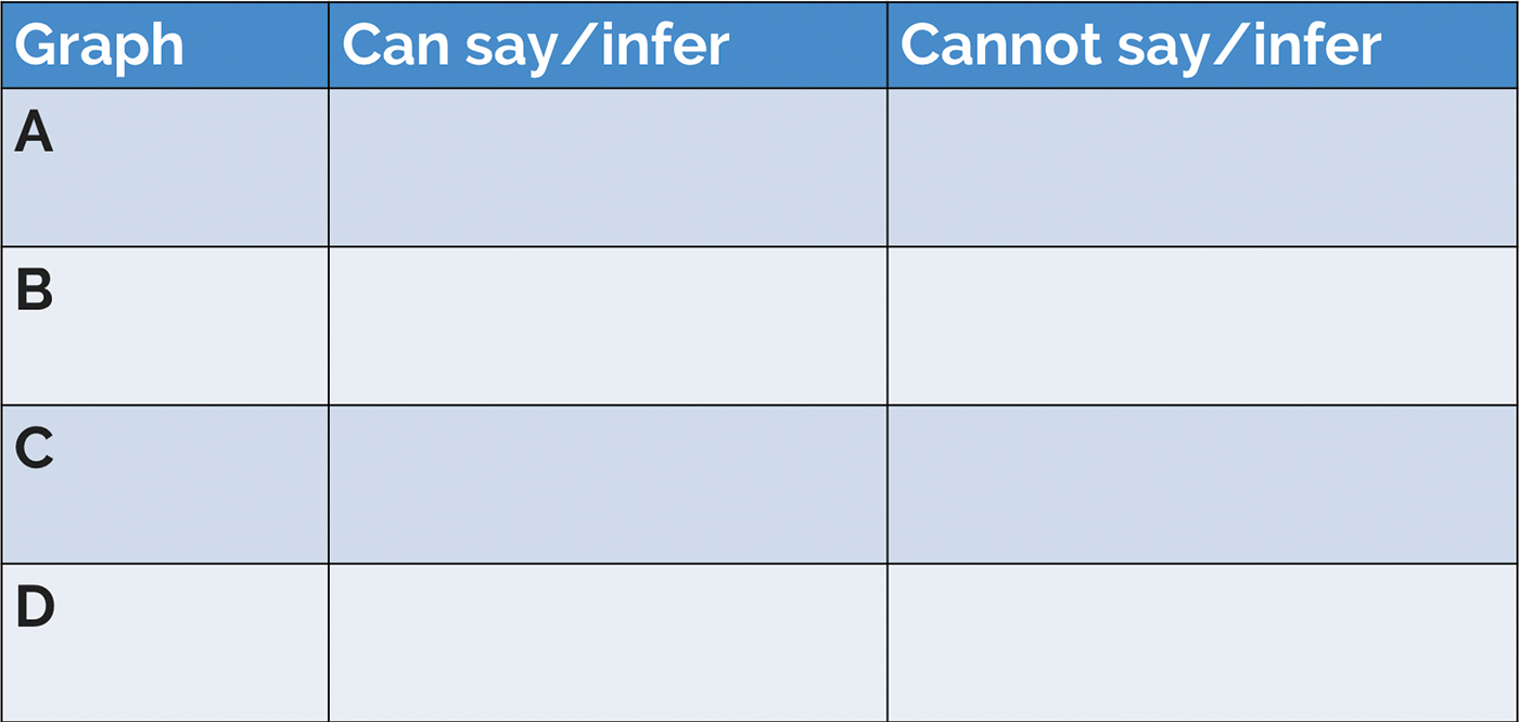
After students have explored the relationships between kinetic energy, mass, and speed of objects (MS-PS3-1) and have thought about how they are related, I ask them to build on their knowledge and apply it to a new situation—in this case, different kinds of bikes. I share bike data for students to look at and make sense of (Figure 2). As these data are new to them, I give students five minutes to quickly make some initial notes on their paper about each graph, including: (1) what they see/notice, (2) what they think, and (3) what they are wondering (Ritchhart, Church, and Morrison 2011). Then I have students work with a partner to list all of the things that they can say and what they cannot say from the data in each graph as it relates to the concept of factors that influence energy. (If we have a time constraint, I assign each partner group two graphs to focus on rather than looking at all of them.) Each partner group gets a handout with Figure 3 to complete. I stress that for each graph they need to add at least one thing about what they can and one thing that they cannot say from the data within each graph.
Data regarding average mass, speed, and kinetic energy of seven different common kinds of bikes
Handout of what we can say/infer and what we cannot say/infer table for students to complete as they are working with provided graphs
Following the partner group work, I facilitate the next part in a few different ways, depending on what I think will work best for students in the class, the timing of the activity, and where we are in the year. Some examples include
- having two partner groups join with another partner group to make a small group of four to share and compare their table statements and revising/adding where they want;
- having students add their statements to a large table on the board or flip chart paper around the room to create a class table;
- having each partner group share one or two statements from their table as I write them on a large table on the board for a class table, and so on.
After students have had an opportunity to share some of their ideas and hear others, I ask them to reflect on what it was like to write statements about what they could and could not say from each graph. Often, students share that it was hard to think of things that they could not say from the data. We talk about what could make it easier for them next time. We also talk about the benefits of thinking about what we cannot say from the data. For example, thinking about what we cannot say can help us figure out what we can say and feel more confident that our claim is from the data. So, this can help us better determine what to include in our claim, thus making our claim even stronger. This reflection discussion helps students process their thinking about and approach to working with data.
I also make sure we talk about the content as well. Rather than asking questions about the specifics of what they included in their table, I ask students a question such as “What can we now say about how mass, speed, and kinetic energy are related that we could not before looking at these data?” This helps students connect what they have learned from the data to the larger concept and helps me role model how to make that connection from the actual data that they have (i.e., within the right “inference space”). The self-reflection and connecting to the larger concept help to keep the conversation off of “did I get it right?” and instead on the science topic and learning from the data.
This approach can be modified to include one or several graphs, all relating to a similar concept or phenomenon. The key component is that students need to write or talk about what they cannot say from the data, as well as what they can say. This helps students start to think about what the data on the page are actually showing them, rather than what they are expecting from the data. This strategy role models how to integrate inference space into their conclusions and how to better develop their CERs (McNeill and Krajcik 2011) with data. (For some other suggestions, see Hunter-Thomson 2019.)
Asking for evidence for and against a claim
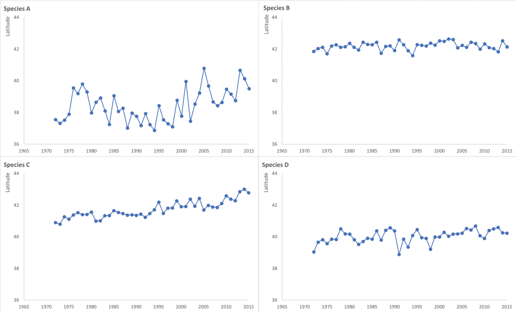
Another approach to develop the activity uses a mystery challenge approach (adapted from ACLIPSE 2017). The following is an example that I have integrated into an ecology unit. As an introduction to exploring how changes in the physical environment affect populations (MS-LS2-4), I share some time series data from different fish species with my students (Figure 4). Students need to use the data to determine which graph is of black sea bass, rather than one of the other three fish species. Before they start working in small groups on the challenge, I lead the group in a short orientation discussion. I ask questions such as “What does anyone know about black sea bass, summer flounder, American lobster, or Atlantic cod? What do you notice about the graph axes? What kind of data are we looking at?” I treat this as a group brainstorming session to help students think about their prior knowledge that could help them with the challenge. I accept all responses from students, meaning I do not correct false statements, nor do I teach any content (in my experience at least someone has heard or seen something about these fish species as students are from the East Coast of the United States). I give each group a handout with Figure 5 on it to complete in their small group. I stress that students need to complete both columns for each row and to include their reasoning.
Latitude of the center location of four species populations between 1972–2016 off of the northeastern United States. Species A = black sea bass, Species B = Atlantic cod, Species C = Ameican lobster, and Species D = summer flounder
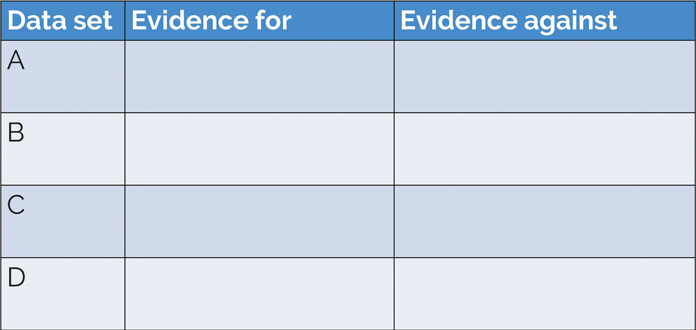
Handout with evidence for and against table for students to complete as they are working with provided graphs
After students have written down their ideas in the handout (Figure 5), I point out the four labeled corners of the room, each with a sign specifying a different “Species [letter]” (see Resources for more on the four-corners strategy). I ask students to independently move (they do not have to go with others from their small group) to the corner of the room that they think is black sea bass, based on the data in that graph. Once in the corner, students talk together to pool their evidence and reasoning about why that graph is of black sea bass rather than any other species. Then I have a volunteer student from each corner share their evidence and reasoning from the data to try to convince students from another corner that they have more evidence supporting their conclusion. If students change their minds and agree with another corner’s evidence statements, they can move between the corners during the discussion. As students are sharing their evidence statements, I capture them on the board in a larger version of Figure 5. If nobody selects one corner, then I ask students to share their evidence against that corner.
Once students come to a consensus, or no longer are making productive progress in their discussions, I facilitate a discussion to review our evidence for and against the different data sets being data from black sea bass. Sometimes I tell students the correct answer, and other times I use this to lead into the next activity. Before moving on, we reflect on the process of coming up with arguments for and against a data set. Students often share that it was hard to come up with evidence or reasoning statements for why it was not a certain fish species. If it does not come up through the conversation, I share connections to the process of science such as:
1. Ideas are accepted or refuted based on the quality and strength of the evidence, so
- understanding how much evidence we have to support a claim can help us think about which claim is most supported by the data, and
- understanding that a claim with stronger evidence is more likely a better description of what is happening in the data and thus the better claim to make.
2. If we learn of new evidence that is more convincing for a different claim from the data, then we adjust our thinking about the concept. This is how science continually grows and we learn more over time.
I recommend avoiding terms such as accurate, correct, inaccurate, and incorrect in this activity, as this can fuel students’ perceptions that science has a correct or proven answer. Instead, in science we look for what has a large amount of evidence; thus, that is the most likely explanation of what is happening. Here is another example how through our framing of a discussion we can reinforce and role model how science is a probabilistic rather than a deterministic endeavor.
This approach can be replicated in various formats. For example, you can present
- multiple graphs and ask students which supports a specific situation (e.g., which graph is of black sea bass data), or
- multiple graphs and ask students which supports a specific claim from the data (e.g., all of these fish species are moving northward over time), or
- multiple hypotheses with one graph and ask students which hypothesis is supported by the data (similar to the Hypothesis Array Technique in Kastens, Krumhansl, and Baker 2015), and so on.
The key feature is that students have to articulate the evidence for and against their conclusions from the data to the problem you have given them. This is what helps students start to think about what the data are actually showing them, and thus helps them start to integrate inference space into their working with data.
Conclusion
For students to be successful in making claims from the data, and for teachers to feel good about their CERs, students also need to gain an understanding of inference. Knowing what evidence our students do have and what they can actually say from the data can go a long way in helping them make sense of data overall. Here we have explored two of many strategies that we can use to start teaching our students the concept of and skills to think about “inference space” in a way that they can practice and apply to data. Students do not need to know what “inference” means in middle school, but they can definitely start applying it to their work with data.
What approaches are you using now to help your students understand inference space? What can you try the next time you are having your students work with data? Remember, these skills are picked up over time from repeated practice through a variety of approaches. Helping our students become more data literate is a marathon, not a sprint. But together we can do it!
Labs Physical Science Middle School