
interdisciplinary ideas
Why Should We All Embrace Statistical Thinking?
(Data Literacy 101)
Science Scope—January/February 2023 (Volume 46, Issue 3)
By Kristin Hunter-Thomson
Making sense of patterns in data and talking effectively about our conclusions from data requires nuance. Much to the chagrin of many, this is why scientists always put caveats around their data conclusions. We aren’t trying to get our middle schoolers to talk like scientists to that degree, but we do want them to think about data in a more nuanced way. How can we thread this needle? By incorporating statistical thinking—not teaching statistics—into all our data-based activities. In this column we will explore what this means and five ways to do this with any of the data-based activities you are already using with your students. We will use an example that ties to this issue’s theme “MS-LS2: Ecosystems: Interactions, Energy, and Dynamics” (NGSS Lead States, 2013), but the ways are applicable to any science topic.
What does statistical thinking mean?
Many of us are familiar with, and may have even taken some courses on, statistics. Statistics, or statistical analyses, are calculations that we make on or with data. Regardless of which statistic we use, the output can help us make sense of the data in a multitude of ways (e.g., to process large amounts of data, to compare different data sets or subsets of data, to repeat others work, to communicate results from large data sets to others not familiar with the data). An important thing to remember is that the calculation only gives a number output that then needs to be interpreted by someone to determine what it means. It is a tool in your data analysis toolkit, not the “answer” to the data analysis and interpretation.
Therefore, to best use statistics we need (1) to have enough of an understanding of algorithmic thinking to know how to make sense of the output and (2) a way to think about data overall. Good news on the first one—beyond some common summary statistics (e.g., mode, median, mean, range; see Hunter-Thomson 2022 for more on these), we do not need (nor probably want) to be teaching middle school students to calculate statistics (or have Google Sheets or Excel calculate it for them), given where their algorithmic understanding is. But we can, and should, do a lot on the second to get students thinking about data from a nuanced perspective by developing their statistical thinking.
Statistical thinking is the mindset that we use when doing anything with data. The Glossary and Tables for Statistical Quality Control (American Society for Quality 1996) states that the mindset is based on the following three criteria: (1) any work with data involves interconnected processes, (2) all processes and data have variability, and therefore (3) understanding variability and these processes is key to making sense of data. In other words, it is what we do when we think critically and make judgements about the data we have and the meaning we make from the data. Statistical thinking involves descriptive (I notice), inferential (I wonder), and contextual (I worry and/or I expect) thinking about the data (Pfannkuch et al. 2010). Thus, it permeates all parts of working with data, not just one tool that we use.
Let’s explore how to do this without teaching statistics and without adding more things to our overfilled plates.
How can we integrate statistical thinking into existing data-based activities?
This may feel overwhelming, but I promise it doesn’t have to be anything onerous or consume lots of our time. In fact, there are five ways we can easily integrate this into our existing curriculum to help our students develop nuanced statistical thinking about data. Let’s explore each in turn with examples.
Way #1: We need to consider what the sample is every time we look at data
It is impossible to collect measurements of the entire universe, and thus every time we work with data, we are only looking at measurements from a subset/slice/sample of all possible measurements. The more representative the subset is of the whole, the better we can use that subset of data to understand the phenomenon we are investigating. This means a key part of thinking statistically about data is considering what the sample is and how representative it is. For example, we ask ourselves questions like: What/who is in the sample and what/who is not? How was the sample collected? How big is the sample? Determining if the data we have are the best possible data to investigate our question is a learned approach. And according to Wild (1994) and Melton (2004), this is key to developing statistical thinking.
Let’s explore with an example. We want our students to look at real-world data to explore MS-LS2-1 (NGSS Lead States 2013), and we find data about prevalence of forest animals in the Peruvian Amazon in terms of visits to various mineral licks, a naturally occurring area in the forest where animals congregate to access essential minerals in the soil (see DataClassroom’s Snapshot of Biodiversity Part 2 lesson and graphing tool in Online Resources). The data-based lesson helps students explore the question of “Is there a relationship between mineral lick size and number of visits by mammals?” to get at the relationship between resource availability and number of organisms.
But before our students jump into looking for patterns in the data and try to answer the question, it is important for them to pause and think about what the sample of data is. Where are the data from? How and when were they collected? Which animals were included, and which were not included in the data set? With the supporting text of the lesson and the data table, we learn that the data are from camera traps placed at 12 mineral licks “within an area of the Peruvian Amazon.” We still do not know when the data were collected, nor which animals are large enough to trip the camera trap system. But the lesson does indicate that data from five animals are reported: red brocket deer, lowland tapir, collared peccary, lowland paca, and black agouti. Therefore, these data are not exhaustive of every animal in forests, but only on five animals captured on camera at 12 mineral licks in the Peruvian Amazon. That is a helpful context for us to use when making sense of the data patterns.
Way #2: We need to talk about uncertainty
Because we are always looking at a sample and because all data have variability (see Hunter-Thomson 2022), we can never be certain how closely any one data point accurately represents the real value of the phenomenon. Therefore, this means that any conclusion we draw from a sample of data should give a nod to this uncertainty. How can our middle schoolers do that? They can use hedging language in their claims, such as that suggested by Governor, Bowen, and Brunsell (2017)—for example, typically, tends, indicates, suggests, likely (rather than definitive or deterministic language). This hedging language encourages students to think more about data from an aggregate and nuanced perspective (Konold et al. 2015). To understand if something is typical or likely, it needs to be in relation to something else, aka the whole group rather than individual instances.
Going back to the Peruvian Amazon animals at mineral licks example, our students graph tapir and peccary visits compared with lick size (m2) to start to explore if there is a relationship between the size of the natural resource (mineral lick size) and the number of animals present at the lick (tapirs or peccaries; see Figure 1). Although many students may find it easier to make a claim that more tapirs visited bigger licks than to make a claim about peccary visits, there is in fact a relationship in both cases. It is more likely that more tapirs tend to visit larger rather than smaller licks. And it is more likely that more peccaries tend to visit smaller rather than larger licks. By framing these claims with hedging language that considers the variation in the data (aka it is not dependent on all the data points falling along the line of fit as our students often look for; see Figure 2), students can practice more nuanced understanding of all the data within a graph and be more open to including a nod to uncertainty in their claims. This use of hedging language is huge for laying the foundation of how they will interpret statistical calculations and data later in life, as well as for understanding how scientists talk about data.
Way #3: We support with evidence, not prove the hypothesis
We do not prove things in science, largely because we always have a sample and can never be certain we have information about all factors that influence the pattern. So, rather than training our students to state their claims deterministically as the “right” answer from the data, we should instead help them learn to discuss which claim is most supported by the evidence.
A great opportunity arises to help students internalize this part of science when they are looking for differences in data (e.g., is Group 1 different from Group 2, how does Variable 1 differ/change as Variable 2 differs/changes). In fact, there are multiple different kinds of “differences” that we can/should be looking for in the data:
1.1. Anecdotal difference = observed difference among data values (e.g., sizes of bars differ)
2.2. Substantive difference = difference that is actually important or relevant to variables investigating (e.g., there is a plausible explanation as to why the size of bars differ)
3.3. Statistical difference (remember not needed in middle school) = difference determined by statistical analysis (e.g., p-value indicates rejecting null hypothesis as bars are different)
Students often report on the first kind of difference—anecdotal difference—when making sense of the data or developing their claim-evidence-reasoning strategy. However, when scientists work with data, they look for all three kinds of differences when making sense of data, as each influences how they interpret what the data patterns could mean. Again, we aren’t trying to have our middle schoolers mimic everything scientists do, but we can certainly help create opportunities for them to look for both anecdotal and substantive differences when working with data.
What could this look like? In our Peruvian Amazon example, students observe the anecdotal difference in number of animal visits by lick size. But before they dive into writing their claim, have them pause to consider if there could be a reason collared peccaries may tend to visit smaller-sized licks and why lowland tapirs tend to visit larger-sized licks. They do not need to know what that reason is, but it is important that they pause to think if a plausible mechanism could drive such a pattern, as that gets to the substantive difference.
One final note—mastering the skill of thinking of both anecdotal and substantive differences in middle school lays important groundwork for our students to better understand how to approach statistical differences in high school. In other words, your students will make sense of data better, and your colleagues will thank you!
Way #4: We can only make claims from the data we have, not what we want to have
Another important component of helping students think statistically about data patterns is helping them gain an intuitive sense of what the data inference space is (more about inference space is available in Hunter-Thomson 2020). Each time we have our students make sense of data, there are opportunities to remind students that they need to base their claims on the data they have. Once we have made a claim, then we can consider making a prediction or guess what that could mean for broader applications in the context. It is important to start with what you can say from the data and then move from there to make a prediction from the data. Students often attempt both at once.
In our Peruvian Amazon example, our guiding question is “Is there a relationship between mineral lick size and number of visits by mammals?” Students often think that their claim should be an answer to the question. Therefore, students may suggest a claim from our data in Figures 1 and 2 such as, “no, more mammals do not visit larger lick sizes” or “yes, mammals visit more small and large licks than middle sized licks.” The students are trying to take data from two mammals and make broad statements about all mammals (note this is especially tricky as collared peccaries and lowland tapirs seem to have different relationships with lick size). Instead, helping students to first make a claim like “more collared peccaries tend to visit smaller-sized licks, while more lowland tapirs tend to visit larger-sized licks.” This is from the data they have. Then we can ask them a follow-up question of “What do you think this means for other mammals and their relationship with lick size?” This invites students to go from the relationship they can see in the data in front of them and make an estimate or informed guess about mammals they do not have data about.
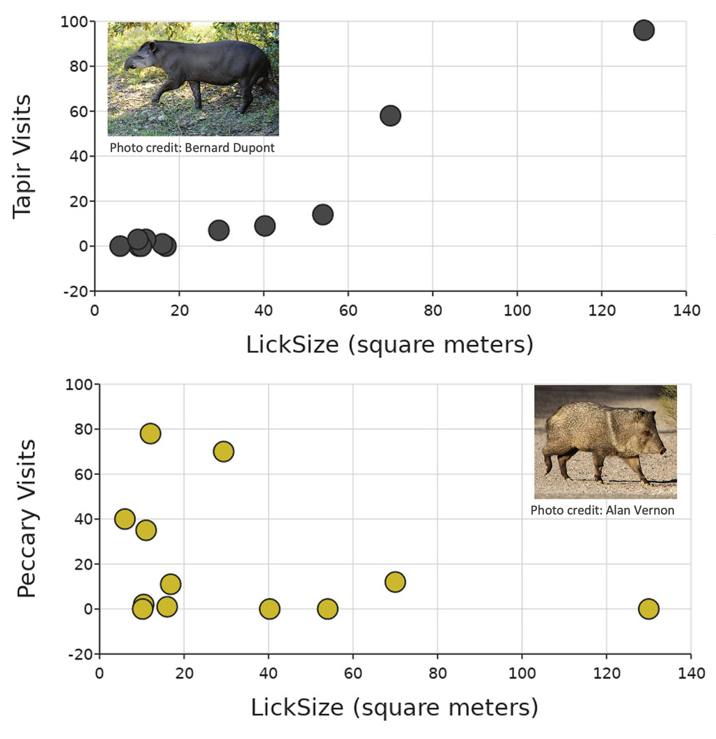
Example of comparing animal visits (lowland tapir and collared peccary) to lick size and how to consider uncertainty and variability when making sense of the patterns (data from https://bit.ly/3uLiRns).
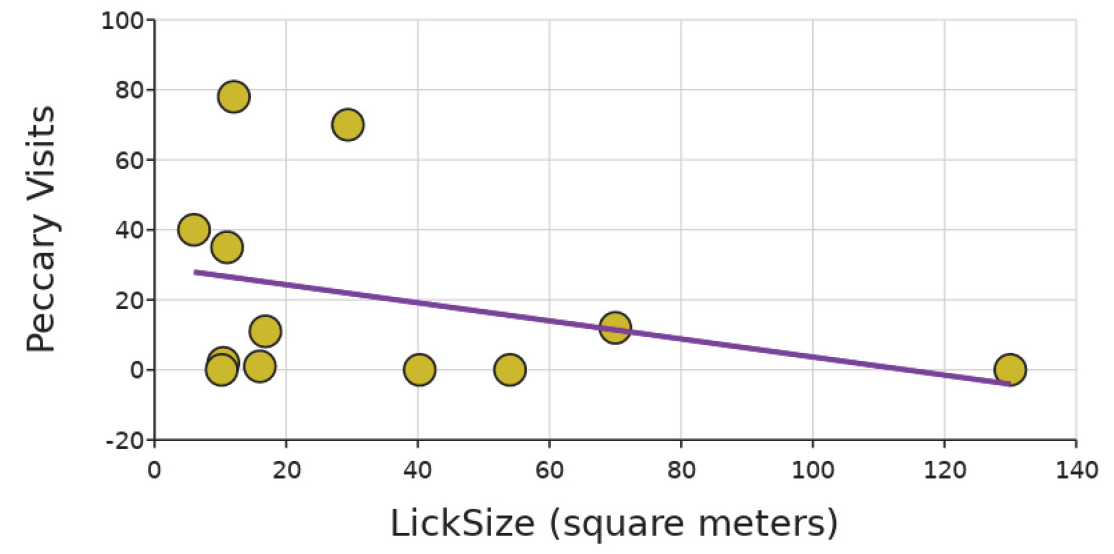
Example of comparing animal visits (lowland tapir and collared peccary) to lick size and how to consider uncertainty and variability when making sense of the patterns including linear regression line of fit (data from https://bit.ly/3uLiRns).
Way #5: We need to think about whether a finding is truly meaningful
Similar to the substantive difference discussed previously, getting students to pause and think about the observed pattern in relation to the data context is critical for developing this more nuanced thinking about data. Helping our students to develop the habit of taking a pause for some healthy skepticism enables them to build statistical thinking skills to make sense of data and is needed before they learn how to calculate statistical equations (Chance 2022).
Let’s use a nonscience example to first explore this, and then we will connect it to our lick size example. As we start to dream about things to do next summer, we may dream about ice cream or maybe swimming in the ocean but then worry about sharks. With a quick Google search, you may find a graph that suggests that as the number of people attacked by sharks increases, the amount of ice cream produced increases (see Figure 3). But what does that mean? As sharks bite more people, we make more ice cream to cope with it? That seems strange. Let’s take a step back: Which is the dependent variable between these? Hmm, ice cream manufacturing is graphed in the typical location of a dependent variable, but why does the amount of ice cream depend on or respond to the number of human–shark encounters? Something feels off here.
![Monthly data of shark attacks in Florida (total for each month from 1926–2021) and average U.S. ice cream manufacturing production index (from 1972–2021) to demonstrate that correlations in data do not always indicate phenomenon in real life (data freely available from https://bit.ly/3VSzUQn [shark attacks] and https://bit.ly/2mgcEjl ([ice cream]).](/sites/default/files/2023-01/3_9.jpg)
Monthly data of shark attacks in Florida (total for each month from 1926–2021) and average U.S. ice cream manufacturing production index (from 1972–2021) to demonstrate that correlations in data do not always indicate phenomenon in real life (data freely available from https://bit.ly/3VSzUQn [shark attacks] and https://bit.ly/2mgcEjl ([ice cream]).
You can use a similar line of questions to help students explore this graph: (1) ask them what pattern they see (i.e., positive relationship), (2) ask them what that means (i.e., as sharks bite more people, we make more ice cream), (3) ask them if that makes sense to them and/or how the y-axis variable could respond to the x-axis variable. As a note, this is an example of confounding variables. The number of human–shark encounters increases as the air temperature increases, aka more people get in the ocean waters where sharks live when it is hotter outside. As it is hotter outside, more people buy ice cream and thus there is more manufacturing of ice cream. Therefore, each of these variables are positively correlated with air temperature, and that mechanism is driving the pattern observed in this graph.
Back to our animal visitors at mineral licks, let’s apply a similar gut check with the observed patterns. Does it seem feasible that the number of different animals we observe at mineral licks would vary by lick size? Sure. We know (from the lesson text) that animals gain essential minerals from the licks. We consider that different species probably need different amounts of those minerals or may have different preferences for how to consume them. This also helps us think through a mechanism of how the animals could respond to the mineral licks. It seems likely that we are setting up our graphs in ways to investigate potential patterns in the wild. Does this completely explain all of the animals’ behavior? Absolutely not, but it does give us plausible evidence toward our question of “Is there a relationship between mineral lick size and number of visits by mammals?” which is why we are looking at the data.
This thought process of making sense of the pattern as it relates to the variables we have, the broader context within which we are asking our question, and the potential mechanism that could explain in the real-world what pattern we are observing in the data is critical to statistical thinking about the data.
Conclusion
Most statistics should not be taught in middle school. Yet we can play a critical role in setting students up for success in their data work with us and in their future statistics work by focusing on helping students develop their statistical thinking skills. The five ways we explored here can be incorporated into almost any interaction our students have with data with a simple question or two in a class discussion and/or on their work products. We do not need to use all five each time we work with data. Instead, the key is to consistently encourage our students to think about data in these more nuanced ways to help build their skills and confidence when “Analyzing & Interpreting Data.”
How are you helping your students think more statistically about data? Share with them the hashtag #MSStatisticalThinking so we can learn from one another.
Online Resources
DataClassroom (data sets, lessons, and graphing tool; free for 90 days)—https://www.dataclassroom.com/
DataClassroom’s Snapshot of Biodiversity: Part 2—https://bit.ly/3Y5DNmf
Kristin Hunter-Thomson (kristin@dataspire.org) runs Dataspire Education & Evaluation and is a visiting assistant research professor at Rutgers University in New Brunswick, New Jersey.
Biology Environmental Science Life Science Literacy