
Interdisciplinary Ideas
Data Literacy 101
How can we help get data into students' science explanations?
Science Scope—April/May 2019 (Volume 42, Issue 8)
By Kristin Hunter-Thomson
The Claims-Evidence-Reasoning (CER) framework provides a great structure to help students make sense of scientific information and develop their scientific explanations (McNeill and Krajcik 2011). However, many students struggle with connecting their evidence to their explanations when using data.
When we ask students to develop a scientific explanation from data, they need to connect the content they are working on, the data they are using, and the visuals of those data (see “Developing CER Capability Framework” in Resources for an interactive graphic of these connections). Teachers, as experts in working with data, fluidly integrate these three aspects to make meaning and develop scientific explanations. However, for students to successfully do this, they must perform certain key cognitive steps to help them pull everything together into a claim that uses evidence and reasoning.
The good news is that we can help them learn to make those steps; the key is focusing on the smaller steps. This month, we will explore each of these steps as a student would to make sense of how gravitational forces depend on the mass of interacting objects, based on data produced using the PhET Gravity Force Lab simulation when the mass of both objects are equal (see Figure 1 and Resources). PhET Interactive Simulations are free interactive simulations around math and science concepts, created by the University of Colorado Boulder, to empower students to explore and discover in a game-like setup (see Resources).
Gravitational force data
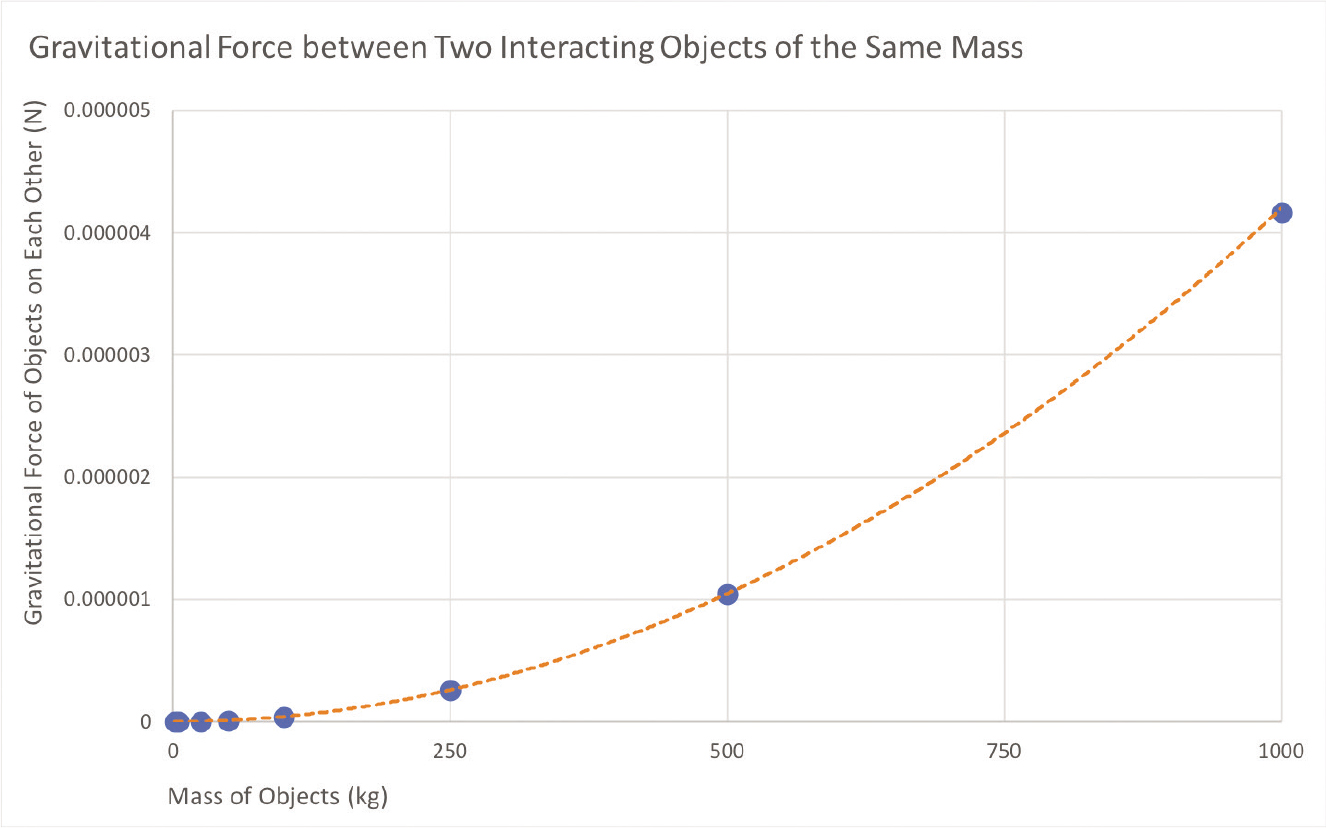
First, students need to engage with the content and visuals together. They need to understand:
- What is the context of the data? The gravitational force between two objects was measured as the mass of both objects was changed.
- What kinds of data are being used? Simulation data, kilograms for mass, and Newtons for force.
- What kind of visualization is being used? A scatter chart with a line of fit.
- What are the parts of the visualization? The x-axis is mass of the objects, the y-axis is the gravitational force between the objects, the blue dots are data points, and the orange dotted line is the line of fit for the data.
- What is the overall shape of the visualization? It looks like a spread-out “J” or a hockey stick.
Second, students can start to interpret the visuals and the data. For this, they need to think through:
- What are the data showing them? First the dots are all down low, but then they arch up more and more.
- What are the ranges of the data? The mass of the objects ranges from 0–1,000 kg, and gravitational force ranges from 0–0.000005 N.
- Are there any outliers? No.
- How do each of the variables change? As the mass of the objects goes up, the gravitational force between them goes up, and vice versa.
- What is the pattern in the data? It is a curved (nonlinear), positive relationship.
Finally, students can work to analyze the data and the content together. This is when students can start to make meaning of how the various parts combine together into a whole. They think through components such as:
- What does the pattern mean? The gravitational force between two objects is not always the same but instead increases as the mass of the objects increases.
- How could that pattern occur? The amount of force between the two objects must have something to do with the objects’ mass.
- What does the pattern mean to them? I think this means that gravitational force between two objects depends on the mass of the objects.
- How does the pattern relate to other things that they know or are learning? We are learning about how the properties of objects affect gravitational attraction, so now I think that mass is a property that affects gravitational force.
Once students have gone through each of these steps, they are ready to make a claim, identify their evidence, and provide reasoning for how their evidence supports their claim. But if students skip over some of these steps, they will be missing some of the pieces that will allow them to make sense of the data.
Let’s explore a variety of ways we can help students better learn these steps and integrate data into their scientific explanations. First, you can take this approach to breaking down the steps prior to doing a CER, and do a self-assessment of your lesson plan:
- Does it offer opportunities for students to conduct each of the cognitive steps of engage, interpret, and analyze before you ask them to write a CER?
- Is there ample time for students to complete each step in class or with active learning strategies, rather than asking them to complete steps outside of class by themselves?
If the answer to either or both of the questions is no, then it is time to adjust the plan to provide opportunities for students to practice each step. Breaking a data experience down into the cognitive steps that novices need to work through to make sense of data can be challenging for us as experts. But similar to breaking down a concept into its subcomponent parts to teach it, we need to support our students’ work with data by breaking the process into steps. We need to teach them the skill of making sense of data and content—often, simultaneously. The above questions are a good place to start when thinking of prompting questions to use when your students start to learn this skill. As they become more proficient, start pulling back on asking all of the questions from each section to determine whether they can ask and answer them on their own, without your prompting.
We can also adjust the questions or prompts we include on physical products (e.g., worksheets, lab protocols) that we ask our students to complete during an experience with data. These questions and prompts help guide our students through their experience with data, and provide a visual reminder of what is important to do when making sense of data. Therefore, being aware of what we are including on the page is a great way to determine whether we are setting students up for success or inadvertently making it harder for them. For example, if you were using the PhET Gravity Force Lab simulation in your class, you could set up your worksheet to have five components:
- Data: Include space for a table so that students can collect data during the simulation and plot the data at the end of the simulation.
- Engage: Include the questions above to guide students’ understanding of the graph.
- Interpret: Include the questions above to guide students through making sense of what is on the page in terms of data.
- Analyze: Include the questions above to help students make sense of how the data on the page relate to other things that they know.
- Conclusion/CER: Ask students to state their claim, evidence, and reasoning based on their data, as well as any further concluding or connecting questions they have regarding the topic area.
Beyond reflecting upon and restructuring how we teach with data overall, we can also incorporate different strategies into our lessons throughout the year that specifically focus on building students’ skills in connecting the data with their scientific explanation. Below are three approaches that I have used with students to help them build their proficiency in this data skill.
Deconstruct existing scientific claims with data
To help students build their understanding of integrating data into scientific explanations, try having them analyze other people’s scientific explanations (adapted from Morrow and Weston 2015). This can be done using a published visualization and support text or examples from previous years’ classes. Ask students to identify the claim or explanation being made from the data and then find the provided evidence and reasoning statements for that claim or explanation. Have students reflect on what made the provided explanations successful or not in communicating the author’s claim based on the data. What part of the process could students mimic from the provided explanation when writing their own scientific explanations with data?
Science News for Students (see Resources) is a great place to find science articles that are written about published literature. The articles provide a summary of the findings at an age-appropriate reading level and include vocabulary assistance. However, they also include a link to the original article so you can track down the scientists’ graphs! For example, a November 14, 2018, article by Jennifer Leman titled “Plants Don’t Grow Well When Always on High Alert: Scientists Bred a Weed to Make Insect-Repelling Chemicals All the Time” (see Resources) highlighted some interesting findings about what impacts a plant’s ability to grow and reproduce. As students are reading the article, you could share graphs and data charts from the original paper to enable them to look at the data as they analyze the science explanations within the text. This will let them make sense of how scientists interpreted the relationship between the specialized plant structure (making bitter leaves to defend against bugs) and the impact on plant growth and reproduction, as well as how experts reference the data in their scientific explanations about it. Looking at how others form their explanations around this topic will help students build their data skill of understanding how to integrate data into scientific explanations.
Argument mapping
This is a technique used in English language arts classrooms to help students visually follow how various premises (i.e., evidence and reasoning provided) relate to one another and how they lead to the argument’s conclusion (i.e., claim; Morrow and Weston 2015). Students could, for example, examine the following argument: “The New York Yankees have won more World Series championships than any other team in baseball history. Therefore, the New York Yankees are the greatest team in baseball history.” Then students use active reading techniques to highlight the evidence (“E”; premise) statements and the claims (“C”; conclusions) within the prose. For example, “The [E: New York Yankees have won more World Series championships than any other team in baseball history]. Therefore, the [C: New York Yankees are the greatest team in baseball history].” Then they can physically draw arrows on the paper from E to C to map out the argument.
We can use an adaptation of this strategy when we ask students to work with data. For example, we can look at the water temperature data from two locations in the National Estuarine Research Reserve network (as suggested by the National Oceanic and Atmospheric Administration’s [NOAA] Seasonal Swings activity [see Resources]; Figure 2). We can draw circles around the highest and lowest temperatures for each location (California in green, Alaska in yellow) and make arrows for the ranges (California in blue, Alaska in red). Our evidence statements are:
- E: In 2011 the lowest water temperature in California was 9°C (~48°F) and the highest water temperature was 22°C (~72°F, green circles).
- E: In 2011 the water temperature in California ranged from 9–22°C (~48–72°F).
- E: In 2011 the lowest water temperature in Alaska was 1°C (~34°F) and the highest water temperature was 12°C (~54°F, yellow circles).
- E: In 2011 the water temperature in Alaska ranged from 1–12°C (~34–54°F).
Water temperature data
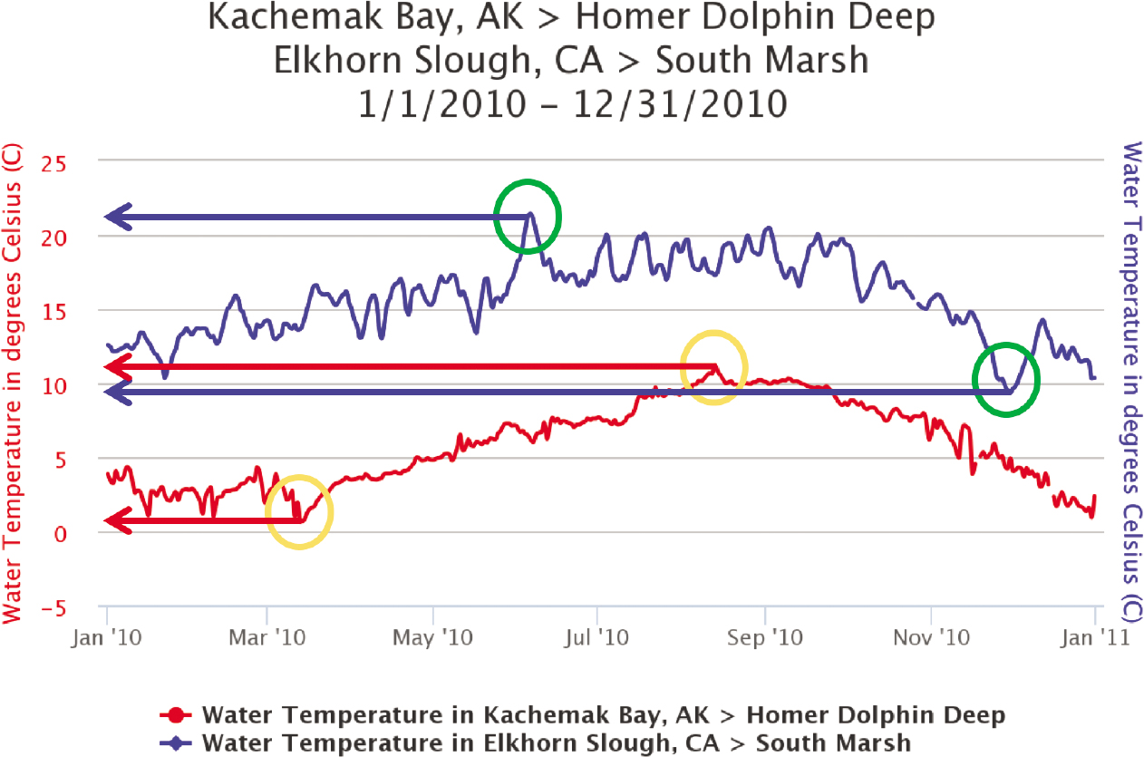
Our claim would be: “Therefore, C: ocean temperature is different across latitudes, as the range of water temperature in 2011 was overall warmer in California (9–22°C, ~48-72°F) than in Alaska (1–12°C, ~34–54°F).” By physically drawing on the data visualization, students use active reading techniques, which engage their brains in sense-making and provide visual cues as to what their evidence is and, thus, what should be included in their explanations.
Argue the opposite
This is a technique that has students work with their own data to dive more deeply into what the data do and do not show. Let’s help students to strengthen their understanding of the data and how to make sense of data by sometimes pushing them to argue the opposite of their claim, or something different from their first claim. Ask students to write down the opposite of their claim and try to find evidence within the data to support that opposite claim. The process of needing to find more than one claim from the data has many benefits for helping students developing data skills overall, but in this context, it can help students learn how to support a claim with evidence from the data.
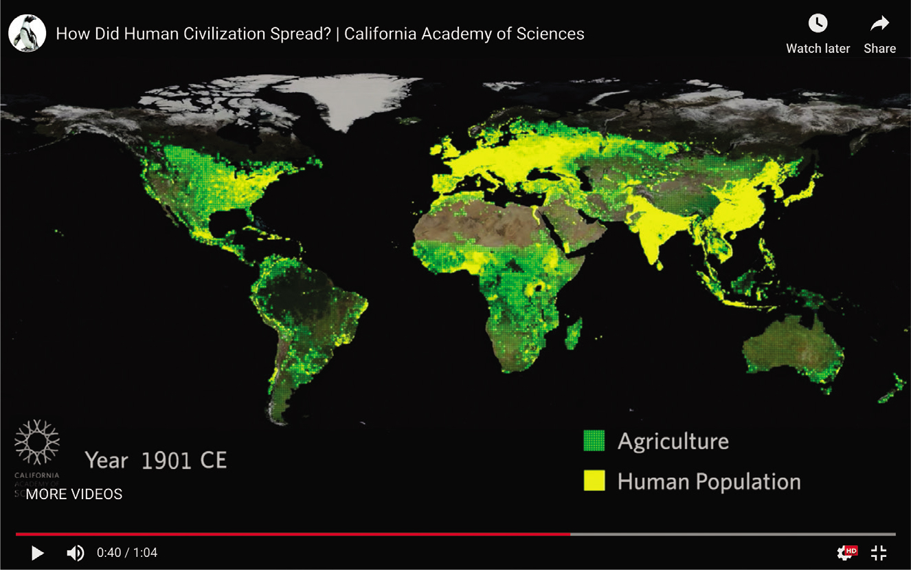
For example, using the agriculture and human population data from the California Academy of Sciences’ “Patterns: Agriculture + Human Population Growth” lesson (see Resources), many would claim that after agriculture was introduced, the human population increased in an area over space and time (see Figure 3). However, from these data we could also claim that where there are a lot of people (bright yellow), there is not land for agriculture (green), so agriculture has to move to locations surrounding the human population. Therefore, rather than arguing that the advent of agriculture in an area leads to a rise in human population, you could argue that the increase in human population in an area leads to a movement of agriculture to other areas. After developing a different claim with evidence, have students work with a partner and present their new claim. The partner is tasked with arguing the opposite or providing critique of the student’s evidence to support the opposite claim. This kind of argumentation from evidence helps students use the data to think about the spatial and temporal patterns.
Agriculture and human population growth data
Conclusion
These are just some of many strategies you can use to help students deepen their skills in integrating data into scientific explanations. Important things to consider with this data skill are evaluating how we are subconsciously supporting or hindering our students building the skill, as well as how our students gain and deepen their skills over time. Making the time to teach this skill will have wide-reaching benefits for your students’ understanding of how to construct arguments and make meaning of data.