
interdisciplinary ideas
Why Is Variability Worth the Teaching Challenge? (Data Literacy 101)
Science Scope—January/February 2022 (Volume 45, Issue 3)
By Kristin Hunter-Thomson
Intuitively we know that we live with variability. We don’t expect to be the same height as all of our friends, nor do we expect that every soccer shot on goal goes to the same place (making the Olympics or World Cup so exciting). We need variability to accurately make claims and inferences; however, we often remove variability when working with data to “make it easier” to manipulate. Unfortunately, this makes it harder for our students to learn how to work with, and make sense of, data. The challenge is to find the balance between enough variability to help students make sense of science data, but not so much that they are completely overwhelmed. Let’s explore what we mean by variability, why it is important for data use in science, and how we can integrate it more into what we are already doing.
What do we mean by variability?
Imagine a bag of your favorite potato chips (or see Schauffler 2019 for a student activity). Think about the size and shape of each chip that you pull out of the bag. I am very confident that your chips will differ from one another, meaning if we were to measure the height, width, perimeter, and so forth, of each potato chip in your bag, the values for these characteristics (i.e., variables) would vary from chip to chip. How much the values vary could be influenced by many things (e.g., brand: Lays [lots] vs. Pringles [not a lot], position in the bag: top [bigger] vs. bottom [mostly crumbs]). To make a claim about your bag of potato chips, you need to think about how the values of individual chips within the group of chips vary from one another. Additionally, if we were going to make a claim about how your chips compare to my chips, we would need to have a sense of how the values of individuals within each bag and across the bags vary. So how do we do that? You guessed it, by describing the variability.
Variability is how much individual data values of a group differ around something, often a center (Wheelan 2014). There are three intertwined components of a group that we use to describe its variability: (1) range/spread, (2) shape/distribution, and (3) center. The range, or spread, refers to the difference between the minimum and maximum recorded values within the data set for that variable. This provides you context about whether there is a large or small difference in the actual values recorded for the group. The shape, or distribution, describes where the data values actually occur along the range. Knowing whether the data values are evenly spread out or clumped (around a mode or multiple modes) and whether they are clumped in the center of the range or to one side or the other helps you make sense of what, if any, data values are “most typical” within the range for the group. This can provide insight about the phenomenon or population you are looking at in and of itself, but it is also hugely important in deciding what measure of center to use (the final component). There are three common ways to measure the center of a group of data values: mode, median, and mean/average. Mode, the recorded value that appears most often, helps us make sense of the shape/distribution of the data. Median, the value that divides the group of recorded data values into two equal subgroups, is helpful with data that clump together on one side or the other of the range (i.e., is skewed). Mean, the calculated middle value for all recorded data values (aka average), is especially useful with data that clump together in the middle of the range (i.e., is bell shaped).
Why is variability helpful in analyzing and interpreting data?
We use variability within a variable to explore the group of data points (e.g., how tall were plants grown in fertilizer?), and we use variability within each group to help us compare across two or more groups to determine how similar or different they are (e.g., are plants grown with fertilizer taller than those grown without?). Being able to describe the variability is key to thinking about data overall in the aggregate (rather than as individual points) and is a necessary first step when working with data (Cobb 2009; Konold et al. 2015). Let’s explore four ways in which variability is helpful in setting our students up for better success in analyzing and interpreting data.
First, visualizing variability helps us better see and understand a pattern in the data. For example, if we want to compare how wave energy and amplitude are related (MS-PS4-1), we could use data of wave energy conversions from simulations of different wave technologies (see link to “The Energy of Ocean Waves” in Online Resources). We adapt the data set to group (i.e., bin) the amplitude data into three categories and make a bar graph of the average wave energy per amplitude category to share with our students (Figure 1A). Our hope is that students will conclude generally that wave energy increases with increasing amplitude. However, with these averaged data, students may also conclude that there are discrete differences in wave energy of different amplitudes. Asking students to look at the recorded and averaged data (Figure 1B) can help them to both see the general pattern across the averages (red lines) and gain a sense that wave energy increases gradually as amplitude increases, rather than in discrete steps. We can simplify a data set to help students see general patterns, but we need to ensure that students are looking at enough data to understand what is happening “in general” and gain insight into the underlying phenomenon.
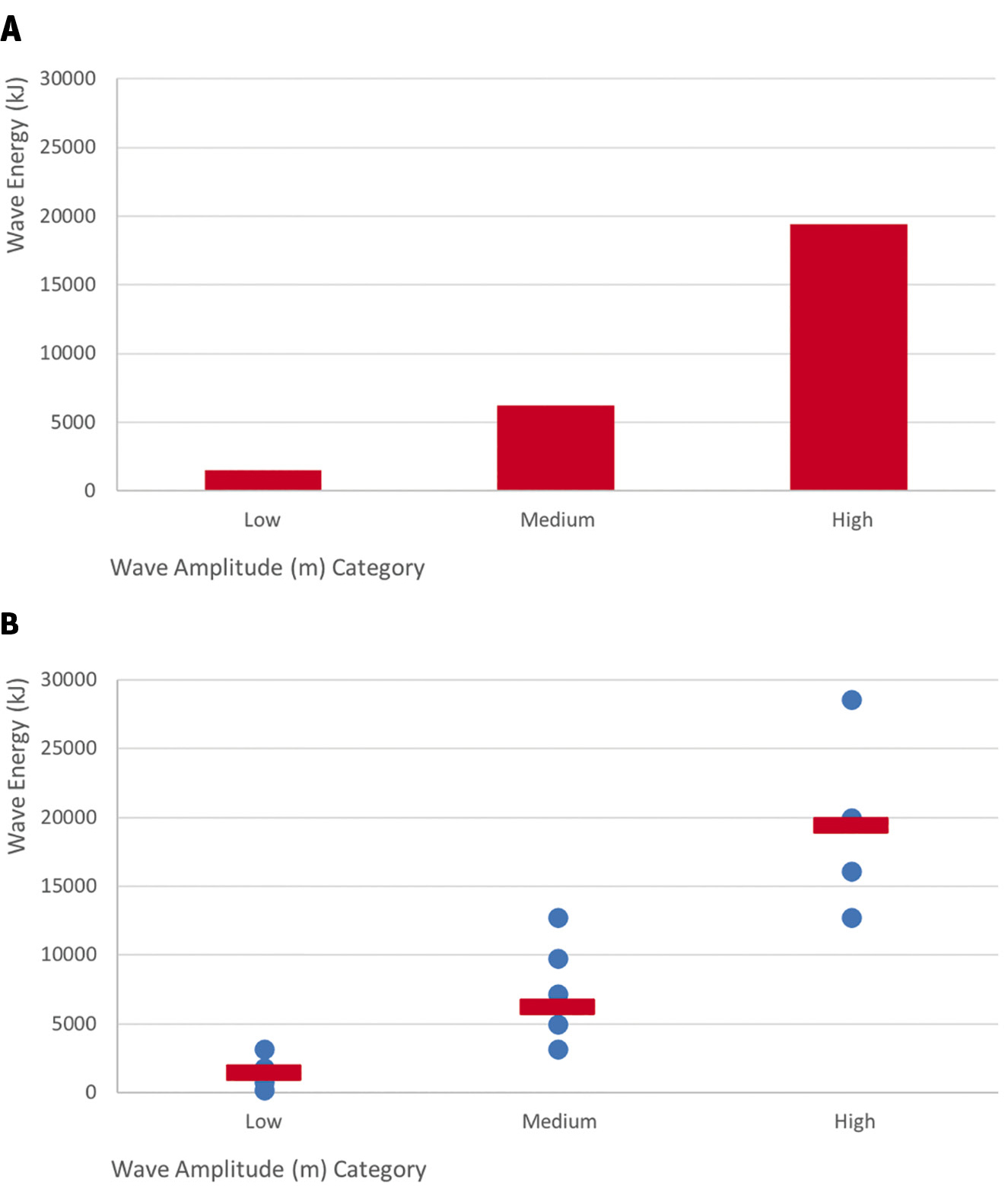
Example graphs comparing wave energy across three categories of wave amplitude:
(A) average energy by amplitude category; (B) all recorded data values (blue dots) and average (red line) energy by amplitude category. Data are from “The Energy of Ocean Waves—Middle School Sample Classroom Task” Attachment 3 data set (see link in Online Resources).
Second, variability influences what we are able to talk about from the data. For example, as we explore the influence of environmental factors on organisms’ growth (MS-LS1-5), we can use data on Galápagos finches from those that did and did not survive a drought year (see “Evolution in Action: Data Analysis” in Online Resources). Typically, we take the average body mass (g) of birds that did and did not survive the drought to share with students in a bar chart (Figure 2A). Students notice that the body mass of finches that survived were larger than those that did not survive. However, students may struggle to determine if the difference between 15.7 g (nonsurvivors) and 17.0 g (survivors) is a meaningful difference (a key part of making an inference from data). Instead, if we look at all of the data (Figure 2B), students can see that survivors generally had larger body masses and a larger median, but also that there is an overlap of body mass sizes, modes, and range across the two groups of finches and neither had a bell-shaped distribution/shape. Students now have enough data to make decisions comparing the finches that did and did not survive, a key part of deciding if the two groups are similar or different. Also, students can more confidently make inferences about finches from these data, as certainty of an observed pattern increases as the number of data points increases.
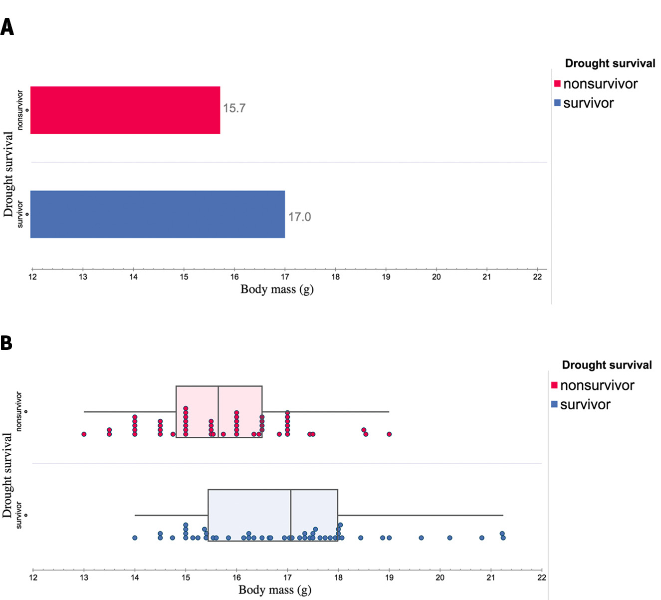
Example graphs comparing body mass (g) of Galápagos finches that did and did not survive a drought year:
(A) average body mass size by group (survivor vs. nonsurvivor); (B) all recorded data of each bird by group. Data are from HHMI Biointeractive “Evolution in Action: Data Analysis” activity data set and are plotted using the freely available Tuva Labs software (see links to both in Online Resources).
Third, visualizing variability helps us learn how to be comfortable observing patterns across data values that differ from one another and/or a line of fit (i.e., noise in data). For example, if our students are exploring sea levels, students could use data about global mean sea levels from each decade (Figure 3A) to see that the sea level increased globally between the 1990s and 2020s. Students would likely conclude there is a positive linear relationship. Because almost all the data values closely line up on the linear line of fit, this example could also lead to the common misconception that a relationship only exists if all data values near perfectly fit on the line. Instead, if we show students the global mean sea levels from each year (Figure 3B) or daily (Figure 3C), they can see that data do not need to fit perfectly on a line to identify a relationship in the data.
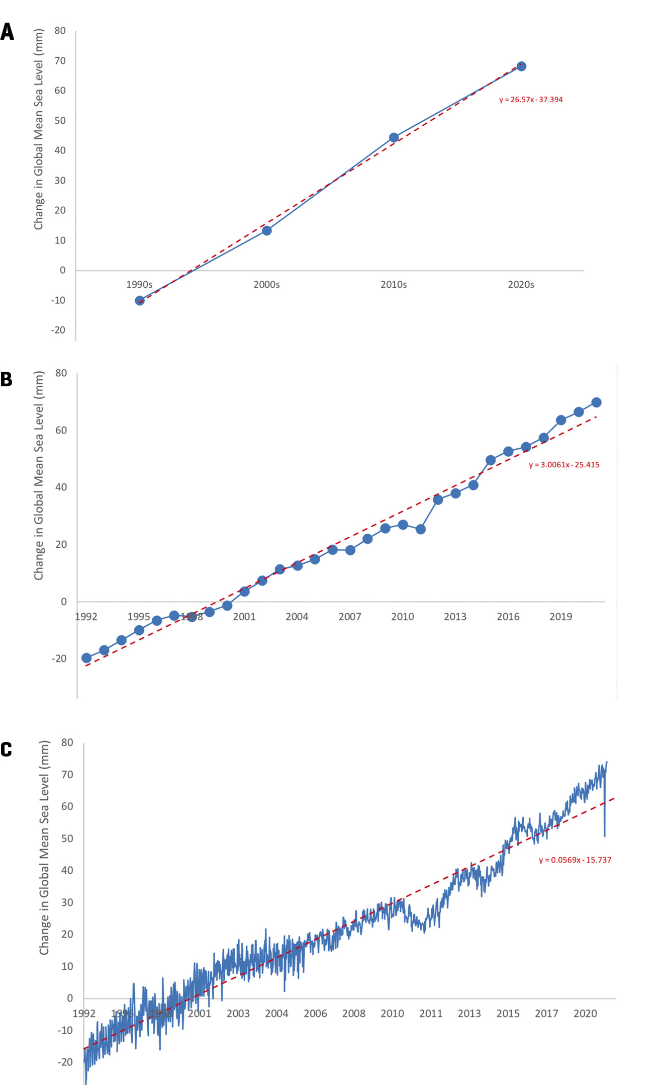
Example graphs comparing global mean sea level between 1992 and 2021:
Data are plotted in blue and linear lines of fit are plotted in red dashed line with equation included: (A) average global sea level by decade, (B) average global sea level by year; (C) all recorded data of global sea level from each satellite measurement. Data are from NOAA Satellite Radar Altimeters (see link in Online Resources).
Finally, variability in data enables us to make more accurate conclusions and increase our confidence in the claim. In both the decadal (Figure 3A) and annual (Figure 3B) data, students may conclude that globally, sea level has been consistently increasing between 1992 and 2021. However, if we share with students all of the data recorded by the NOAA satellite radar altimeters, it is apparent that sea levels have not consistently increased at each time step (Figure 3C; see also “NOAA Satellite Radar Altimeters” in Online Resources). The overall trend is increasing sea levels (i.e., positive change), but there have been time periods of no change and decreasing sea levels (i.e., negative change). The inclusion of additional data that inherently has more variability allows students to consider their confidence or certainty when making a claim about a data pattern.
How can we bring this into our existing lessons?
Now that we have tackled the what and why, let’s think about the how. Here are three categories of strategies we can use to introduce more variability into our lessons.
Strategy 1: What data we use
First and foremost, the more data our students are looking at the better (see Hunter-Thomson 2020 and Hunter-Thomson 2021 for how to organize and graph larger data sets). What could that actually look like? Have students graph all the data before they calculate a measure of center for it. For example, have students look at data from the whole class or from across multiple classes when they are collecting data. Have students collect more than one data measurement for each iteration of an investigation (e.g., multiple trials) and use all of it as data, not just as numbers to average. These are just a few ways to add more data into your data sets that make it easier to include variability.
Strategy 2: What graph types we use
Next, adjust what kinds of graphs you ask students to make. Before diving into claim, evidence, and reasoning (CER) questions about the relationship between/among variables, first ask students to plot one variable at a time as a frequency plot (i.e., unidimensional dot plot, histogram, box-and-whiskers plot). If they are comparing across categories, ask them to make their frequency plot for each of the categories first. The key here is to support students looking at the data and describing the variability of it first. Once they have looked at the data within a variable or category, they can better explore the data to identify relationships between/among variables. If this feels daunting, see Hunter-Thomson 2019 and Online Resources for more about graph types or coordinate with your math colleagues about teaching these frequency plots, as all three are part of the middle school math standards (NGAC and CCSSO 2010).
Strategy 3: What we ask about and ask students to do
Finally, adjust the kinds of prompts you ask your students. For example, we can ask students to describe in their own language the data values that they see. As students are sharing out what they notice in the data, prompt them to discuss things like (1) range and where the “central clump” of the data values occur, (2) shape of the data values along one axis and where the mode(s) is, and finally (3) what the center value is (helping them think through whether median or mean is the best choice for the data values they have). Students can respond to this both in written and oral comments as well as by physically annotating their graphs to demonstrate what they are noticing about the three aspects of variability in the data.
Conclusion
We live in a world full of variability and thus data from any sample will have variability; we need to set our students up for success in understanding how to work with that variability. Like almost every other data skill, we shouldn’t have large discussions about or emphasis on variability every time we work with data. Instead, some tweaks to our data sets, graph types, and teaching prompts can gradually help build students’ comfort with variability. Working with variability may be awkward, frustrating, and/or confusing for some students, but it is a productive struggle that will increase students’ critical thinking and data literacy skills. •
Online Resources
The Energy of Ocean Waves—Middle School Sample Classroom Task—https://www.nextgenscience.org/sites/default/files/MS-PS-Ocean%20Waves_version2.docx
Evolution In Action: Data Analysis—https://www.biointeractive.org/classroom-resources/evolution-action-data-analysis
NOAA Satellite Radar Altimeters—https://www.star.nesdis.noaa.gov/socd/lsa/SeaLevelRise/LSA_SLR_timeseries.php
On variability and graphing variability
Reference/student handout “describing shapes of distributions” for use when discussing variability in data—https://tuvalabs.com/pd/student-handouts/Describing_Shapes_of_Distributions.pdf
Graph type matrix resources, graph type cards, and empty worksheets for K–12, and AP/IB/College—https://dataspire.org/graph-type-matrix-resources
Free graphing tools for making frequency plots
CODAP by Concord Consortium (free tools, data sets, and activities)—https://concord-consortium.github.io/codap-data/
Tuva Labs (free tools, most data sets and activities are part of premium subscription)—https://tuvalabs.com/
Tableau Academic Programs by Tableau Software (free tools and data sets)—https://www.tableau.com/academic
Kristin Hunter-Thomson (kristin@dataspire.org) runs Dataspire Education & Evaluation and is a visiting assistant research professor at Rutgers University in New Brunswick, New Jersey.
Literacy Pedagogy Teaching Strategies Technology