
Research & Teaching
Beyond “See Figure 1”
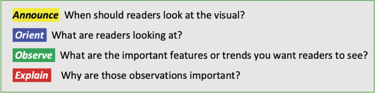
A Heuristic for Writing About Figures and Tables
Visual elements such as graphs, tables, and diagrams are essential components of scientific writing. Although scientific writing textbooks and guides often contain information on how to design such visuals, little has been written on how to effectively discuss those visuals within the text. This article offers a novel heuristic for teaching students how to effectively execute these “passages about visuals” in a way that is both conceptually simple enough to be understood by novices yet rich enough to accommodate the complexity of expert scientific writing. The heuristic consists of a set of “moves”: announce, orient, observe, and explain. Following an explanation of the moves, readers are walked through a variety of examples showing the moves in context and noting the different ways the moves are arranged and executed in published scientific research articles. Pedagogical implications and approaches for using the heuristic in the classroom are then discussed.
Scientists and teachers of scientific writing are well aware of the importance of visual elements (e.g., graphs, tables, diagrams, and maps) in communicating science. What is less appreciated is the essential role of the written elements that nearly always accompany these visuals. Some of these elements—titles, captions, legends, and data labels—may be considered part of the visual itself. The focus of this article is the written material that is not in the visual or legend. I call these “passages about visuals,” or PAVs.
Widespread dogma says that figures should speak for themselves, but only novices believe that “see Figure 1” is sufficient as a reference. Even though PAVs are a standard part of scientific writing, they are overlooked or oversimplified in textbooks and guides to scientific writing. Science students can find plenty of detailed instruction on how to create figures and tables (and even how to craft captions), but they will find little on how to discuss figures in the papers or articles where those visuals appear.
The need for a new approach
In their classic book, Writing in the Sciences: Exploring Conventions of Scientific Discourse, Penrose and Katz (2004, p. 87) took a step in the right direction to provide guidance on this topic:
The relationship between data and generalizations is easily demonstrated by looking at how tables and figures are referred to in well-written reports. Tables, graphs, and other visual representations are essential tools for reporting scientific results, but it is important to keep in mind that graphics only present the data; the generalizations needed to interpret those data must be provided in the text.
Penrose and Katz (2004, p. 87) then give readers this two-step model for writing about visuals:
“Refer readers to the visual explicitly.”
“Tell them what patterns to notice.”
While clearly acknowledging the importance of PAVs, Penrose and Katz (2004) do not account for the different types of visuals used in scientific writing and the different kinds of rhetorical tasks that PAVs must therefore perform. In fact, existing scientific writing textbooks tend to limit discussion of visuals to those that present data or findings—and even then, the textbooks only address the role of these visuals in supporting generalization and interpretation. However, figures and tables regularly serve other purposes as well. In the introduction, a map may show readers the geographical location under study, or a flowchart may present a theoretical model. In the methods section, a diagram or photograph may illustrate the experimental setup. In the results section, a table may present demographic data for the sample.
Given the lack of a sufficiently articulated model for teaching the writing of PAVs, I have developed a heuristic that accommodates the broad range of rhetorical functions that visuals accomplish in scientific discourse. The “moves” I present in this article are inspired by the work of linguist John Swales. In their rhetorical analysis of the introductory sections of contemporary scientific research articles, Swales and Najjar (1987) identified these standard moves:
- Introduce the topic; establish that the research area is of significance.
- Selectively summarize relevant prior research.
- Show that prior research is incomplete by articulating a gap in that research.
- Explain how the current research helps fill the gap.
Although Swales developed these moves as a descriptive device, they have been widely used as a heuristic for helping scientists learn how to craft introductions to their research reports. (In fact, Penrose and Katz [2004] use Swales’s moves for teaching introductions.) Teaching PAVs through a similar set of archetypical “moves” seemed like a promising approach.
The heuristic
I developed the PAV heuristic in relation to a set of empirical questions:
- Where are visuals typically used in science research papers?
- What are those visuals intended to communicate?
- What kinds of prose do scientists use to facilitate that communication?
I examined these practices in leading science journals, then refined the moves by testing them across a wide range of scientific disciplines, ensuring that the schema was broadly applicable. The final version of the heuristic is presented in Figure 1.
A heuristic for PAV moves in scientific writing.
Figure 2 shows these four moves in context, with an example from the Journal of Economic Perspectives (Cutler et al., 2006) that investigates human life span and mortality across countries and age groups.
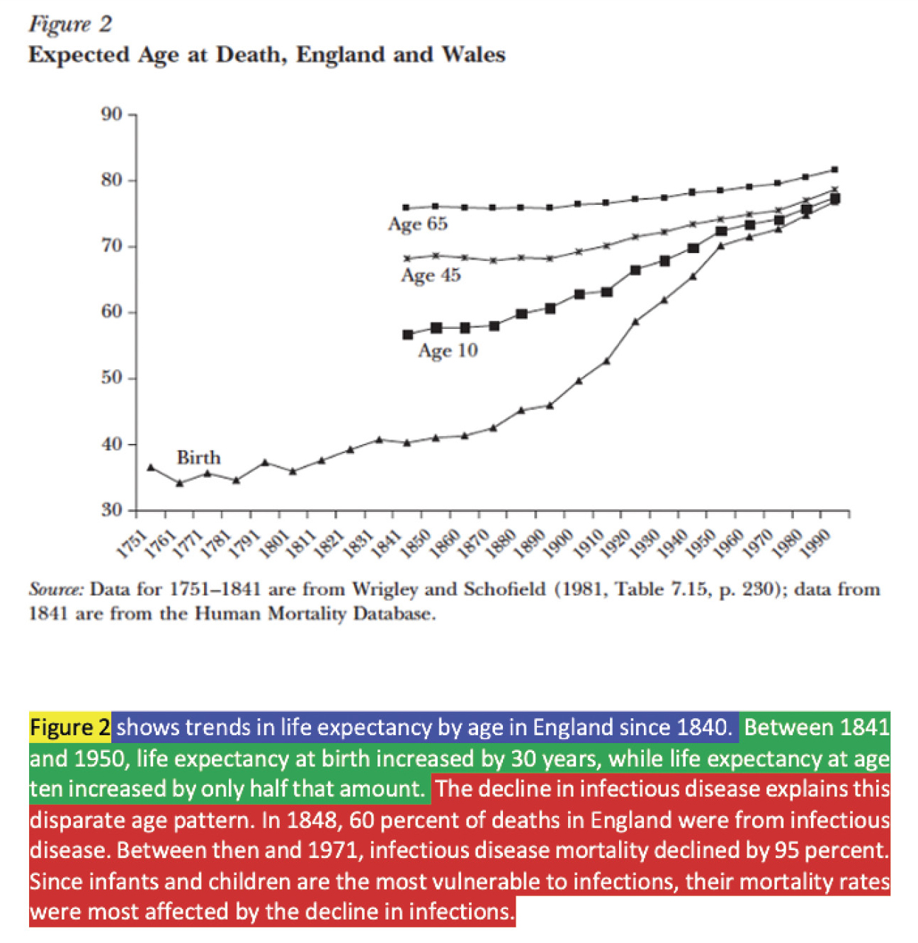
Example showing the four PAV moves in the Journal of Economic Perspectives.
Source. Cutler et al. (2006), p. 5.
Following the opening announcement (yellow in Figure 1), the remainder of the first sentence does an orient move (blue), describing the figure’s general content. The next sentence makes an observation (green), directing readers to locate the years 1841 and 1950 on the x-axis, then notice that the gains in age at death (y-axis) during that period are greater for the lowest curve (birth) than for the other three curves. The remaining sentences explain these trends (red), telling readers why the curves have these patterns.
Although this example shows all four moves, only the announcement move is ubiquitous in scientific writing. The others, as I discuss in this article, are used in various combinations. First, I describe each move in greater depth.
Announce
Announcements are the “see Figure 1” gesture, the straightforward calling of attention to the visual itself. Announcements are nearly universal in PAVs: When authors include a figure or table, they need to tell readers when to look at it. Most visuals have only a single announcement, but it is common to see multiple announcements for the same visual. Authors may, for instance, want readers to first look at a diagram in the introduction to understand the nature of the research project, then again in the methods section to see specific experimental details.
Orient
Orientation moves provide information that helps readers make sense of a visual. They usually tell readers what kind of thing the visual is and may provide other information as well. Because there are many types of visuals and audiences differ in their familiarity with each type, authors should choose orientation material based on the expected readership. Authors should also decide which orientation information should be in the PAV itself versus in the caption.
Observe
Observations focus readers’ attention on specific aspects of a visual, such as relationships, trends, or key features. Even though there are many varieties of observe moves, I find it pedagogically useful to categorize observations for visuals that present data in two general ways:
- Point observations direct readers’ eyes to a specific spot on a graph or a cell in a table to see things such as maxima or minima, inflection points, and outliers. (If you can place your finger on it, it is a point observation.)
- Trend observations ask readers to scan their eyes across a region of the visual to notice a pattern (e.g., the negative slope of a line, the bimodal nature of distribution, the clustering of a group of curves, or the decreasing values in a table column).
Explain
Explanations tell readers how to think about observations that have been made. Some explain moves suggest reasons for a feature or observed trend. Others are inferences, in which authors generalize from observations by answering the question “What do these observations mean?”
The moves in context
We may find these moves in a wide variety of combinations and orders, but my informal survey of published examples suggests some noteworthy trends for PAVs in IMRD (Introduction, Methods, Results, and Discussion) structured papers. First, all four moves do not occur in every PAV. Second, we often see these moves in the order in which I present them in this article—announce, orient, observe, explain—but this is far from standard, as readers will see in the examples I share.
Finally, moves are more or less common depending on the section in which the PAV appears. Visuals in the introductory part of a paper are frequently schematic in nature, such as illustrating concepts, locating the study geographically on a map, and so on. PAVs for such visuals usually include orient moves and perhaps observations. In methods sections, we typically see visuals that present experimental details; these will usually include orient and observe moves, but they often include explanations as well in which authors articulate the rationale for their methodological choices. In results sections, we may see all four moves together, or the explanation may not be included until the discussion section. Because visuals are rare within discussion sections (when separated from results), any PAVs there will address visuals already mentioned; thus, PAVs in discussion sections rarely contain orientations and observations because those moves will have already been performed. I map out where each move is most likely to occur in Table 1.
I also note that announcement moves are not always placed at the beginning of the PAV. Scientists frequently place announcements at the end of an orientation statement. Other times, authors first make their observations as if the visual were not present and only announce the visual afterward. I feel that this last approach is less desirable for readers, as it encourages them to try to understand details as they read without the aid of the visual—until they reach the end of the passage and see the announcement, at which point they may need to reread the passage while examining the visual. I also suspect that students do better work if they tie their presentation of findings more explicitly to their visuals.
Visuals in research articles are almost always accompanied by captions. Norms regarding what is placed in the caption versus in the main text vary considerably across disciplines and publishing outlets, and limits on article length can play a role as well. Authors (and sometimes editors) may relegate most or even all of the orientation material to the caption. Deciding what should go in the main text versus the caption can be difficult for both novices and experienced researchers. In some journals, observations may also be placed (or repeated) in the caption.
The PAV heuristic can be useful in thinking through these choices. In making these decisions, students should try to design the readers’ experience: What is useful for them to know before they move their eyes to the visual—to prepare them for it? That information should go in the PAV. What details are better placed close to the visual for easy and possibly repeated reference? That information should be included in the caption.
Examples
I next present a number of examples showing different types of visuals and PAV structures across different scientific disciplines. Due to space constraints, and to make it easier for readers to grasp the concepts of my schema, my examples are on the short side of the spectrum. Science, technology, engineering, and mathematics (STEM) researchers in some fields frequently employ much longer passages when discussing visuals; teachers who use my approach should be careful not to mislead students into thinking that longer PAVs are necessarily undesirable. I begin with an example from an introduction, followed by examples from other parts of the typical IMRD structure.
While rarely addressed in science writing textbooks, visuals (usually figures rather than tables) are often included the Introduction. These visuals typically contextualize the research project, communicate its scope, or present other information that clarifies the nature of the investigation.
Figure 3, from the Introduction of a medical sciences paper, provides an example with only two moves: the PAV goes straight from announcement to observation, with all orientation work handled in the caption.
Example from the introduction of a medical sciences research article.
Source. Liu et al. (2012), pp. 1–2.
Note. The PAV contains only an announcement and observation. All orientation occurs in the caption.
Visuals included in methods sections are often diagrams of experimental apparatus. PAVs for these figures typically include orientation moves, followed by detailed observations describing the experimental procedure in reference to the figure, as is shown in Figure 4A. A common variation is shown in Figure 4B, in which observations (green) are accompanied by an explanation (red) that provides the rationale for the methods described.
Examples of PAVs in methods section of an experimental paper.
Sources. Ponitz et al. (2014), pp. 3–4; Tan & Hare (2013), p. 2.
Note. Panel A: Orientation followed by observations, without rationale. Panel B: Includes rationale for some of the methods.
Once we move into the results section, we almost always see observe moves. The next example (Figure 5) is from the results section of a biology paper on the antibacterial effects of curcumin. In the PAV, we see the orientation move (blue) followed by the announcement (yellow) and then the observation (green).
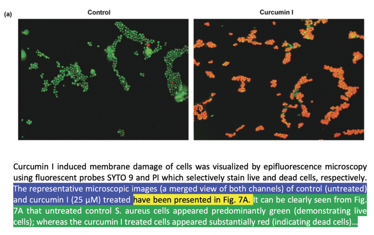
Example of figure panel presenting results from a microbiology paper.
Source. Tyagi et al. (2015), pp. 9–10.
Research papers in some journals have a single, combined results and discussion section rather than two separate sections. PAVs in these papers often contain all four moves. The next two examples, a table and a figure, come from the results and discussion section of an environmental sciences paper on water pollution (Jonnalagadda & Mhere, 2001). In Figure 6, we see three moves: The brief announcement of the table (yellow) is followed by orientation to the table (blue); the observe move (green) is what I’ve called a “trend” observation, guiding readers in seeing the general increase of values from left to right—particularly for TDS (total dissolved solids) and TSS (total suspended solids) in the middle two rows.
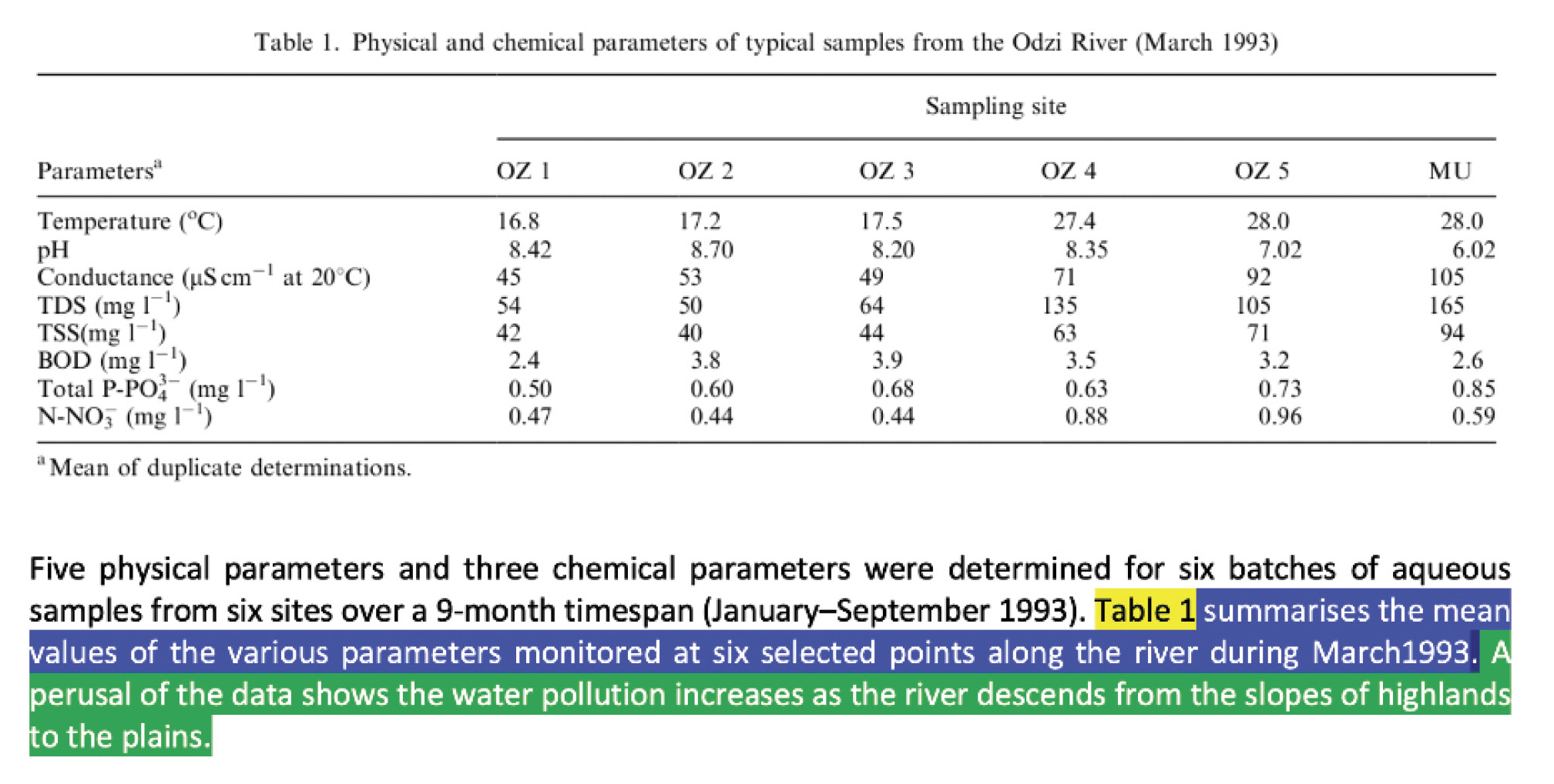
Example of table presenting results in an environmental science article.
Source. Jonnalagadda & Mhere (2001), p. 2372.
In Figure 7, we see all four moves. Note how the authors explain (red) the qualitative difference between the lower three curves (OZ 1, 2, and 3) and the others, using knowledge from outside of study to make sense of the observed trends. Also note that the authors use both categories of observation: trend observations in the first green sentence and point observations in the second.
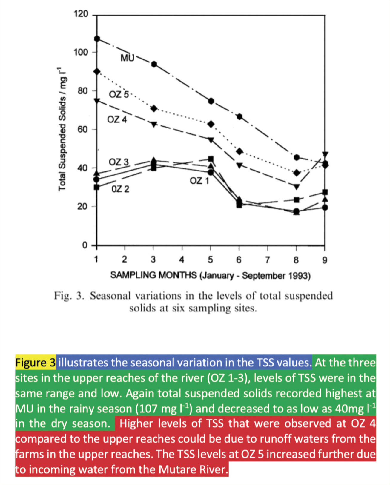
Example of figure in results and discussion section of an environmental science article.
Source. Jonnalagadda & Mhere (2001), p. 2373.
Pedagogical applications and implications
The set of moves described in this article can serve as a useful heuristic, revealing patterns in how scientists write about visuals that tend to go unnoticed. Though this schema may have value as a tool for studying scientific writing practices, I focus here on its use in teaching. There are at least three pedagogical ways to use the PAV heuristic: as a tool for observing how experts write, as a checklist for writers, and as a guide for giving feedback.
Reading-as-writers exercises
The PAV heuristic can aid students in learning how experts in a particular discipline write about the kinds of visuals the students might themselves use, revealing patterns in the otherwise bewildering variety of PAVs students may encounter when reading research articles. Before attempting to implement these moves in their own writing, students will benefit from exercises that let them identify and code PAVs in model papers. Having students analyze counterexamples (papers or passages lacking expert use of PAV moves) can be useful, too, especially in papers from prior offerings of the same course. These exercises can be done even in courses in which enrollment is too large to offer students opportunities to do their own writing, such as introductory-level lecture courses. These PAV coding exercises also lend themselves to small-group work, after which students can report their coding back to the class, compare with other groups, and debate their choices. An example of a handout for this activity is given in the online appendix.
During the writing process
Students can be asked to use the heuristic as a guide while drafting and revising, as they check their own PAVs for each figure and table and think about which moves they should include and whether they have executed each move in ways that will be effective for their audience. A useful way to approach this is to have students imagine they were giving a talk, the visual was on a slide, and they had a laser pointer. What would they say to make sure their audience understood what they were looking at? What would they point to, and why? Even better, have students make slides with their visuals, then record themselves presenting their slides to peers.
In giving feedback
The PAV heuristic offers a vocabulary that both instructors and students can use when giving feedback, whether on drafts or completed assignments. In place of the typical but often vague terms such as “unclear,” the heuristic allows instructors to offer more precise and thus useful responses. It can also be used as a checklist for peer feedback by giving students a focused task for reading and commenting on their peers’ papers that the student authors can understand and act on when revising. An example peer feedback activity handout is given in the online appendix.
The importance of context
The varied examples presented in this article show that even though the four PAV moves are conceptually simple, their implementation can be varied and complex. Unlike Swales’s moves that inspired this heuristic, where the complete set of moves are found in almost every IMRD paper, the moves in any PAV will vary based on where in the paper it occurs, the type of visual it is, the audience, and disciplinary conventions. In some cases, not including a given move will be the best choice. Therefore, even though Swales’s moves might be seen as a set of requirements for an effective research article introduction, the PAV moves should be seen as a toolbox. Learning to use these tools effectively requires students to pay attention to both internal context (where the visual occurs within the paper) and external context (the discipline and the target audience).
Accommodating one’s audience is, of course, important for every aspect of writing. This heuristic can help students implement this idea, but doing so requires that students know what their target audience is! Unfortunately, like so often happens with writing assignments in school settings, scientific writing assignments in college courses often do not specify an audience. Teachers who want to implement the ideas presented in this article should take care to choose and articulate the audience for their writing assignments and also to help students understand how writing for that particular audience will affect their choices in crafting PAVs, especially if students do not have personal familiarity with that audience.
Teachers should also take the students’ educational context into account. Consider the differences between the two PAVs from methods sections shown in Figure 4, where one example included explanation and the other did not. In lab courses where students are provided with detailed experimental procedures, expecting students to include explanations in methods PAVs is nonsensical; they did what they did because that is what they were told to do. In advanced courses in which students design their own experiments or at least have some say in the methodology, instructing students to include explain moves in methods PAVs would be useful.
Context always matters in writing. When teaching the moves presented in this article, teachers need to set expectations and provide models that align with disciplinary norms, the target audience, and the realities of their students’ educational situation.
Scientific writing and scientific thinking
Critical thinking in science involves knowing how to make and articulate meaningful observations, explanations, and inferences. These abilities—both the thinking and the expression of that thinking—are strongly tied to epistemology and disciplinary expertise. Expert scientists will have developed, for example, a set of observations they instinctively look for in the types of visuals they work with regularly. Along the way, they will also have learned how to express those moves, unconsciously absorbing the language of the moves in their reading. I am optimistic that this heuristic will help students develop skills not only in scientific writing but also in scientific reasoning.
Acknowledgments
My conversations with David Kellogg about these moves and the manuscript were invaluable in refining the ideas presented in this article.
Cary Moskovitz (cmosk@duke.edu) is a professor of writing and director of Writing in the Disciplines in the Thompson Writing Program at Duke University in Durham, North Carolina.
Literacy Teaching Strategies Postsecondary