
scope on the skies
Visual Literacy—the 3Rs or STEAM?
Science Scope—July/August 2021 (Volume 44, Issue 6)
By Bob Riddle
Visual literacy is a term first used by John Debes in 1969 (see Resources). By a variety of definitions, visual literacy, or being visually literate, is the ability to interpret or read information shown as a picture, a diagram, or graphs, for example. Visual literacy is a two-way skill (learned or inherited) where one can interpret and communicate what is seen. What is “seen” is essentially data that are processed by the individual, internally and/or externally. In the context of this column, visual literacy could mean students are able to understand a visual or “draw” a visual explaining something—an important skill in any content area but certainly important in the science classroom (although my wife, a proponent of teaching how to diagram a sentence, would argue that diagramming a sentence is also a form of visual literacy). Knowing better, I agree; nonetheless, I wonder somewhat tongue-in-cheek if the “3Rs” are now the “4Rs” (Reading, Writing, Arithmetic, and Art). Wait, what! Isn’t that STEAM? And isn’t visual literacy a teaching tool in the science and other classrooms already?
It’s all about data
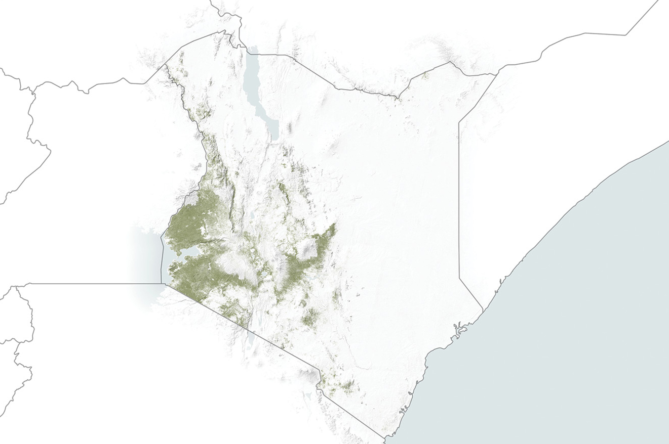
Visual literacy works in two directions—as interpretation and communication. Interpretation is more than asking students “What do you see in this picture?” or determining if the illustrations in the textbook or visuals you use are understood by students. Interpretation requires the capability to explain in some form, in this case visually as what is seen. There are a variety of tools available for students to use in answering that question. What they need to do this, depending on the project, are data. Data are essentially measurements composed of numbers and words we gather from instruments to draw conclusions or make decisions. Data are everything our senses detect and pass along to our brain where the data are processed, resulting in some sort of response or reaction. In addition, we live in a technological world that is increasingly data driven and where decisions are made based on data, not opinions or beliefs. For example, satellite data from observations made by NASA and the European Space Agency (ESA) have been used to develop maps for monitoring ground and crop conditions for the African country of Kenya (see Figure 1). This information has enabled the country to better manage areas affected by droughts and other issues that impact crops (see Resources).
It is important for our students to realize the relationship between data, data science, and decision making. Data are a significant foundation for science as they show trends or patterns. Often data (“just the facts”) are what allow for a better understanding of complex issues leading to a more appropriate outcome. For more information about how data are important in the science classroom, read the article “Turning Data into Evidence: Where Science Standards & Data Meet” (see Resources). Introduce students to data science with the two data-driven activities “Kids + Data: 2 Activities to Introduce the Fun World of Data” (see Resources).
Sources of data for students to use are readily available from websites maintained by NASA and the U.S. Government, for example. While there is no lack of available public data, much of it is in formats requiring software, programming skills, or access to commercial websites. NASA and other organizations receive much of their data as streams of numbers sent by satellites orbiting the Earth and other solar system objects. These streams of data typically include information about physical properties of an object, some of which is converted into the images we see in print, on TV, and on online. The ICSat-2 satellite uses six laser beams to accurately measure the elevation of everything it orbits over, from water to land to ice and snow. These data, which are essentially the roundtrip times for the laser beam, are radioed to Earth and mission scientists. To see how the mission scientists use data visualization to understand what they are measuring, visit NASA’s Goddard Media Studios and watch the video Photon Phriday: One Phull Orbit (see Resources).
Students have several opportunities for getting involved in data science and data visualization at NASA’s Solar System Treks website. Here data from various satellite and telescope missions create the images and information used to display the visuals, allowing us to virtually visit these otherwise inaccessible (at least for now) locations. Students may select from several solar system objects, including planets, moons, and asteroids, and examine their respective surfaces after applying different filters to highlight certain features (see Resources).
Another NASA source of data your students could use as introduction to data science and visualization is at the My NASA Data website’s Earth System Data Explorer. Here students may select from a variety of data sets and, after applying filters, see a map or graph of the data they have requested. Data sets have data from all five of the Earth “spheres” from which to choose. There are a series of tutorial videos as well as printed directions for accessing and using data from the Earth System Data Explorer (see Resources).
Using several scanning, imaging, and processing techniques, scientists and artists at the NASA Astromaterials website have imaged and created three-dimensional interactive displays of meteorite samples collected from the Lunar Apollo missions, as well as meteorites from our Moon and Mars collected in Antarctica. Images may be moved in any direction, and there is a wealth of data about each sample. After selecting the Astromaterials 3D Explorer application link, students may then apply various filters and layers to the sample. For example, students, using micro X-ray computed tomography, virtually of course, could “cut” into the rock from different directions to reveal the interior structure.
Projects that require students to generate their own data could range from hands-on science projects like the Tomatosphere Project, the Globe Observer, or more game-like structures such as those found at the Data Game website. Statistics may be a good source of data, and there are numerous sources of statistics and methods for graphically displaying this type of data (see Resources).
For students
1. International, or universal, signs are usually recognizable as one travels; however, how easy is to understand local signs (see Resources)?
2. How many countries have a space program? Find out and then create a Choropleth-type world map showing the countries having a space program using the Pixelmap Generator (see Resources).
3. Landing on our Moon sounds easy. Is it? Try the Lunar Lander at the Data Games website. Compare your results with classmates and analyze the data to create a visual displaying the results (see Resources).
4. Read how satellite energy (data) is transferred into images and then see examples of how NOAA uses data visualization to show atmospheric conditions using satellite-derived data (see Resources).
A picture says 1,000 words
In looking back, visual literacy was probably part of all our school experiences. In drafting classes, we would draw “exploded diagrams” that would show what a multisided shape would look like if it were unfolded; in science classes, we diagrammed the flow of blood through our bodies; and in language arts classes, we would use creative writing skills to write a story about a picture or an object, and so on. You get the picture!
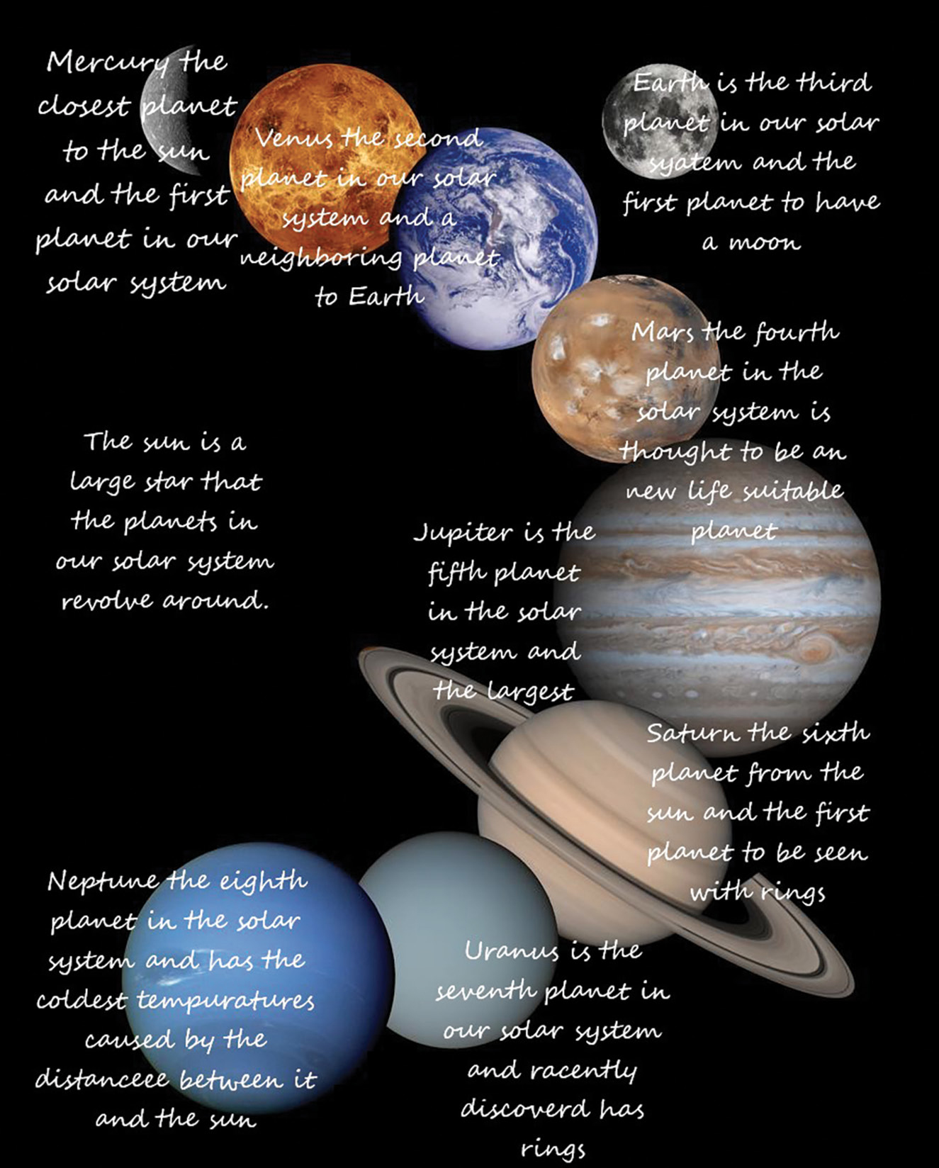
For both teachers and students, desktop publishing, graphic editing software, online resources, and PowerPoint-type programs are useful tools for creating and using visuals. There are online resources where students may download data sets, imagery of all types, and websites for graphically displaying data or information. A popular format is the use of infographics, a graphically based display with explanatory text adjoining the images used (see Figure 2). Visit the NASA’s Printed Products website or its Infographics Gallery website for a variety of posters, lithographs, and other visuals (see Resources). An internet search will bring up many online infographic creator websites where students may use premade templates or make their own for displaying information graphically (see list of online infographic and chart creators at the end of Resources). To ensure these websites are okay for student use, the teacher should view them before giving their web addresses to students. While graphics are certainly useful, unfortunately in some cases, the overuse of graphics in slide-show type presentations has led to the saying “death by PowerPoint.”
It is not uncommon in areas where there is international travel or foreign visitors for easy-to-understand picture signs to be used rather than text (see Figure 3). Understanding and using symbols in a visual display is as important as the use of text and often reduces or eliminates the need for text (see Resources). Students may combine symbols and images with easily gathered data from a variety of sources or develop their own from a project, research, or experimentation. This could be combined into an infographic using online infographic creators or software like the Microsoft Publisher or the free, open-source, Scribus desktop publishing program (see Resources).

Visual literacy is very much open to interpretation, but it is more than just understanding imagery or creating visual displays of data. It could also include, for example, things like the column I write or the writings our students do. Writing is an attempt to create visual images in the mind of the reader. A favorite writing activity in my Earth science classes is to have students write a story about a rock, a mineral, or a particular type of star, for example. The story would describe the “life cycle” of the object. How and where did that object form? How did it come to be where it is now?
Visual literacy could be as fun as creating ASCII art using only the characters on the keyboard. This was a popular pastime in the early days of desktop computer use and required some ingenuity. Now creating ASCII art is automated at some websites, but even that has taken a large step forward in recent years (see Resources). Imagine telling a computer to draw a picture of an emoji of a baby penguin wearing a blue hat, red gloves, green shirt, and yellow pants. In another form of ASCII art, computer algorithms and artificial intelligence are being developed that are capable of drawing based on a text prompt (see DALL-E in Resources).
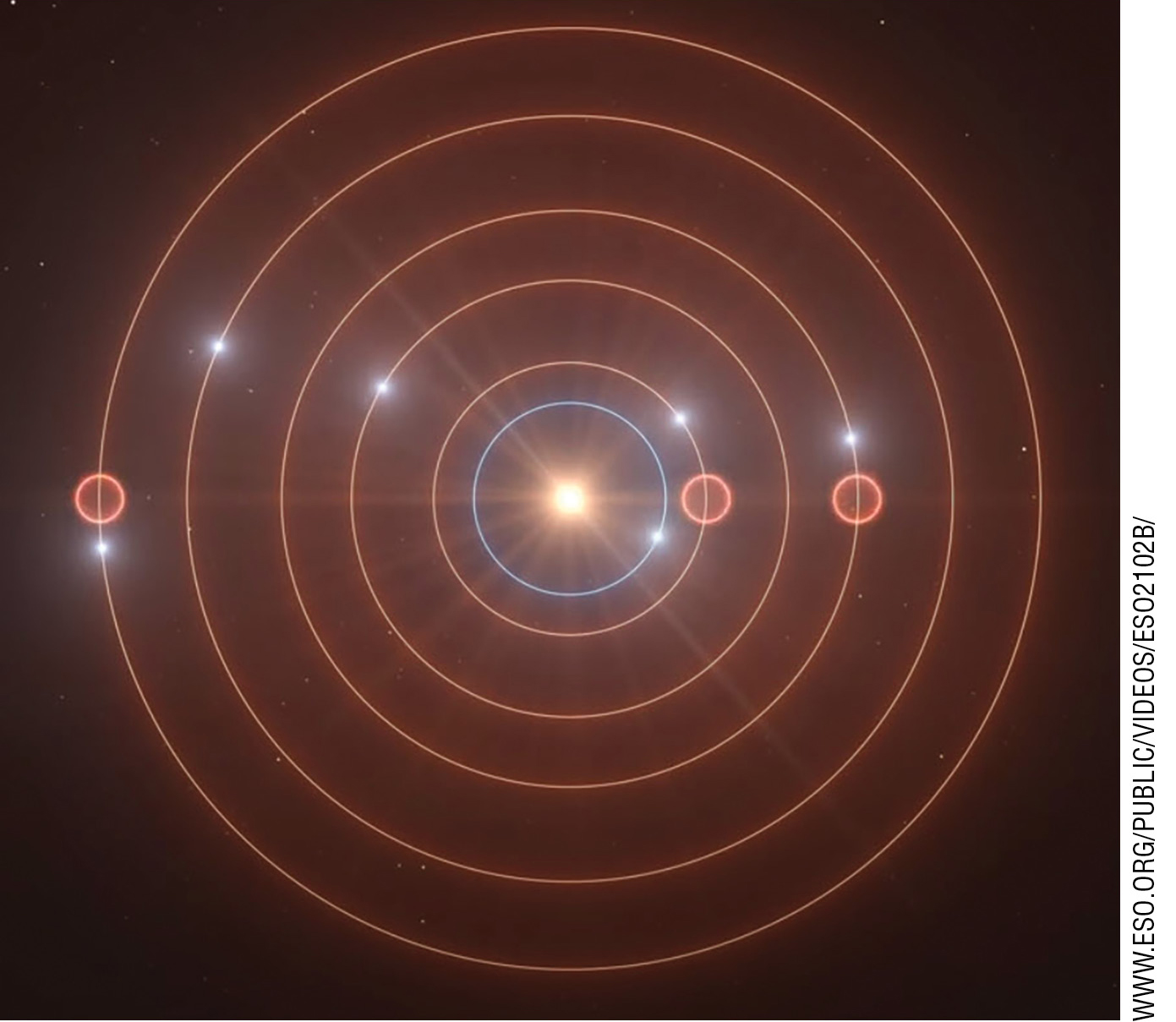
Music could also be thought of as a form of visual literacy. A few years ago, I collaborated with a group of musicians who wrote original musical scores and performed them in a series of live performances to accompany videos, graphics, and data from a high-altitude balloon project (see Ascent in Resources). Music was also used by scientists from the ESA to explain the complicated orbital paths of planets in orbital resonance around the star TOI-178 (see Figure 4 and Resources). How about visualizing “Songbird,” a song by Fleetwood Mac? Hovering the cursor over the music marks will display information about that mark. This is one of many “best of” data visualizations at the Public Tableau website (see Resources). And if you are fan of Ed Sheeran, watch this video to see how data visualization played an important role in the creation of his song “Shape of You” (see Resources). Visual Literacy, in many ways, is the ‘A’ in STEAM Education.
Visible Planets
Sky Calendar
Resources
Artist’s animation of the TOI-178 orbits and resonances—www.eso.org/public/videos/eso2102b/
“Ascent: A Community-Based Project to the Stratosphere”—Science Scope. Bob Riddle. November 2012.
ASCII Art Generator—textfancy.com/ascii-art/
BepiColombo Mercury Mission—sci.esa.int/web/bepicolombo/-/47346-fact-sheet
Census at School, United States—ww2.amstat.org/censusatschool/
Choropleth Maps—datavizcatalogue.com/methods/choropleth.html
CLIP: Connecting Text and Images—bit.ly/36z12wb
Common Core in Action—www.edutopia.org/blog/ccia-10-visual-literacy-strategies-todd-finley
Common Symbols and Meanings—venngage.com/blog/symbols-and-meanings/#4
DALL·E: Creating Images from Text—openai.com/blog/dall-e/
Data Evidence Science Standards—https://bit.ly/3rgKn8k
Data science for kids! Why data science?—www.datasciencekids.org/p/mentor-experiences.html
Difference Between Data Science and Data Visualization—https://bit.ly/36Aywua
Differences of World Signs—www.frontsigns.com/blog/the-difference-of-world-traffic-signs/
“Earth and Moon Relationship via Scaled Drawings”—Science Scope. Chuck Fidler and Sharon Dotger. December 2009
Ed Sheeran’s creative process explained with music visualization—https://bit.ly/2LaCFx8
First Dogs in Space—russianlife.com/stories/online/the-first-canine-cosmonauts/
Globe Observer—observer.globe.gov/do-globe-observer
How Visualizing Data Helped One Boy ‘See the Connections’—https://tabsoft.co/3rsL8eT
Kids and Data—https://tabsoft.co/36GALvL
Lunar Lander: Welcome to Data Games—ccssgames.com/welcome_to_data_games.html
My NASA Data—mynasadata.larc.nasa.gov/
NASA Astromaterials—https://ares.jsc.nasa.gov/astromaterials3d/
NASA Data Aid Food Security in Kenya—https://go.nasa.gov/39Ei9yy
NASA Earth System Data Explorer—mynasadata.larc.nasa.gov/EarthSystemLAS/UI.vm
NASA Infographics Gallery—www.jpl.nasa.gov/infographics/
NASA Printed Products Downloads—spaceplace.nasa.gov/posters/en/
NASA-Solar System Treks—https://trek.nasa.gov/
Parker Solar Probe—parkersolarprobe.jhuapl.edu/The-Mission/index.php#Timeline
Photon Phriday: One Phull Orbit—svs.gsfc.nasa.gov/13735
Pixel Map Generator—pixelmap.amcharts.com/
Scribus—www.scribus.net/
Solar Orbiter—sci.esa.int/web/solar-orbiter
Songbird by Fleetwood Mac—https://tabsoft.co/3cBu69V
Statistics Education Web (STEW)—www.amstat.org/ASA/Education/STEW/home.aspx
Tableau Public—public.tableau.com/en-us/s/
Tomatosphere—tomatosphere.letstalkscience.ca/
Transforming Energy into Imagery—https://bit.ly/39KW2GM
Viking Missions to Mars—nssdc.gsfc.nasa.gov/planetary/viking.html
U.S. Government Open Data—www.data.gov/
Visualizing Earth Systems—svs.gsfc.nasa.gov/forEducators/Start_Here.html
“Visual Literacy in Science”—Science Scope. Erin McTigue and Amanda Croix. Summer 2010.
Visual Literacy Toolbox—vislit.arhu.umd.edu/activityplans.php
Want NASA Data?—nasa.github.io/data-nasa-gov-frontpage/
What is Visual Literacy?—visualliteracytoday.org/what-is-visual-literacy/
What’s Going on in this Graph?—www.amstat.org/ASA/Whats-Going-on-in-this-Graph.aspx
Why is Data Visualization so Important in Data Science?—https://bit.ly/3rjr2Do
Free Infographic Maker—piktochart.com/formats/infographics/
Free Infographic Maker—venngage.com/
Free Infographic Maker—spark.adobe.com/make/infographic-maker/
Free Online Infographic Maker by Canva—www.canva.com/create/infographics/
Online Chart Maker—live.amcharts.com/
Online Infographic Maker—online.visual-paradigm.com/infoart/create/infographics/
Bob Riddle (bob-riddle@currentsky.com) is a science educator in Lee’s Summit, Missouri. Visit his astronomy website at http://currentsky.com.
Astronomy Earth & Space Science Instructional Materials Literacy STEM