
interdisciplinary ideas
How Can We Help Students See Patterns in Data?
(Data Literacy 101)
Science Scope—July/August 2022 (Volume 45, Issue 6)
By Kristin Hunter-Thomson
A big part of helping students work with data is getting them to where they can make sense of the data, but this can be challenging. In fact, many of the students I work with cannot do the first step of recognizing patterns in the data, which is a necessary precursor to making meaning. We can approach this differently so that we help students see common data patterns from a science/application perspective (as opposed to a functional fit or plotting perspective that is often used in math classes). We will explore two ways to do this with examples from this issue’s theme “Energy Literacy,” but the ways are applicable to any science topic.
Norm set on five common data patterns
Humans are pattern-seeking creatures. In fact, pattern recognition is a huge way that we learn and take in our world, with our eyes especially drawn to patterns we are already familiar with (Few 2020). We can leverage this pattern-seeking tendency to our advantage to help students learn what to look for in data before they are asked to make meaning of the data (aka the “Interpreting Data” part of SEP4; NGSS Lead States 2013). Let’s think back to another learning experience in school that is visual (for most): reading. First, we help students learn what the letters and phonics are before we expect them to read and understand a book. Specifically, we help students learn what the pattern of each letter looks like on the page, and then what we call those visual patterns. For example, we learn what a “J” looks like before we connect that visual pattern to the label of “J” and its sound.
We can do the same for data. For example, we can help students learn what a positive data pattern looks like before they need to know how to use the label “positive” to describe it consistently to one another. Students do not need to learn the vocabulary words for each of the data patterns before they figure out what each looks like. Instead, they should learn to visually recognize and describe each pattern and discuss in general what it would indicate about the variables being plotted.
There are five common patterns when looking at two or more variables together. In other words, this list is neither exhaustive of all data patterns nor does it include patterns when looking at only one variable (a critically important part of working with data in middle school, but a different topic). The five common data patterns are: stable, negative/lower, positive/higher, cyclical, and variable (see Figure 1).
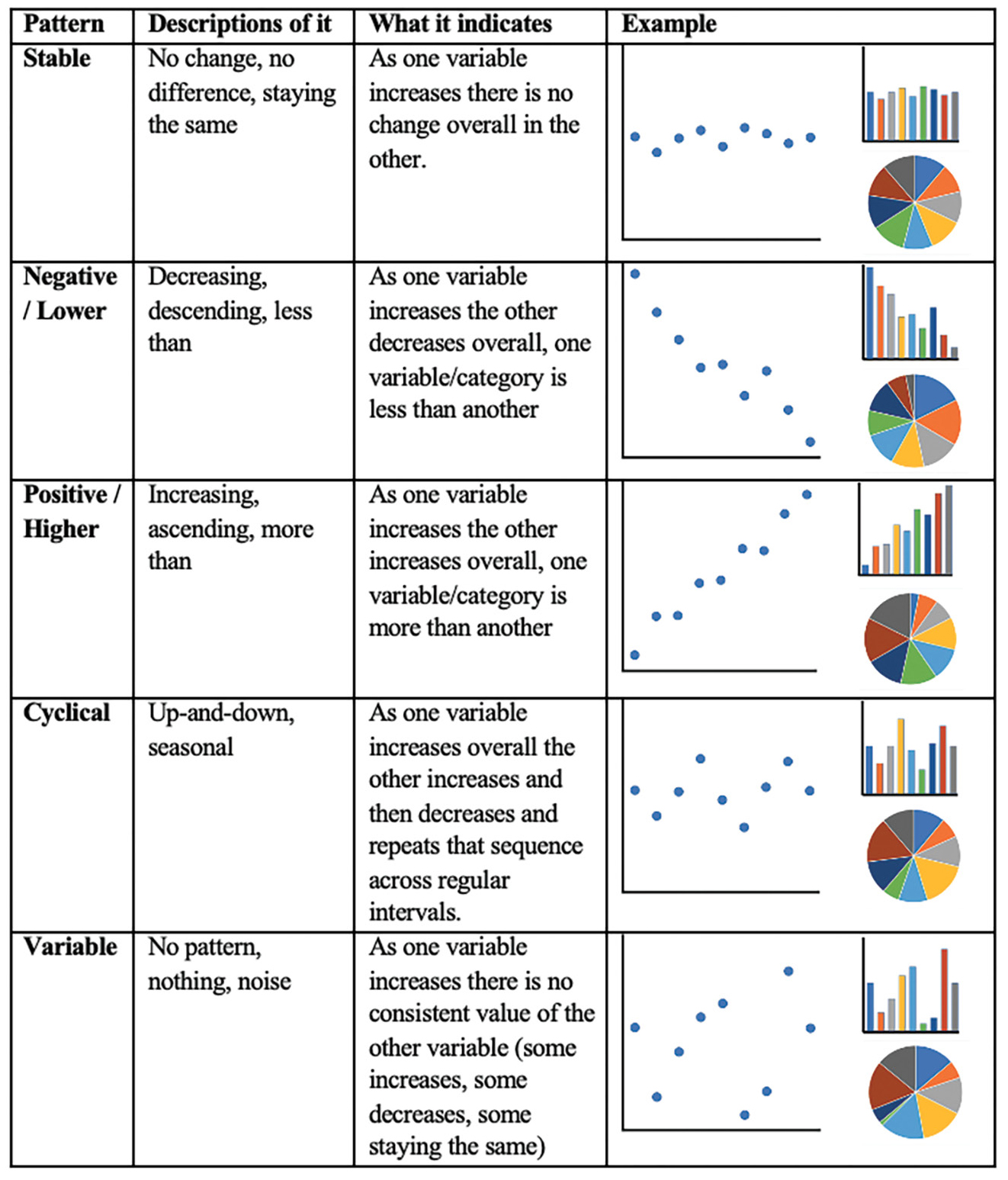
Description of five common data patterns observed in middle school science classrooms.
Building students’ understanding of these common patterns works well when done with simulated data (see Hunter-Thomson 2019a for more) or schematic data (as in Figure 1), rather than real-world data that you simultaneously are asking students to make meaning from for your science content. Let’s think back to the reading example. Students learn “J”, “A”, and “M” independently before we ask them to read and understand what “JAM” as a word means. And often when we ask them to read “JAM,” at the beginning we pair it with a visual picture of a jar of jam to provide another visual cue to assist in their understanding of the meaning of the word of letters they are reading. Therefore, I encourage us all to first help our students learn these patterns on their own, separate from making meaning of any specific data sets, and to consider giving Figure 1, or something like it, to our students as a visual cue to help in their data analysis of science-related data sets going forward.
But for this to be helpful for their future data analysis, students need to be able to describe visually what is going on with the data in terms of what it could mean for the variables (“What it indicates” column in Figure 1). That is because when our students take the step to look at data to investigate a real-world problem, their effectiveness at “Analyzing & Interpreting” the data is dependent on thinking through what the pattern means in the real world for those variables. This doesn’t mean that they need to interpret what the data means (data interpretation), but rather consider what the patterns could indicate about the data (setting them up for success with data interpretation).
For example, let’s imagine our students are testing different materials for their ability to adjust thermal energy transfer to keep something cold (MS-PS3-3). Using the output data from a trial (see Figure 2), we don’t just want students to tell us that cotton sock was less than nothing. Ideally, we want students to tell us that all materials had lower temperatures than nothing, and that indicates that there must be some qualities of the materials rather than no material (nothing) that interact with the thermal transfer over time. Notice here the students are not getting into interpreting why which material best reduced the temperature, but rather relating what they are seeing on the page (the common pattern) to what it means overall for the materials variable. Then the students can work to integrate that connection to their content understanding of the mechanisms at play as they work on their data interpretation.
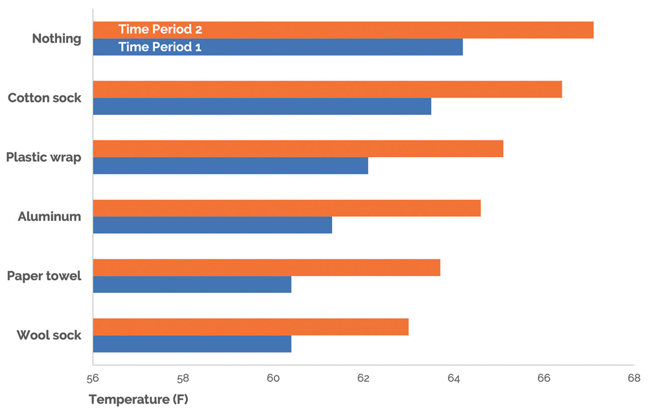
Example of temperature data for an object surrounded by materials to try to quickly cool its temperature and keep it cool to consider the transfer of thermal energy from Save the Penguins: Introduction and Insulation (for data source see Online Resources).
In summary, one approach we can take is to help our students learn the “letters” of common data patterns, by teaching them the patterns in general before we ask them to see the pattern and make meaning from it at the same time.
Leverage Gestalt principles
Another way that we can help students see common patterns in data is to leverage perception science to our advantage. A group of German psychologists in the early 1900s set out to determine how we visually make sense of the world without going into “overdrive.” In fact, although our eyes receive millions of visual stimuli a second, we focus on around 50 of those objects and pay attention to only around four to five (ScienceDaily 2016). The Gestalt School of Psychology described ways that we subconsciously group visual stimulus and make meaning from those groupings before we know anything about what we are looking at (meaning those initial patterns may not match the reality of the situation but help us process the vast amount of visual information we are receiving). These are called the Gestalt principles (Schwabish 2021), and I find that eight are particularly relevant to middle school science data experiences (see Figure 3):
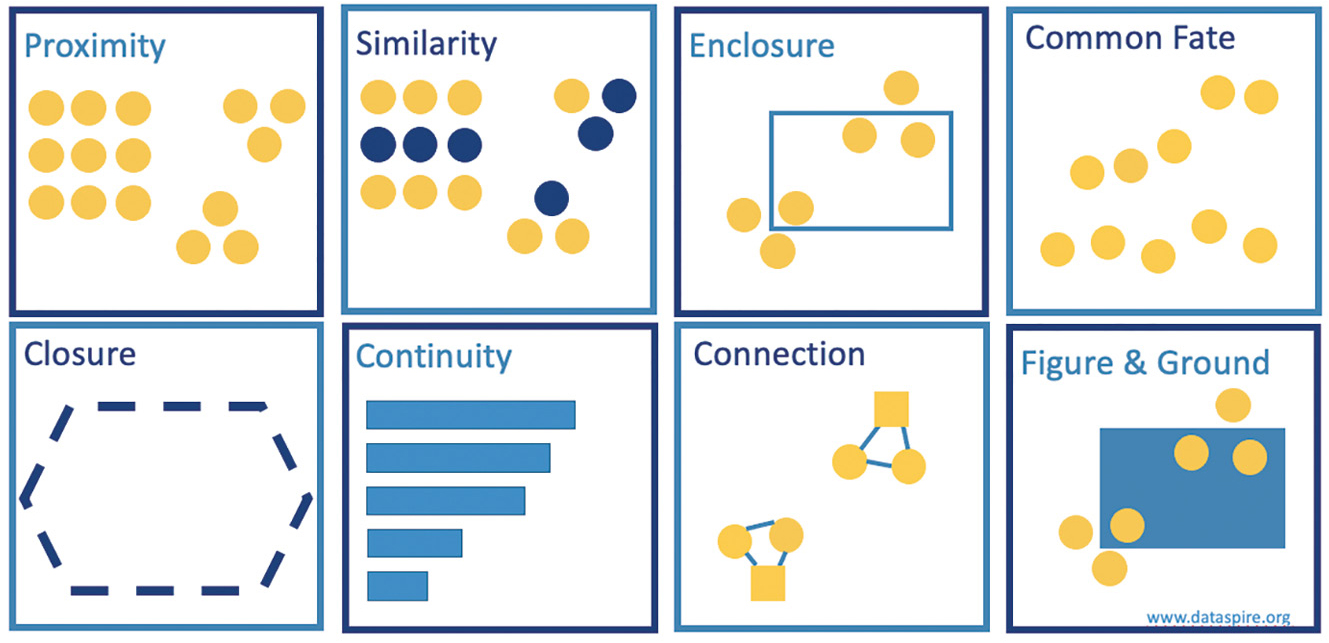
Eight of the Gestalt principles that are particularly easy to leverage in middle school science data experiences.
•Proximity—We perceive those objects that are physically close to one another as belonging to part of the same subgroup more than part of the whole (e.g., we see a set of nine dots and two sets of three dots often before we see 15 dots).
•Similarity—We perceive those objects that are of similar color, shape, size, and/or orientation as related or belonging to part of the same subgroup (e.g., we see a set of blue dots and a set of yellow dots, even though those blue and yellow dots are in different proximity groups).
•Enclosure—We perceive those objects that are physically enclosed together within a shape as belonging to part of the same subgroup (e.g., we see a set of yellow dots within the blue rectangle).
•Common fate—We perceive those objects that share a direction of movement as belonging to part of the same subgroup (e.g., we see a set of yellow dots that goes up to the right and another that stays constant along the bottom).
•Closure—We perceive a set of individual components as a single, recognizable shape whenever possible, even when not all the information is there (e.g., we see a blue hexagon more than a collection of disparate short lines).
•Continuity—We look for the smoothest path for our eyes to follow and create connection in what we perceive across that path (e.g., we see a set of blue bars that are decreasing in size).
•Connection—We perceive those objects that are physically connected as part of the same subgroup more than part of the whole (e.g., we see two sets of three connected dots, rather than a set of circular dots and a set of square dots). Note, this principle is often stronger than many other principles except enclosure.
•Figure and ground—We perceive objects as either in the foreground or in the background (e.g., we see a set of yellow dots “in front of” the blue rectangle).
Knowing about the Gestalt principles provides a fun new lens through which to explore how you make sense of various data visualizations, but I think just as important for us educators are that the principles provide an opportunity to layer in more conscious scaffolds into work with data for our students. Any set of plotted data will trigger one if not multiple Gestalt principles in our brains as we make sense of the information. The exciting thing is that through annotations and strategic graph type choices (see Hunter-Thomson 2019b and Online Resources for more on graph choice), we can create opportunities for more principles to be triggered in our students’ brains, thus aiding their ability to see the patterns.
For example, let us imagine our students are conducting the Rubber Band Cannon Lab to explore cannon angle, distance traveled, and time as ways to investigate the relationship between kinetic energy and velocity (MS-PS3-1). We could have the students plot the three measured variables from their investigations (time on x-axis, distance on y-axis, and cannon angle by color) to look for patterns in the data (see Figure 4). Ideally, we are hoping that they will see the turning point, that the rubber band increased its distance up to a point (40 degrees angle of the cannon) but then decreased its distance again. Just plotting these data triggers the Gestalt principle of common fate in that many of us perceive an upward and then downward movement of the points as we look from left to right.
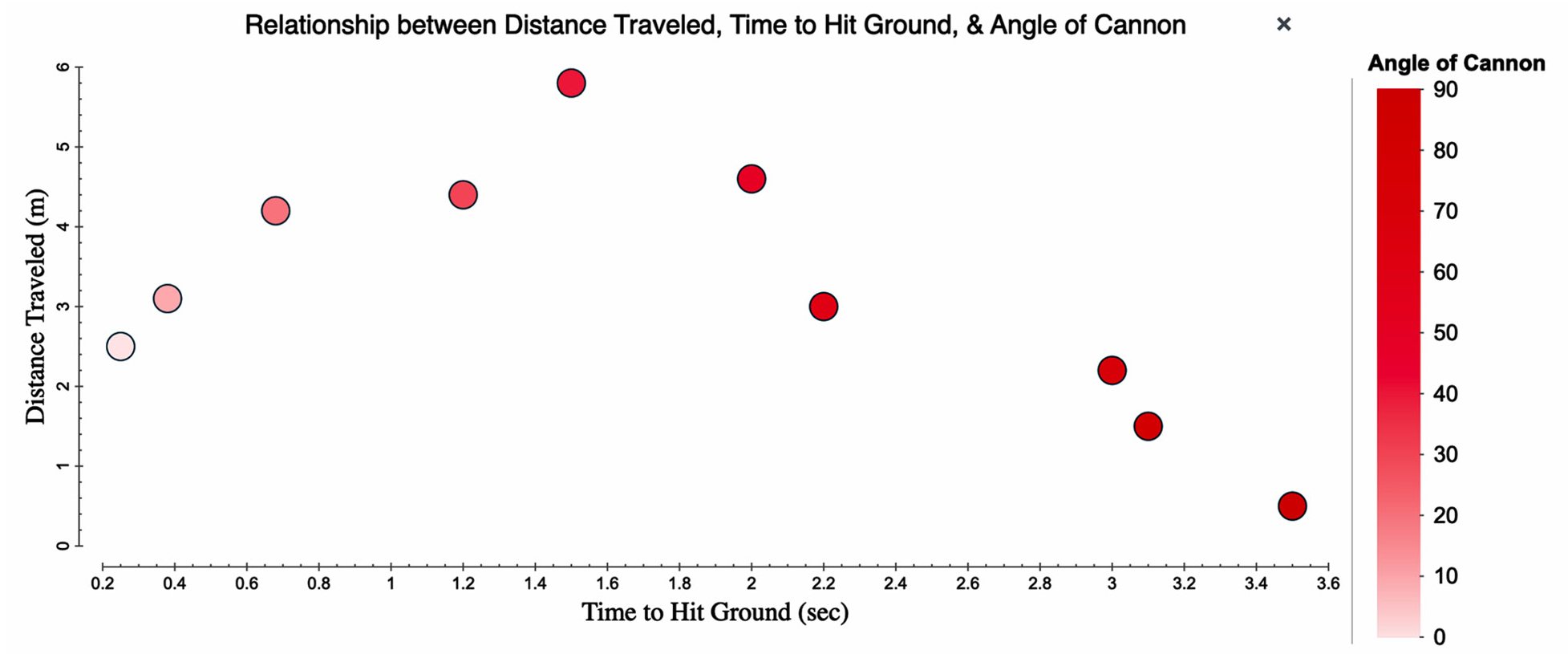
Example of graph of the relationship between distance traveled, time to hit ground, and angle of cannon from the Better Lessons: Rubber Band Cannon Lab (plotted using the freely available Tuva graphing program; see Online Resources).
However, we could also role model for our students or scaffold them through their own annotations of the data to layer on the Gestalt principle of enclosure by putting a circle around the data points from the left-most to the peak and another circle from the peak to the right-most data points (see Figure 5, dark blue circles). These circles visually help us to see the data as two different subcomponents of the whole data set. We could take it a step further and add a line bisecting each circle to provide another visual cue of the direction of the relationship, by leveraging the Gestalt principle of connections (see Figure 5, light blue lines).
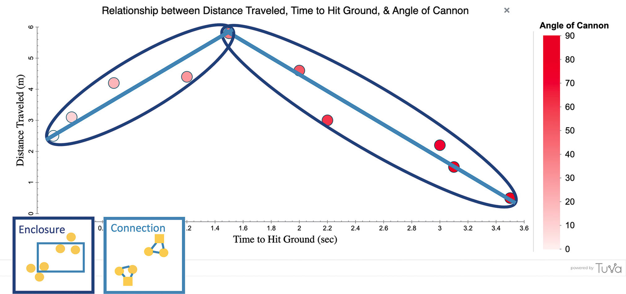
Example of how to help students layer the enclosure and connection Gestalt principles onto the graph from the Better Lessons: Rubber Band Cannon Lab (see Online Resources).
In summary, the second approach we can take is to layer annotations, or adjust the colors of the data points, onto any graph we are working with in ways that trigger multiple Gestalt principles to provide students with more visual cues when looking for patterns in the data.
Conclusion
Sometimes, making sure we have a solid foundation in the basics can be the most fruitful use of our time in the long run. If our students are struggling with making sense of data, a key question for us to ask ourselves is, “Do they have the basics of pattern recognition that I am asking them to apply and build upon?” While these two approaches take time away from our science content in the moment, they set the groundwork for more efficient and effective engagement with our science content in the future. Putting the time and energy in up front (or tomorrow) pays off in the end in terms of their science content understanding, their skills in using the science practices in sense-making, and their abilities to apply their skills and knowledge in different future circumstances.
What other approaches are you using to help your students to “see patterns in data”? Share them out with the hashtag #PatternsInData so we can continue the conversation and learn from one another. •
Online Resources
Better Lessons: Rubber Band Cannon Lab—https://bit.ly/3zo3zbA
Graph type matrix resources, graph type cards, empty worksheets for K–12, and AP/IB/College—https://dataspire.org/graph-type-matrix-resources
Save the Penguins: Introduction and Insulation—https://bit.ly/3H1ArJa
Tuva Labs—free tools, most data sets and activities are part of premium subscription—https://tuvalabs.com
Kristin Hunter-Thomson (kristin@dataspire.org) runs Dataspire Education & Evaluation and is a visiting assistant research professor at Rutgers University in New Brunswick, New Jersey.
Instructional Materials Literacy Teaching Strategies Middle School