
Research & Teaching
Using Publicly Available Long-Term Climate Records in Undergraduate Interdisciplinary Big Data Curriculum
Journal of College Science Teaching—November/December 2021 (Volume 51, Issue 2)
By Richelle L. Tanner and Lisa E. Collins
Understanding data analysis and interpreting data are key components of teaching interdisciplinary undergraduate students. We detail a semester-long research project that introduces students to long-term data sets, incorporates the use of widely available statistical analysis, and underscores an inquiry-based method of teaching climate change. Our learning objectives included analysis of large-scale climate data and interpretation of empirical trends in the context of two climate change phenomena: warming and the urban heat island effect. We demonstrate how small groups of students (n = 2 or 3) were empowered to independently download and analyze long-term temperature data to be aggregated into a class data set. Students used the National Centers for Environmental Information (NCEI) to find the long-term data sets of hourly maximum (TMAX) and minimum (TMIN) temperatures. Students used the open-source statistical software R to manage and summarize data. Students also examined changes in land use cover using Google Earth satellite data to quantify whether stations were urban or rural. Students were assessed in their groups based on a research paper and a class presentation. Approaching climate change education from the inquiry-based learning perspective allows students to understand how scientific research is conducted, apply the scientific method, and experience firsthand the importance of open-source data.
Recent studies, compounded by the hottest years and decades on record (AghaKouchak et al., 2014); see reports available at https://www.ncdc.noaa.gov/sotc/ and https://climate.nasa.gov), have brought climate to the forefront of international news. While climate change is prominently featured in the mainstream media, the detrimental effects of the related urban heat island effect on wildlife and human health are often underscored. We demonstrate how an interdisciplinary class of undergraduate students can access, analyze, and interpret climate data to see trends in temperature and underlying causes firsthand. This inquiry-based learning approach is ideal for exploring themes of climate change effects, as students have the opportunity to participate in cutting-edge research not yet represented in traditional textbooks (Pedaste et al., 2015).
Climate is defined as a 30-year period of weather and climate processes and is dependent on both natural systems and inputs to the atmosphere, whether natural or anthropogenic. Climate change is caused by contributions of greenhouse gases to the atmosphere by anthropogenic sources such as automobiles, power generation, waste disposal, agriculture, and other industries (IPCC, 2014; Monnin et al., 2001; Neftel et al., 1985). While climate change is most often manifested as a general warming of both maximum and minimum temperatures (TMAX and TMIN as defined in our study), it can also lead to more weather extremes on both ends of the spectrum (IPCC, 2014, and references therein). Therefore, it was important to look at the increase in the number of extreme hot and cold days by year and the length of the seasons by year to see if there was increased variability over time.
The urban heat island effect (UHI) is characterized by a convergence of maximum and minimum temperatures within a day. UHI is a phenomenon most commonly associated with increasingly urbanized areas with concrete structures that absorb daytime heat and release it throughout the night, thereby increasing the minimum daily temperature over time to near the maximum daily temperature (Easterling, 1997; Gallo et al., 1999). However, large urban areas are not the only perpetrators of UHI. The addition of water, manure, and fertilizer to farmland can increase soil temperature and induce UHI (Kalnay & Cai, 2003). Climate change and UHI are prominent forces in not only urban climate but also climate patterns in areas with agricultural land. This exercise investigates the extent to which historic trends have been altered in their presence.
Inquiry-based learning (IBL) is gaining popularity in science education because the process of data acquisition, analysis, discussion, and dissemination of results mimics the process of the scientific method (Pedaste et al., 2015). Several studies have shown the effectiveness of IBL when compared to traditional learning; specifically, IBL increases active learning and engages students in the process of scientific research (Furtak et al., 2012; Minner et al., 2010). In this project, we used IBL to support the broader learning outcomes of our academic program, including students using an interdisciplinary approach to environmental problems, completing these tasks in teams, and communicating these results for both layperson and expert audiences.
This project is an introduction to big data for undergraduates engaged in interdisciplinary climate science courses. Students learn how to download, manipulate, and summarize large, publicly available data sets as part of a team. They are introduced to basic statistical analyses in R, data management in R and Microsoft Excel, and presentable figures in R. In the topical context, students learn how public data sets are useful for recognizing climate trends and how they may be driven by anthropogenic influences such as land use. Analyzing and interpreting the data require students to think beyond the presence or absence of climate change or UHI and to delve into the analysis of trends and causes. This project offers a useful introduction to using large data sets to identify patterns and connections among disciplines. We also take advantage of freely available software to encourage students to engage in independent data analyses.
Methods
Diurnal temperature range (DTR) has long been used by scientists to examine and determine climate change while minimizing regional variation (Gallo et al., 1999). DTR looks at the difference between the maximum daily (or monthly or yearly) temperature (TMAX) and the minimum daily (or monthly or yearly) temperature (TMIN). In this analysis, students defined UHI as the convergence of absolute maximum (TMAX) and minimum (TMIN) temperatures, where the slope of TMIN is at least three times that of the negative slope of TMAX. In particular, students were trying to determine the impact of agriculture, with its addition of water and fertilizer, on UHI using imagery analysis.
Data collection
Maximum and minimum daily temperature (TMAX and TMIN, respectively) data sets were downloaded from the National Oceanic and Atmospheric Administration’s (NOAA) National Centers for Environmental Information (NCEI) database (https://www.ncdc.noaa.gov/cdo-web/) for the longest time period available, specific to each city. This was accomplished using the Climate Online Data Search function on the NCEI website, with the Daily Summaries data set selected along with the longest date range on the drop-down calendar (https://www.ncdc.noaa.gov/cdo-web/search). Once search results are returned, the longest temperature record available (shown by period of record) was added to the request cart. The request cart must be exported in CSV format, with the full date range and temperature data selected. The files requested are sent to the provided student email address. Where continuous records were not available, multiple stations were used for single cities. Data were prepared for import into R with Excel. (See Tanner [2020] for more detailed instructions on how to guide students through data downloads.)
In the classroom setting, students were divided into groups of two or three and the cities were divided randomly among the groups for independent downloading. Groups were organized to pair students with more experience in independent study with students less familiar with inquiry-based learning. All downstream analyses were performed in tandem, and the results were collated on the classroom level with a shared Google spreadsheet to collect city metadata.
Absolute temperature calculations
NCEI data were converted from degrees Fahrenheit to degrees Celsius, then yearly averages were calculated. Yearly averages were plotted as TMAX and TMIN for each city using linear regression with one-way analysis of variance (ANOVA). This method allows for statistical comparison of means among groups. The entire time period was used to determine the average climate and standard deviations for hot and cold day designation per city (for R code, see Tanner [2020]). Extreme heat days and extreme cold days were defined and counted for each year. A heat day is defined as the TMAX average plus one standard deviation; a cold day is defined as the TMIN average minus one standard deviation (Tamrazian et al., 2008). Extremes were counted along with the first and last date of occurrence each year (for R code, see Tanner [2020]).
Climate anomaly calculations
Using the 1960–1990 standard climate period introduces bias in the standard deviation and analyses of data outside of the standard climate period (Tingley, 2012). To combat this bias, we performed climate anomaly calculations based on the entire time period, in addition to absolute temperature calculations based on the 1960–1990 period. The city-specific means of the complete time span for TMAX and TMIN were taken. Each day’s TMAX and TMIN were compared against the overall means to get the climate anomaly (for R code, see Tanner [2020]).
Determination of UHI and climate change signatures
Slopes of the yearly averages for maximum temperature (TMAX) and minimum temperature (TMIN) were used to determine the presence of climate change and UHI. Only the statistically significant (one-way ANOVA, p = .05) data sets were used in our analyses. Analysis of variance (ANOVA) calculations were done in the provided R script (see Tanner [2020]); briefly, these calculations demonstrate the relationship between time and TMAX or TMIN and indicate whether regression slopes are statistically significant. The UHI was calculated as a difference between slopes of TMIN and TMAX, where the slope of TMIN was at least three times that of the negative slope of TMAX. Climate change is defined as a positive significant slope in yearly TMAX or TMIN. Extreme heat and cold days were defined as one standard deviation above and below the mean, respectively for each city; extreme heat and cold days were counted for each year and the trends analyzed.
Land use coverage
High-resolution data for each station were obtained using satellite imagery from Google Earth. Still images were downloaded and used in an ImageJ analysis (e.g., Figure 1). ImageJ is a freely available software that allows measurement and manipulation of images and videos (https://imagej.nih.gov). Stations were separated by population size of the nearest city into categories of more than 10,000 people and less than 10,000 people. The stations associated with larger populations were analyzed on a 5-mile radius scale, while the stations associated with smaller populations were analyzed on a 2-mile radius scale. It is important to note that while the population sizes were determined by the most proximal city, stations did not always correspond to city centers. The assumption made in determining whether to use a 2- or 5-mile radius was that larger cities had more environmental inputs that were further reaching, as opposed to smaller cities or towns that were more likely to be in a homogeneously rural area. Three categories were used to determine land use: urban, defined as dense areas of manmade structures; agricultural, defined as irrigated farmland or pastureland; and rural, defined as the naturally occurring landscape specific to that region. Coastal stations’ analyses often included oceans, which were sorted into the rural category. A circle around the station was drawn with either a 2- or 5-mile radius, and the percent coverage of each category was recorded using a grid overlay in ImageJ. Scaled radii may be calculated using the scale bar in Google Earth at time of imagery download, where the number of pixels in a given distance (e.g., 1 mile) are multiplied by the desired radius to produce the pixel distance to input as the circle radius. Data were gathered for both 2015 satellite imagery and 1990–1998 satellite imagery due to inconsistent imagery that prevented a single-year designation. Data were correlated with climate change, UHI, and region designation analyses performed earlier. All step-by-step analyses are available in supplemental R code (Tanner, 2020). Optional data visualization of complex principal components was performed using the package “ggbiplot” in R (Vu, 2011), which is accessed from within the R landscape as demonstrated in the supplemental R code (Tanner, 2020). This step is highly encouraged for more advanced students with an interest in statistical approaches.
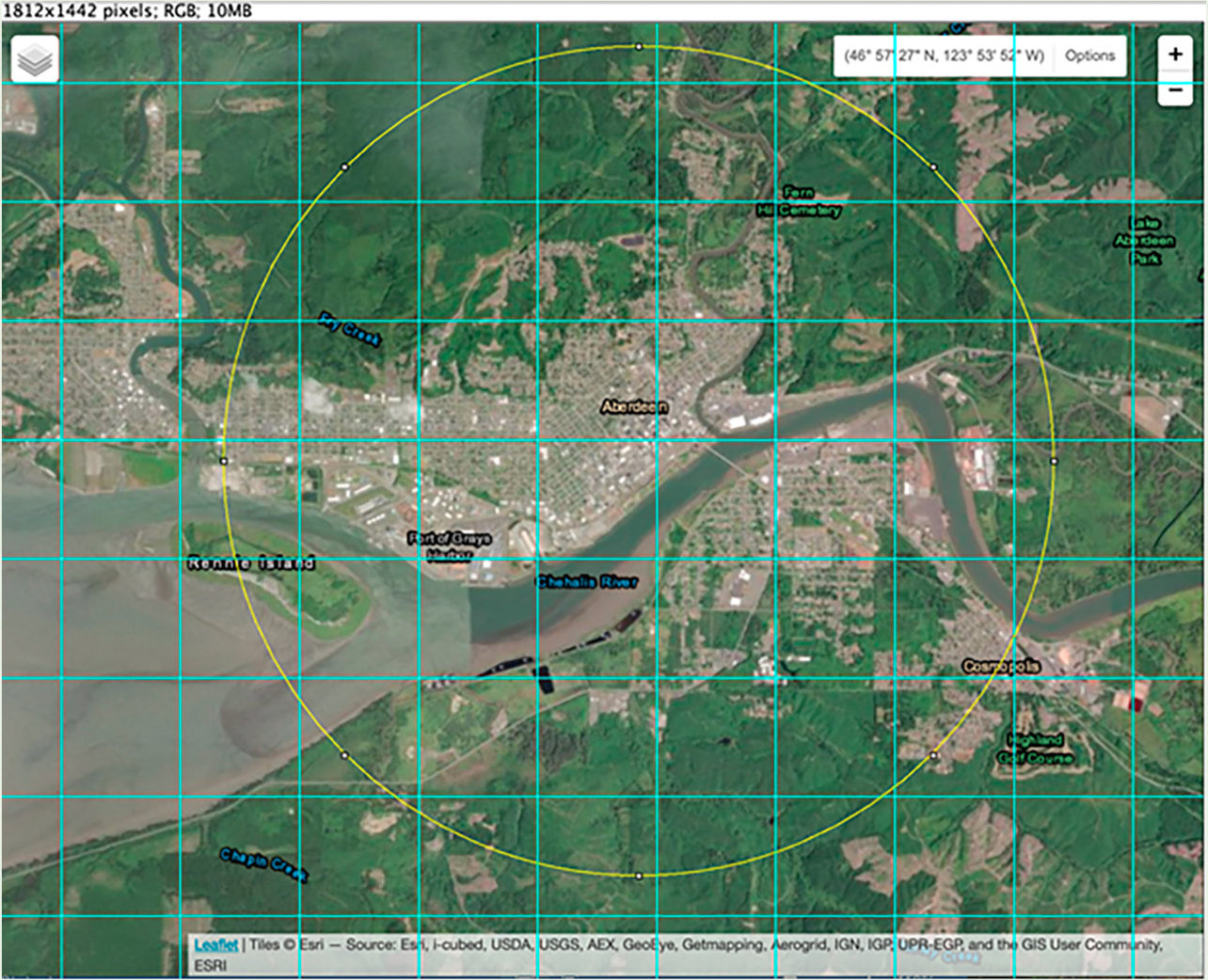
Sample city with grid overlay and centered circle drawn in ImageJ.
Note. Image taken from open-source USGS Earth Explorer webpage (https://earthexplorer.usgs.gov/).
Evaluation of student performance
Students were evaluated in their groups through a collaborative 10-page paper and an 8- to 10-minute oral presentation. Broadly, students were assessed using the learning objectives and outcomes for the project. As instructors, we wanted students to apply their knowledge of general anthropogenic climate drivers to their cities and their data. We looked for thoughtful analysis and connection between the data and the relevant existing primary literature, much of which was covered during the semester through dedicated class readings and lectures. (See Tanner [2020] for evaluation rubrics used in this study.)
Results and discussion
Here we highlight the learning outcomes achieved by this curriculum, as well as the prerequisites for a student to be successful in this project. We suggest guiding questions for the discussion of data and provide a rubric for evaluation of student success (Tanner, 2020).
Prerequisites for student success
While groups are designed to have peer mentoring support, we encourage participation from all students excited about independent study. To be successful in this independent project, students are encouraged to enroll in freely available R tutorial programs to first learn the language (e.g., Lynda.com, Datacarpentry.org, Datacamp.com, or Codeacademy.com). Successful students will be able to discuss topics without any predetermined answers and engage in collaboration with their diverse peers. If they are not already familiar with the concept, students will learn how to be detail oriented and manage the metadata (i.e., how data are organized and stored) associated with their project. This activity can be adapted for students who are less motivated or underprepared by modeling introductory tasks as an instructor in a recorded format, so students may replay complex instructions. For example, we have provided a sample video lesson of introductory R tasks using the tasks within the course. (See Tanner [2020] for video link and transcript.)
Learning outcomes
Student learning outcomes are tied to the course goals. The course goals that this project addresses include the following: to understand how natural forcing differs from anthropogenic forcing; to analyze the primary peer-reviewed literature; and to apply quantitative analysis and statistical methods to real-world data sourced from publicly available websites and interpret the data. Student learning outcomes are measured using two rubrics: one for their class presentation and the other for their written paper (Tanner, 2020). Learning outcomes included defining UHI and how they are created; describing, applying, and summarizing the academic literature on anthropogenic climate change; and analyzing and interpreting daily temperature trends for many cities to determine the impact of anthropogenic climate change over several decades. This semester-long project scaffolds the learning outcomes by starting project tasks in the classroom. Students learned from traditional lecture the basics of the climate system, including what anthropogenic climate change and UHI are and how they manifest across the environment. Students also read selected landmark articles from the primary literature and had class discussions on these readings to help them analyze and interpret the information. All the articles were applicable to our class project, and students were encouraged to use their class notes when writing their papers.
Effectiveness of this project for perceived student learning can be grossly evaluated from course evaluations. The project was implemented in spring 2015. Prior to the project being added, students evaluated or rated the course overall at 4.0 ± 1.26 (5-point scale, with 1 = poor, 3 = average, 5 = excellent) and instructor effectiveness at 4.0 ± 1.10. After the addition of the project, overall course rating increased to 4.60 ± 0.51, and instructor effectiveness increased to 4.8 ± 0.41.
Overarching questions to address with student data
Depending on the geographic area of focus, climate change and/or UHI will be prevalent in the data set. Coastal regions and areas of urban or agricultural development will be most fruitful for this exercise, but it could also be worthwhile for students to compare environmentally disparate regions to demonstrate how patterns of climate depend heavily on local microclimate, especially when considering seasonality of extreme heat or cold days. Students may also explore more complex statistical interpretations beyond the scope of the provided materials, investigating how increased variation in temperature is also a signature of climate change by some definitions. Finally, students in interdisciplinary courses will benefit greatly from a discussion of the policy and management implications of these climate trends.
Conclusion
This exercise uses inquiry-based learning techniques to reveal the power of widely available, publicly accessible data and free statistical software to analyze long-term climate trends. Using this as a class project illustrates how teams of students can work on smaller parts of a larger question to compile and analyze data. The conclusions from data generated by students in our pilot study demonstrate what we know to be occurring: a warming of the daily temperatures in most California cities. This project gives students the framework for how to test a similar question in their local geographic area, gaining power from the IBL approach. This project can be replicated and/or built upon by looking at other areas of the world and asking similar questions to those we posed to our students.
Richelle L. Tanner is a professor in the Environmental Science and Policy Program at Chapman University in Orange, California. Lisa E. Collins is a professor in the Earth Science Department at Santa Monica College in Santa Monica, California. This project was conducted at the University of Southern California in Los Angeles, California, under their prior affiliation.
Computer Science Instructional Materials Interdisciplinary Teaching Strategies Technology Postsecondary