
Teacher’s Toolkit
Leverage the Data You Have
Increase Creativity and Confidence in Science
Science Scope—May/June 2022 (Volume 45, Issue 5)
By Naomi Weintraub and Kristin Hunter-Thomson
CONTENT AREA Life Science
GRADE LEVEL 6–8
BIG IDEA/UNIT Data analysis
ESSENTIAL PRE-EXISTING KNOWLEDGE Working with data to create graphs and practice data analysis
TIME REQUIRED Four 45-minute classes
COST None
SAFETY Care should be taken around computer cords.
Data is what we use to do science and engineering; therefore, it is not surprising that data analysis is explicitly called out in Practice 4: Analyzing and Interpreting Data of the Next Generation Science Standards (NGSS Lead States 2013). Fortunately, data is increasingly being incorporated throughout the science curriculum in images, diagrams, charts, tables, maps, and graphs (Wolff, Wermelinger, and Petre 2019; Hammet and Dorsey 2020). However, there still is a need for effective curriculum materials that utilize data to teach content and data skills simultaneously (Kastens, Krumhansel, and Baker 2015; Schultheis and Kjelvik 2020), as well as formative assessments that provide teachers with insight about students’ data skills. A great way to provide students with opportunities to interact and analyze data is to use data that are already a part of your current unit.
I developed an end-of-unit project following my students’ completion of the Metabolism unit by Amplify Science (my district’s contracted curriculum in 2020–2021). During the unit, I watched the students get excited about playing with the Amplify Metabolism Simulation and its associated data (because Amplify is only available to subscribers, I have shared a link to the data from this project in Tuva so that anyone who sets up a free account can access it; see Metabolism Dataset in Online Resources). I began by creating a large dataset from the simulation. I asked the students to explore the data for the purpose of understanding how metabolism varies with different external inputs. I was specifically interested in seeing students’ skills demonstrated across the following aspects of analyzing and interpreting data:
- constructing and/or using multiple different graphical displays to identify linear or nonlinear relationships,
- analyzing and/or interpreting large datasets to identify trends and provide evidence of how different inputs from data impacts metabolism,
- applying concepts of statistics (e.g., mode, median, mean) and probability to analyze and/or characterize the data, and
- interpreting data to determine similarities and differences in findings among attributes.
Preparatory work
This project was conducted with a class of 38 seventh-grade students, nine of whom were English language learners (ELLs) and eight of whom had IEPs stipulating in-room assistance. Due to COVID-19, each student had their own device (whether in school or at home), but this project could also be conducted with two students to one device if 1:1 technology is not possible. In September, I introduced the Tuva Labs interface (see Online Resources) to build student data skills while learning science content. Tuva is an interactive, web-based platform that enables students to actively manipulate data across different graph types and filtering options, to annotate data, and to view various summary statistics of data through a drag-and-drop interface. With a free Basic account on Tuva, you can access all of the tools and features to manipulate data, upload up to five of your own datasets, and use 15 of their curated datasets. The platform is designed for users to explore and tinker with the data in a user-friendly way.
We spent a week learning how to use the Tuva tools and features exploring data on different breeds of dogs (e.g., weight, average life expectancy, and overall disposition toward children) from Tuva’s Man’s Best Friend Introductory Activities (see Figure 1). Through the activities, students gain familiarity with Tuva’s tools and features as well as with graphing, exploring, and analyzing data. Initially, I projected my screen and demonstrated how to interact with Tuva, but the students (either in-person or remotely) quickly learned to work independently in the interface.
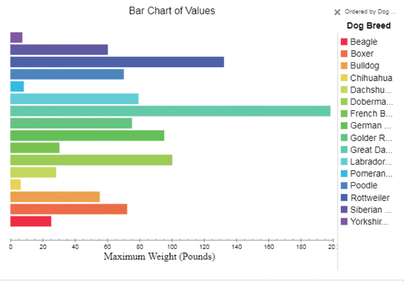
Screenshot of Tuva’s Man’s Best Friend Introductory Activities.
To create the project, I first generated the dataset that my students would use from the Amplify Metabolism Simulation. I selected 12 different attributes from within the simulation related to metabolism (see Table 1; Tuva, the graphing program that I used for the project, uses the naming convention of “attribute” to refer to variables that are within its platform). The simulation includes the input attributes of types of bodies (healthy, diabetes, asthma), types of food, activity levels (e.g., rest, walking, running), and amounts of digestive enzymes (low, medium, high). The output attributes from the simulation run include the glucose molecules absorbed by cells, oxygen molecules absorbed by cells, amino acid molecules absorbed by cells, oxygen molecules taken in per breath, heart rate, breath rate, cellular respiration, and change in stored glucose molecules.
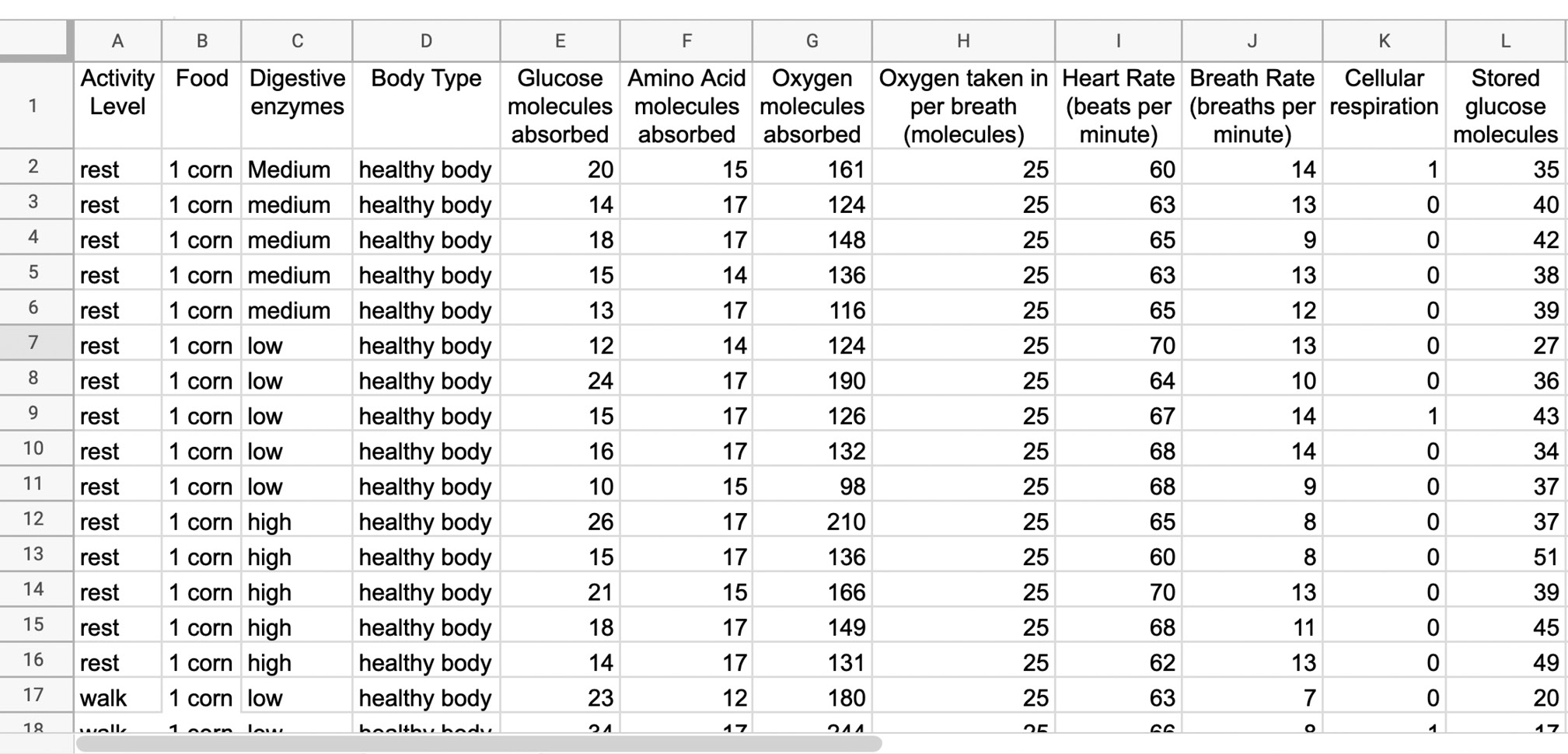
Screenshot of dataset generated from the Metabolism Simulation for the students to use in the end-of-unit project.
To create the dataset, I iteratively altered one attribute at a time and recorded the output data for all 12 attributes following a full run of the simulation. For example, I ran the simulation for a healthy body type eating corn, walking, and with a low amount of digestive enzymes. Then, I kept all of the input attributes the same except I adjusted the amount of digestive enzymes to medium. I repeated this process for all options of each of the input attributes. Fortunately, the simulation has built-in variability in its data outputs, so I ran each iteration of input attributes five times for replication. This resulted in 538 rows and 12 columns of data (which were the input and output attributes). I collected the data in Google Sheets and then uploaded it into the My Datasets repository within Tuva to share with my students via a URL (see Online Resources for link to metabolism end-of-unit project dataset in Tuva).
Next, I wrote the instructions and questions for the activity (available in the class worksheet in Supplemental Materials). Because many of my students at this point in the year were focused on finding the “right” answer, I created questions that prompted them to think creatively about the data. As a final product, students had to produce graphs that were based on the attributes that interested them and complete questions that were based on their data exploration. I developed a project rubric (see Figure 3) to assess the students’ ability across the following three main categories:
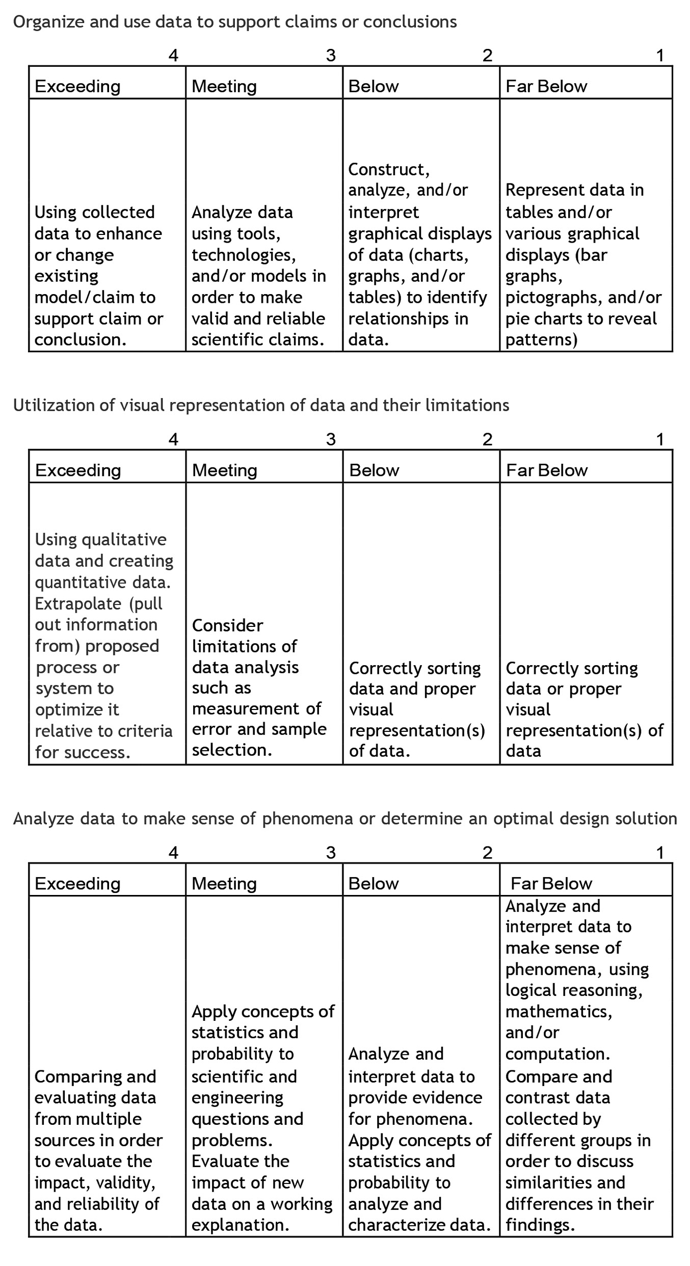
Metabolism project rubric.
- organize and use data to support claims or conclusions of how metabolism output attribute(s) change with input attribute(s),
- utilize visual representations of data and their limitations, and
- analyze data to make sense of how metabolism varies with different external factors.
Because we had shifted to fully remote instruction due to the pandemic, I used Google Meet and Classroom to begin and end each class period with full group discussions; during the rest of the class, students worked independently. When a student had a question, I would show the specific data related to their question via screen sharing and help them problem solve and/or visualize their question. For example, one of my ELLs had problems articulating his thoughts about what he wanted to look at in the data. When examining data, we usually look at two attributes to compare, but the student only mentioned one: Body Type. I put Body Type on the x-axis so we could see that plotting one attribute looked like a dot plot. Together, we talked through what he wanted to learn from the data (how body type, glucose absorbed, and activity level were related). As the student verbalized what he wanted to look at, I showed him what the graph looked like. I talked one-on-one with the student in the main online meeting room so anyone could join in. While I facilitated and assisted students, my co-teacher reviewed students’ work. To support the special education students and ELLs, we worked with them in small groups and provided them with sentence starters designed to help them start answering each of the worksheet questions (see sentence starters in Supplemental Materials). Tuva also provides alternate languages for the interface, which we utilized when necessary.
Activity sequence
When I introduced the project, I reviewed with the students how to use Tuva and had them explore the dataset that I had created. I asked the students to pick different attributes and place them on the x- and/or y-axis to visualize the data. I also encouraged them to use the data to create different types of graphs. On Day 2, I asked them to share ideas regarding the kind of analysis they could make from the data. I wanted to see what they would come up with on their own and to learn about their thought processes. At this point, most of the students were stuck, which I had expected. I encouraged them to “play around with the data.’’ I asked the students to create graphs using at least four different combinations of data (I considered a “combination” to be the attributes selected and the type of graph used to display relationships within the data). Students made a variety of exploratory graphs for the purpose of becoming familiar with the data. For example, one student graphed activity level and stored glucose molecules (see Figure 2A), while another graphed oxygen absorbed by cells, body type, and activity level (see Figure 2B). In the process, students learned that there was no “right” or singular way to play with the data; rather, they could explore the data in ways that interested them.
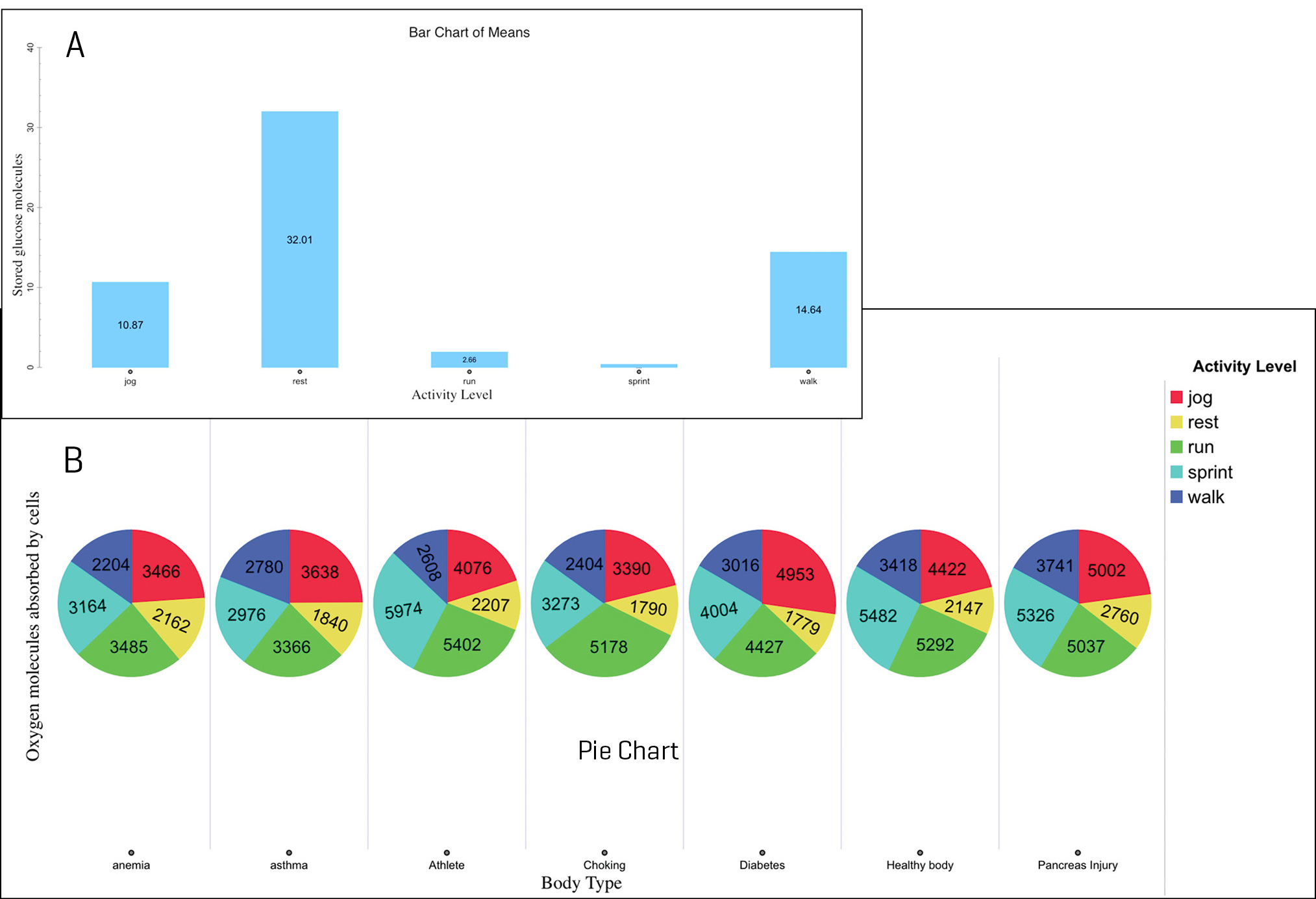
Examples of student-generated graphs as they “play around” with the data on Days 1 and 2 of the project: (A) activity level and stored glucose molecules and (B) body style and oxygen molecules absorbed by cells and activity level.
At the end of class, I asked them to write about their explorations in terms of what they created by asking, “What type of graph(s) did you make? Why? Explain your reasoning.” One student wrote that “we can make from this data the type of body a person has and the metabolism a person has when their body is doing a chemical process.” I also asked, “What did you notice in the data that you looked at? Were there any patterns or anything that surprised you? Explain.” Students commented on the kinds of graph types they were making, the distribution of data values, and the patterns they could see in the data.
The next day, I asked them if they could reduce the amount of data they were looking at to just what was relevant to their data exploration. For example, could they filter the data by including more or fewer attributes? Could they adjust the graph type to better visualize what was going on with the data? I asked them to choose one of the data combinations they had created the day before and to develop two additional ways of looking at the same data by altering the graph type, the data included, and so forth. Using their chosen data combination, the students adjusted and refined their graph types to better explore the data in ways that interested them, rather than just choosing their go-to default (a bar chart) or the initial graph type that they made on the previous day.
On the last day of the activity, I asked students, “What can you tell me when you compare the two different data combinations? Were your data results from the two graphs similar or different? Why do you think this may be?” and “How does this relate back to the unit on metabolism that we just learned about?” I wanted to know not only what they noticed in their graphs, but also how their analyses compared and how they thought this related to their understanding of metabolism. At this point, many students began using summary statistics features in Tuva and/or adjusting their graph types to better enable them to draw claims and conclusions from the data.
To close, we had a whole-group reflective discussion about what students had learned from their data work and how it related to what they had learned previously in the metabolism unit. Many students had explored data that related to various aspects of the previous unit (e.g., athletes vs. nonathletes, metabolism of diabetics, etc.). They were eager to share information they had learned (e.g., athletes take in and absorb more oxygen in their cells than nonathletes, diabetics don’t absorb a lot of glucose molecules regardless of activity) about how different situations impact metabolism. Additionally, as I wanted to communicate to students that we use data to discover information about a topic and to spark more questions, I asked them, “What is something you would like to investigate next (from the data)?” Students were particularly curious about exploring how their data combinations and relationships would change by changing diet, as well as how changing their personal diets could change their own metabolism.
Assessment
I used the students’ graphs, completed worksheets, and small-group discussion points to assess their work and their data skills. I found that students were familiar with the topic and had enough background knowledge with the simulation and data that they felt comfortable tackling the large dataset. Although most students initially struggled to choose what to do with the data, after “playing around” with the data they became proficient at identifying potential areas to explore. For example, one student began with a statement of what we could take away from the data as “we can see in the data how many cases there are and with each one we can see every attribute and data of the case we looked at.” After more exploration, his answer became more focused with “I was looking at food and activity level and if there is any connection between the two.” Based on student comments, the open time to “play around” with the data helped them develop a better sense of what data were in the dataset and allowed them to think of data explorations based on their own interests.
Throughout the project, students actively engaged in the productive struggle of working with data as they took the time to tinker with their graphs, reflect on how different graphs helped them interpret the data, and make adjustments based on their learning. I saw student confidence in working with the data increase, as they asked me fewer questions and relied on me less for guidance when working with and making sense of their data.
Using the project rubric, I was able to quantify areas to focus on in coming units. I realized that many students could create a variety of graph types using the data and interpret the data within them, especially when given time and prompts to try different options. However, many students were still struggling to connect how different input attributes related to metabolism. They realized the data was related to metabolism, but they struggled to express their thoughts about what we could learn about how metabolism changes based on different external factors.
According to the kinds of questions my students asked during the project, their final products, and their assessment scores, I reviewed relevant different types of graphs and what each type helps to explore in terms of a question and dataset. We continued to work on getting better at expressing our thoughts. I integrated graphic organizers, bubble charts, and sentence starters to help with our data analysis. I also created more opportunities for students to verbally articulate their thoughts before writing them down, via peer-to-peer and teacher-to-student conversations.
Conclusion
By using simulations and the datasets already part of my curriculum, the students were able to practice data manipulation and analysis around a previously studied topic. Students learned there are many ways to look at the same data, while I gained insight into their understanding of the topic (by looking at attributes they selected and the relationships they explored), as well as insight into their skills in making data decisions. The open-ended nature of the data work allowed students to use data to pursue their interests around a topic they had previously studied. If you are interested in trying something like this with other online datasets, check out the Online Resources section for a list of educationally ready data repositories we recommend. •
Acknowledgment
Implementation of the project would not have been possible without the assistance of Marianna Vizzielli.
Online Resources
Educationally ready data repositories—https://bit.ly/3tNCueA
Metabolism Dataset—https://bit.ly/3wJVkoU
Tuva Labs—https://tuvalabs.com/
Supplemental Materials
Class worksheet—https://bit.ly/3wVFPKJ
Sentence starters—https://bit.ly/3DwUCNp
Naomi Weintraub (naomiweintraub6626@gmail.com) is a retired science teacher at George L. Egbert Intermediate School 2 in Staten Island, New York. Kristin Hunter-Thomson runs Dataspire Education & Evaluation and is a visiting assistant research professor at Rutgers University in New Brunswick, New Jersey.
Computer Science Teacher Preparation Teaching Strategies Technology Middle School