
feature
Chimborazo Then and Now
Using Historical Data to Demonstrate Effects of Global Climate Change on Plant Communities
Science Scope—November/December 2020 (Volume 44, Issue 2)
By Ron Gray, Dane Henderson and Natalie Rothenberg
CONTENT AREA Earth Science and Life Science
GRADE LEVEL 6–8
BIG IDEA/UNIT Climate science or ecosystems
ESSENTIAL PRE-EXISTING KNOWLEDGE Some background in ecology is helpful but not required.
TIME REQUIRED Two days
COST No cost
SAFETY No safety issues
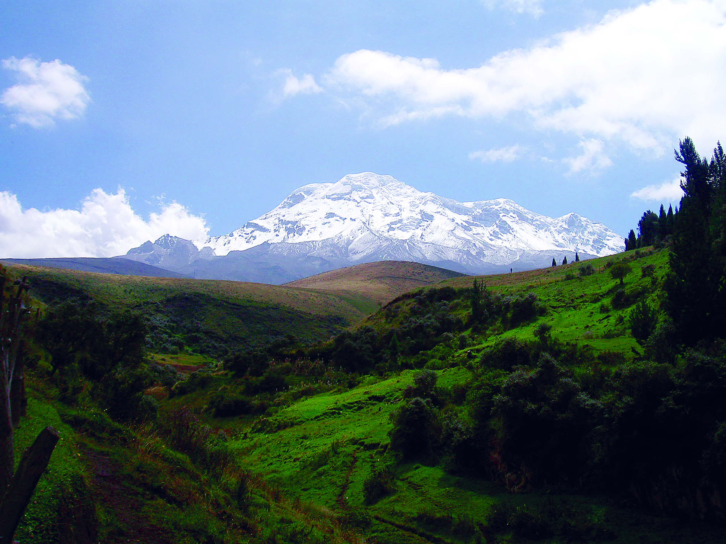
Alexander von Humboldt was once the most famous person in the world, rivaled only by Napoleon. The German naturalist and explorer was a polymath, a person whose expertise seemed to span all possible topics, who was able to draw together complex bodies of knowledge to better understand the world. One of Humboldt’s most important intellectual discoveries concerned what we would now refer to as the interdependence of life and the environment. In 1802, Humboldt traveled to modern day Ecuador to climb Mount Chimborazo, then thought to be the highest peak in the world. In his Essay on the Geography of Plants (Von Humboldt and Bonpland 2010), Humboldt documented the temperature, altitude, humidity, atmospheric pressure, and the plants and animals found at each elevation. Seen in comparison to other peaks in Figure 1, it was the first attempt of its kind to find patterns in the distribution of plants based on ecological factors.
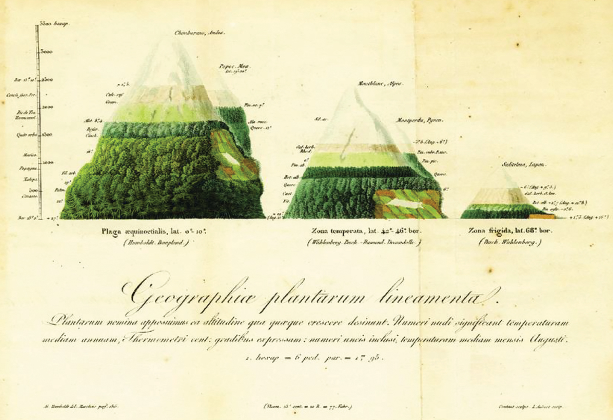
“Lines of the geography of plants,” from De distributione plantarum (On the Distribution of Plants) by Alexander von Humboldt, 1817.
Over 200 years later, Dr. Naia Morueta-Holme, a macroecologist interested in learning about species diversity and distribution, used Humboldt’s meticulous data for a purpose he had not intended—to reveal the long-term effects of a changing climate. In 2012, Morueta-Holme and her team followed Humboldt’s path up Mount Chimborazo to collect plant samples of 51 different species and compared them with the measurements and notes written by Humboldt himself. The results were alarming: the maximum elevation limit of plants and the distribution of vegetation zones shifted up the mountain more than 500 meters in 210 years due to local changes in temperature brought on by climate change. In the activity described here, we ask students to compare the historical and modern data sets to better understand the impacts of climate change on our ecosystems. Over two days of lessons, the students are introduced to Humboldt and Morueta-Holme, compare the two datasets, and predict the effects of climate change on a local mountain—Humphrey’s Peak in Northern Arizona.
Day 1
We begin by introducing the students to Alexander von Humboldt and his relevance to the sciences (see the Day 1 PowerPoint presentation in Online Supplemental Materials). We would highly recommend reading Invention of Nature by Andrea Wulf (2015) for further background on Humboldt and his importance to science and history. Then, before showing the data, display the botanical geography illustration (see Figure 1) Humboldt drew in 1817. Ask students to examine the drawing and think independently about what the illustration shows about plant life on the mountains. Then ask students to share their insights with the class. During this whole-class share-out, discuss how Humboldt’s documents were critical in establishing the field of biogeography that studies the geographic distribution of plants and animals. Through observing and collecting samples of both abiotic and biotic specimens, Humboldt combined biology, meteorology, and geology to better understand the distribution of plants, a tenant of the biogeography field.
Introduce students to Humboldt’s Essay on the Geography of Plants (Von Humboldt and Bonpland 2010). Briefly tell the story of Humboldt’s ascent of Mount Chimborazo, one of the tallest mountains on Earth. Then introduce Naia Moruea-Holme to the class. Describe Moreuta-Holme’s scientific background and highlight her curiosity in quantifying the impact of humans on flora and fauna distribution, both from a local and global scale. Following Moreuta-Holme’s introduction, describe her scientific study, which contains all of the data for this lesson.
Moreuta-Holme and her team travelled the same route as Humboldt, except they hiked up Chimborazo in 2012, not 1802. Point out to students that there was a reason Moreuta-Holme revisited Humboldt’s pioneering research study of vegetation elevation ranges, but make sure you do not allude to any definitive answers. Students will have the opportunity to make sense of the data after they complete a graphing activity.
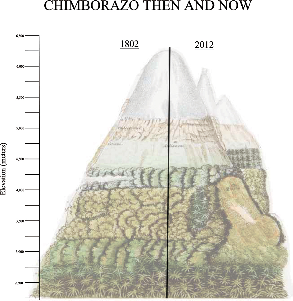
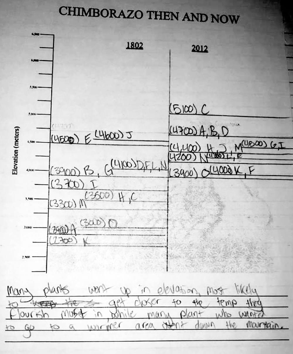
Display a chart (found in Day 1 PowerPoint presentation; see Online Supplemental Materials) of four species on which Moreuta-Holme collected data. Using the think-pair-share method, ask students to interpret this chart. Following a brief share-out session to hear student ideas, graph these four plants and the two mountain features on a Chimborazo map as a whole class. This scaffolding exercise is critical because students will be asked to create their own Chimborazo graph with a much larger data set. Be sure that students understand why there is a (+) and (–) sign in front of the numbers representing “Elevation Change (m).” An example of a student’s data sheet is shown in Figure 2. Once you feel confident that students can successfully and independently create their own Chimborazo map comparing the max elevation of 15 plants, pass out the Chimborazo map (see Figure 3; also available in Online Supplemental Materials as Chimborazo map Day 1) and Chimborazo data set Day 1 (available in Online Supplemental Materials) for students to work on. Individually or in small groups, students should complete the calculations for each of the data points and add them to the graph as you did with the whole class. While students are graphing their comparison data, be sure to use back-pocket questions, or questions prepared in advance that encourage critical thinking. Some back-pocket questions you can use are: Do all plants have a significant increase in elevation? Why do you think that is? Have any of the plants moved down in elevation? What could cause plants to move up or down the mountain? Are you surprised by this data? Make sure that students are analyzing the data after they plot all the species on their map. Students are encouraged to work in pairs during this activity so that they share resources with one another, but every student will be creating their own graph. An example graph is shown in Figure 4.
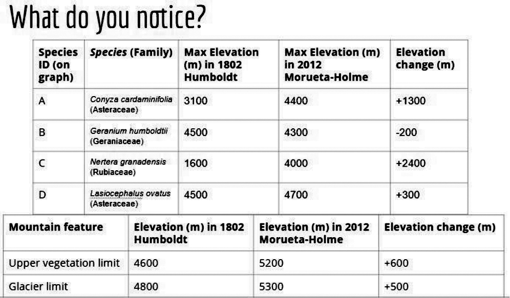
Sample of student data sheet comparing 1802 and 2012.
Blank student worksheet for comparing data sets.
Once the class has finished graphing all of the plants and mountain features, display an updated version of Humboldt’s Chimborazo Tableau (see Figure 5) for students to examine. Reveal to students that they just created a modified version of this tableau, which was produced after Morueta-Holme and her team analyzed their data.
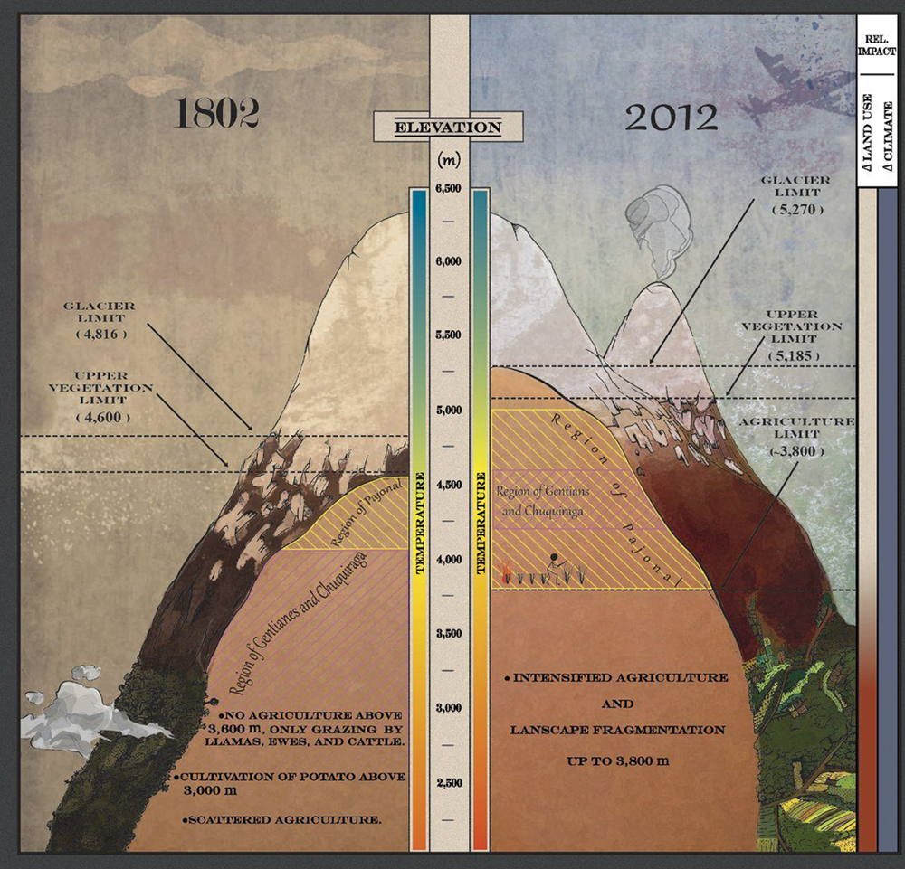
Data comparison infographic from Morueta-Holme et al. (2015).
Next, display a line graph from the new research study which visually demonstrates the vegetation shifts of each plant on Chimborazo (found in the Day 1 PowerPoint presentation; see Online Supplemental Materials). Ask the students to independently analyze the graph but be sure to include simple instructions on reading the graph. For example, tell the class “green bars mean that the plant expanded its range upward and red bars indicate that there was a range decrease in either the upper or lower range limit.” Ask if any student wants to share their interpretation with the class. Additionally, address the uncertainty of the data in an inquisitive manner. For example, probe students by asking: Why don’t all 51 plants follow the same pattern? How is it possible that some plants moved upward and some plants shifted down the mountain? Conclude day one with a discussion: what do you think is causing the overall upward shift of vegetation on Chimborazo?
Day 2
Connecting to climate change
Begin day two with an overview of the previous day (see Day 2 PowerPoint presentation in Online Supplemental Materials). Again, ask students why they think vegetation is shifting upslope on Chimborazo. Capitalize on any comments that mention global warming, temperature increase, precipitation changes, or climate change. All answers are welcomed and many more can be explored, but today will be focused on climate change as the driver of plants moving up in elevation. To move the conversation toward global climate change, begin with relevant climate data. For example, we have climate data from Ecuador starting in 1866. Since that time, records indicate an increase in mean annual temperature of 1.46°C. In addition, data shows an increase in mean temperatures globally of 0.26°C from 1802 through 1866. We can estimate a total temperature increase from the time of Humboldt’s expedition to be 1.72°C (3.1°F) (Morueta-Holme et al. 2015). Remember, the students are working toward figuring out the mechanism for the plants moving up (and a few down) the slope throughout today’s activities.
Spend the next 15 minutes engaged in a class discussion about climate change. This discussion should bounce from break-out groups to whole-class discussions. Once the entire class recognizes climate change as the driving force behind the upward shift of vegetation on Chimborazo, tell students to write an explanatory paragraph underneath their Chimborazo graph they created yesterday. Instruct students to include the two research studies conducted on Chimborazo and the specific data we utilized during our graphing activity. We always prepare a sentence stem for the first sentence of the paragraph for those students who struggle getting started. This activity provides students with practice utilizing empirical evidence to construct a scientific explanation.
Once students have completed their explanation, tell the class that they are now going to focus on another scientist, C. Hart Merriam. Explain how Merriam created the concept of life zones, which is similar to the vegetation zones Humboldt created except it takes into account not only altitude but latitude as well. Review key biogeographic concepts such as community, biome, and ecosystem, so that students better understand how organisms are organized on both a local and global scale. Then look at two figures, one depicting major terrestrial biomes and a climograph (see Figure 6; see also Day 2 PowerPoint presentation slide 11 in Online Supplemental Materials). Simplify the climograph by discussing the color similarities with the other biome map of the world. Note that for teachers who prefer to spend more time in the discussion on climate change and life zones, the next activity could be done over a third day.
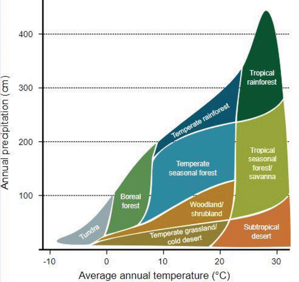
Climograph
Humphrey’s Peak activity
Introduce our last and final activity of the lesson, the Humphrey’s Peak activity. In this activity, students will be using what they learned about Mount Chimborazo to make predictions of plant locations on another mountain studied by Merriam—Humphrey’s Peak of Northern Arizona—80 years in the future. Here we use predictions of temperature changes due to climate change estimates from the Assessment of Climate Change in the Southwest United States. Here scientists predict a change in mean temperatures of 4–8°C (7–15°F) between 2019 and 2099 (Cayan et al. 2013). Note how much larger this increase is compared with that which occurred in Ecuador over the past 210 years.
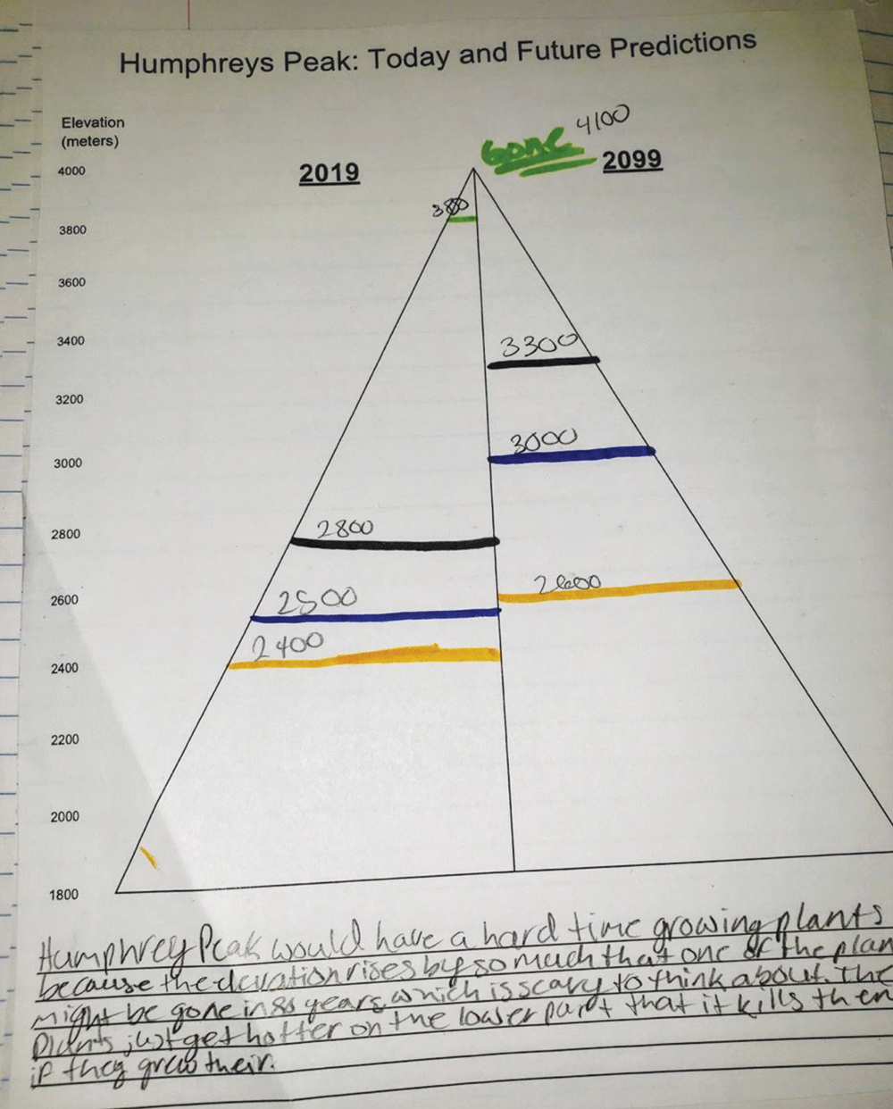
Because students created a much more detailed graph the previous day, they should be experts at plotting points on the mountain. As you pass out the data sheet and accompanying graph (see Figure 7; see also Humphrey’s data map in Online Supplemental Materials), review the instructions. Reinforce that students should reference their Chimborazo map when creating their Humphrey’s graph. Again, students are encouraged to work together so that they can talk through their thought process. While students are working, use these back-pocket questions to elicit their ideas: What is different between Mount Chimborazo and Humphrey’s Peak? What do you think will happen to the plants in the Arctic-Alpine zone? Is there anything we can do to stop plants from changing life zones? Have students write another explanation below their Humphrey’s graph illustrating their understanding of the both climate change and its effect on plant communities. An example is shown in Figure 8.
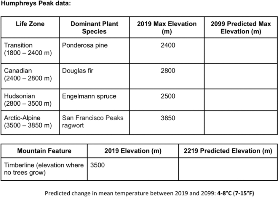
Data from Humphrey’s Peak (Arizona).
Humphrey’s Peak data worksheet.
Conclusions
As shown in the Day 2 PowerPoint presentation (see Online Supplemental Materials), we close the two-day lesson with a quote from The Invention of Nature (Wulf 2015). It reinforces the idea that Alexander von Humboldt was an insightful scientist and truly changed the way we understand the world. Introducing Humboldt and Morueta-Holme as the experts at the beginning of the lesson provides a unique experience that students do not often have: They are getting to know the scientists behind their work. Additionally, it is beneficial for students to review the same research conducted by two different scientists from different times. Thinking about the research conducted by these scientists and predicting future trends in vegetation based on empirical evidence exemplifies the significance of understanding the effects that climate change can have on our planet.
Online Supplemental Materials
Ron Gray (ron.gray@nau.edu) is an associate professor of science education in the Center for Science Teaching and Learning at Northern Arizona University in Flagstaff, Arizona. Dane Henderson is a teacher at Imagine Prep in Surprise, Arizona. Natalie Rothenberg is a teacher at Alice Vail Middle School in Tucson, Arizona.
Climate Change Earth & Space Science Environmental Science Life Science Middle School Grades 6-8