
Middle School High School Informal Education | Daily Do
How Can We Make Informed Decisions to Keep Ourselves and Our Communities Safe During the COVID-19 Pandemic?
By Todd Campbell and Okhee Lee
Biology Crosscutting Concepts Is Lesson Plan Life Science Phenomena Science and Engineering Practices Three-Dimensional Learning Middle School High School Informal Education Grades 6-8 Grades 9-12
Sensemaking Checklist


Introduction
In today's task—How can we make informed decisions to keep ourselves and our communities safe during the COVID-19 pandemic?—students and their families use science and engineering practices alongside disciplinary core ideas and crosscutting concepts to explain differences found when comparing COVID-19 data in their local county to those in another county (or equivalent) and propose informed solutions for keeping themselves and their communities safe. This task is intended for middle school, but can be modified for upper-elementary school or high school.
Today's task exemplifies a developing instructional framework from Okhee Lee and Todd Campbell initially described in "What Science and STEM Teachers Can Learn From COVID-19: Harnessing Data Science and Computer Science Through the Convergence of Multiple STEM Subjects." This task builds on and extends the ideas developed in the How Is COVID-19 Impacting Families and Communities? and Why Do We All Have to Stay Home? (Elementary and Secondary versions) Daily Dos.
Daily Do Playlist: Tracking COVID-19 in the United States
How can we make informed decisions to keep ourselves and our communities safe during the COVID-19 pandemic? is a stand-alone task. However, it can be taught as part of an instructional sequence in which students are provided authentic opportunities to develop and use the science and engineering practice Using Mathematics and Computational Thinking to make sense of the spread of COVID-19 through the U.S. population and the disproportionate number of cases and deaths in non-white communities. Students further use data to support them in identifying actions they can take to keep their families and communities safe and implementing their proposed solutions to ending health disparities.
Part 1: What patterns in the spread of COVID-19 can be found in your county? How have these patterns changed over time? Now select another county in your state or another state in the United States. How do the patterns in your county compare to those in the other county you selected? [Data Science]
Working in groups of two or three, using the link to the Johns Hopkins Coronavirus Resource Center’s COVID-19 Dashboard, students go to the U.S. Map and search for their county (or equivalent). Once students have searched for their county, it will be highlighted on the map. When students click on their county on the map, a link to an infographic for their county will appear. Students click on the infographic link, take a screenshot, and paste the screenshot into the Making Informed Decisions to Keep Safe During COVID-19 Pandemic student handout.
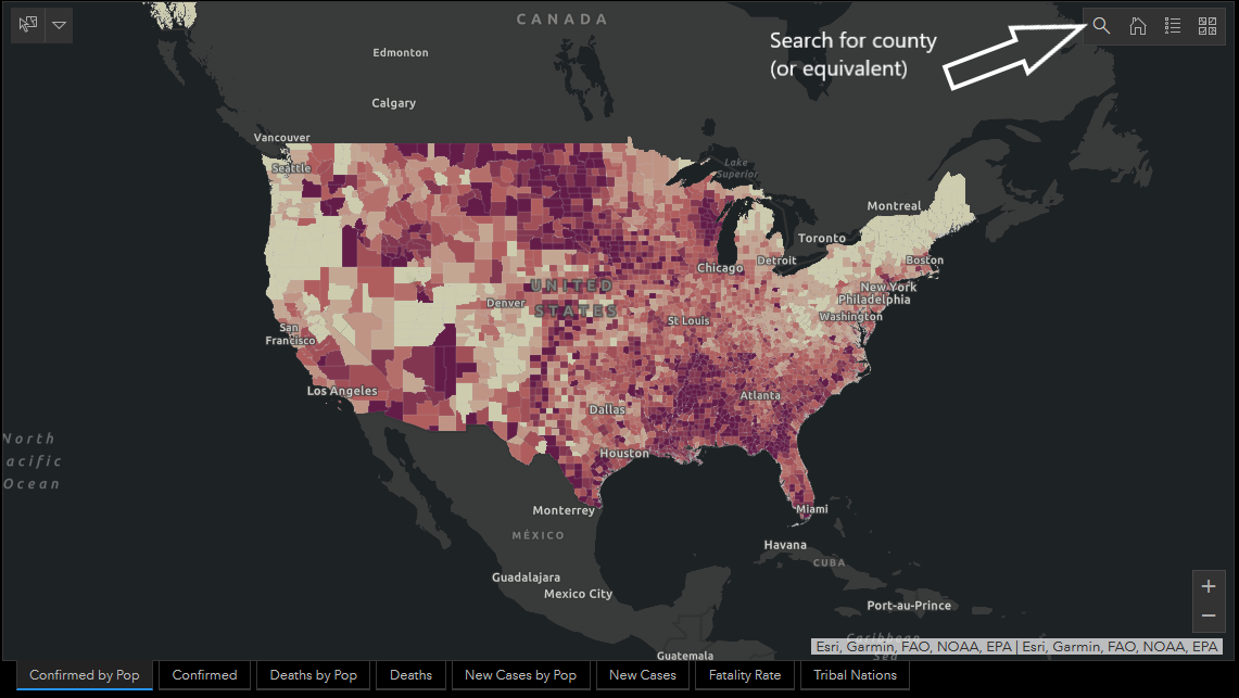
Next, students identify and search for another county in their state or another U.S. state they want to investigate. They can search for a county by name, or zoom in on the map and click on a county of interest. As before, once students have searched for another county, it will be highlighted on the map. When students click on this county on the map, a link to an infographic for the county will appear. Students click on the infographic link, take a screenshot, and paste the screenshot into the student handout.
After students paste the two county infographics in their student handout, they record their observations about both county infographics. Students focus on the data in four areas: (a) total confirmed cases, (b) total deaths, (c) cases in the last 14 days, and (d) county cases per 100,000 population.
In these four areas of focus, students describe patterns in their local county infographic and the other county infographic. Then they compare the differences and similarities in patterns of the two county infographics.
Part 2: How can we explain the similarities and differences in patterns in the spread of COVID-19 and patterns in change over time of the two county infographics? [Simulations/Computer Science]
Now that students have compared patterns of COVID-19 of two county infographics, they will understand the nature of the COVID-19 spread specifically and viral spread more generally. Next, by exploring computer simulations, students will also understand mechanisms for flattening the curve of viral spread through varying degrees of social distancing. Based on their understanding of the nature of viral spread and mechanisms for flattening the curve, students will construct explanations for the patterns of COVID-19 spread in their two counties.
Students read the following section on the spread of a fictional disease that originally appeared in The Washington Post (Stevens 2020). This section includes screenshots of simulations of viral spread under different conditions. When students click on the link below, which is also embedded in the student handout, they are taken to the original article, in which they can run and explore the simulations themselves:
https://www.washingtonpost.com/graphics/2020/world/corona-simulator/
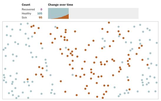
Simulation of the Spread of a Fictional Disease Through a Population
The simulations in this section are for a fictional disease called simulitis. It spreads even more easily than COVID-19. Whenever a healthy person (blue) comes into contact with a sick person (orange), the healthy person becomes sick, too.

In a population of just five people, it did not take long for everyone to catch simulitis.
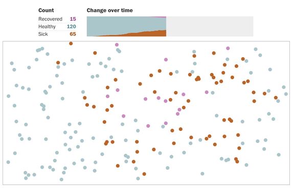
In real life, of course, people eventually recover. A recovered person (purple) can neither transmit simulitis to a healthy person nor become sick again after coming in contact with a sick person.

Let’s see what happens when simulitis spreads in a town of 200 people. We will start everyone in town at a random position, moving at a random angle. We will make one person sick (orange).
Notice how the slope of the orange curve, which represents the number of sick people, rises rapidly as the disease spreads, then tapers off as people recover.
Our simulation town is small...so simulitis was able to spread quickly across the entire population. In a country like the United States, with its 330 million people, the curve could steepen for a long time before it starts to slow.
When it comes to the real COVID-19, we would prefer to slow the spread of the virus before it infects a large portion of the U.S. population. To slow simulitis, let’s try to create a forced quarantine.
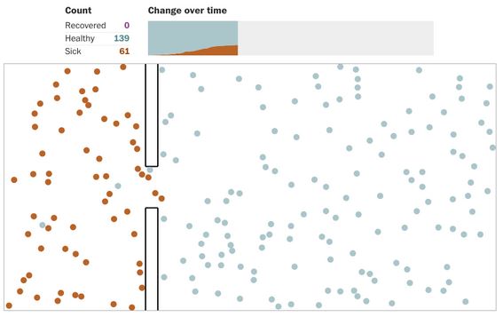
Whoops! As health experts would expect, it proved impossible to completely seal off the sick population from the healthy one.
Fortunately, an outbreak can be slowed in other ways. Above all, health officials have encouraged people to avoid public gatherings, to stay home more often, and to keep their distance from others. If people are less mobile and interact with one another less, the virus has fewer opportunities to spread.
Some people will still leave their homes. Maybe they cannot stay home because of their work or other obligations, or maybe they simply refuse to heed public health warnings. Those people are not only more likely to get sick themselves, but they are also more likely to spread simulitis.
Let’s see what happens when a quarter of our population continues to move around while the other three quarters adopt a strategy of what health experts call social distancing.
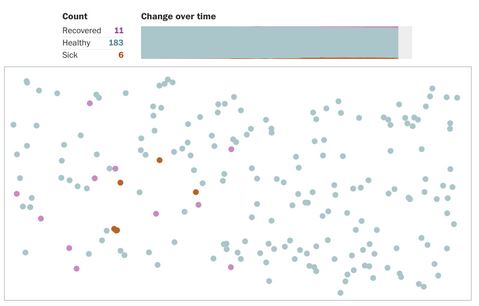
More social distancing keeps even more people healthy, and people can be nudged away from public places by removing their allure.
To simulate more social distancing, instead of allowing a quarter of the population to move, we will see what happens when we let just one of every eight people move.
The four simulations you just watched—a free-for-all, an attempted quarantine, moderate social distancing, and extensive social distancing—were random. That means the results of each one were unique to your reading of this article; if you scroll up and rerun the simulations, or if you revisit this page later, your results will change.
Even with different results, moderate social distancing will usually outperform the attempted quarantine, and extensive social distancing usually works best of all. Below is a comparison of the results.
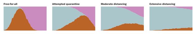
Simulitis is not COVID-19, and these simulations vastly oversimplify the complexity of real life. Yet just as simulitis spread through the networks of bouncing balls on your screen, COVID-19 is spreading through our human networks—through our counties, our towns, our workplaces, our families. And like a ball bouncing across the screen, a single person’s behavior can cause ripple effects that touch faraway people (from The Washington Post. ©2020 The Washington Post. All rights reserved. Used under license).
Now that students have explored the simulations, using the Nature of Viral Spread and Flattening the Curve questions in Part 2 of the student handout, students construct explanations of rapid viral spread and design solutions to slow the viral spread.
First, students construct their explanations about what might be causing the patterns of viral spread in the two counties (use the student handout).
Second, students design solutions to slow the amount of viral spread (use the student handout).
Finally, students relate what they have learned from the simulations to the patterns they reported about their county and the other county they investigated in Part 1 of the Daily Do. Students construct their explanations about what might be causing the patterns of viral spread in the two counties. Then they discuss with a peer, a family member, or the teacher.
Part 3. What role can students, their families, and their communities play in staying safe in schools? [Making Informed Decisions and Taking Responsible Actions]
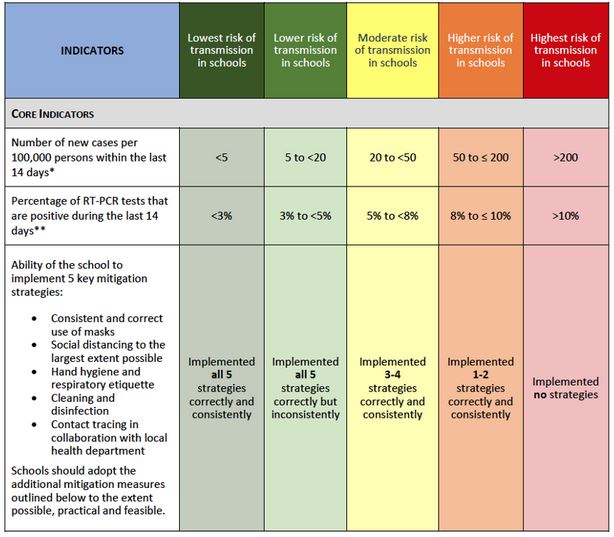
In the final part of this Daily Do, students use what they learned about the spread of COVID-19 in their county and the other county (Part 1) and how to control the spread of a virus using simulations (Part 2). In addition, students use the Centers for Disease Control and Prevention (CDC) guidance for schools, especially the CDC (2020) COVID-19 indicators and thresholds for schools (see Table 1).
Using these three sources of information from Parts 1 and 2 and the CDC guidance for schools, students assess the level of risk of transmission in the schools in their county and the level of risk of transmission in the other county’s schools. Based on their assessments, students make recommendations for the schools in their county and in the other county’s schools. Students focus on varying degrees of social distancing for remote instruction, in-person instruction, or hybrid instruction. If you are completing this Daily Do in a remote or hybrid learning environment, consider asking student groups to complete their recommendations on the What role can students, their families, and their communities play in staying safe in schools? Part 3 Google Slides template to be used in a virtual gallery walk to share ideas.
To conclude this Daily Do, students examine at least one other group’s set of assessments and recommendations. If you are completing this Daily Do in a remote or hybrid learning environment, consider asking student groups to complete a virtual gallery walk. The Gallery Walk Google Docs template provides space for students to comment and question recommendations of other groups and reflect back on their own recommendations. Then they discuss what they saw and what was recommended with a peer, a family member, or the teacher.
References
Centers for Disease Control and Prevention. 2020. CDC indicators and thresholds for risk of introduction and transmission of COVID-19 in schools [infographic]. https://www.cdc.gov/coronavirus/2019-ncov/downloads/community/schools-childcare/indicators-thresholds-table.pdf.
Lee, O., and T. Campbell. 2020. What science and STEM teachers can learn from COVID-19: Harnessing data science and computer science through the convergence of multiple STEM subjects. Journal of Science Teacher Education 31(8): 932–944. DOI: 10.1080/1046560X.2020.1814980. https://www.tandfonline.com/doi/full/10.1080/1046560X.2020.1814980.
Stevens, H. 2020. Why outbreaks like coronavirus spread exponentially, and how to “flatten the curve.” The Washington Post. https://www.washingtonpost.com/graphics/2020/world/corona-simulator/.