
feature
The Potency of Evidence
Shining the light on inequities that have surfaced due to COVID-19

School closures in the wake of the COVID-19 pandemic led to kids asking pertinent questions about why they were not in school, especially some students suffering financial hardship. Virtual classrooms became the mundane venues for students to piece together the pandemic puzzle and unpack unseen inequities. This article examines disparities that have surfaced due to the pandemic: racial, health, financial resilience, and mental stress, from students’ point of view.
I describe how students utilize their higher-order thinking skills to make sense of COVID-19. One activity serves as a springboard for launching the next, and they are interwoven to give students more comprehensive understanding of inequities. I incorporate the lesson into my unit on the atmosphere; the “connective tissue” is the movement of particles in the atmosphere (Figure 1).
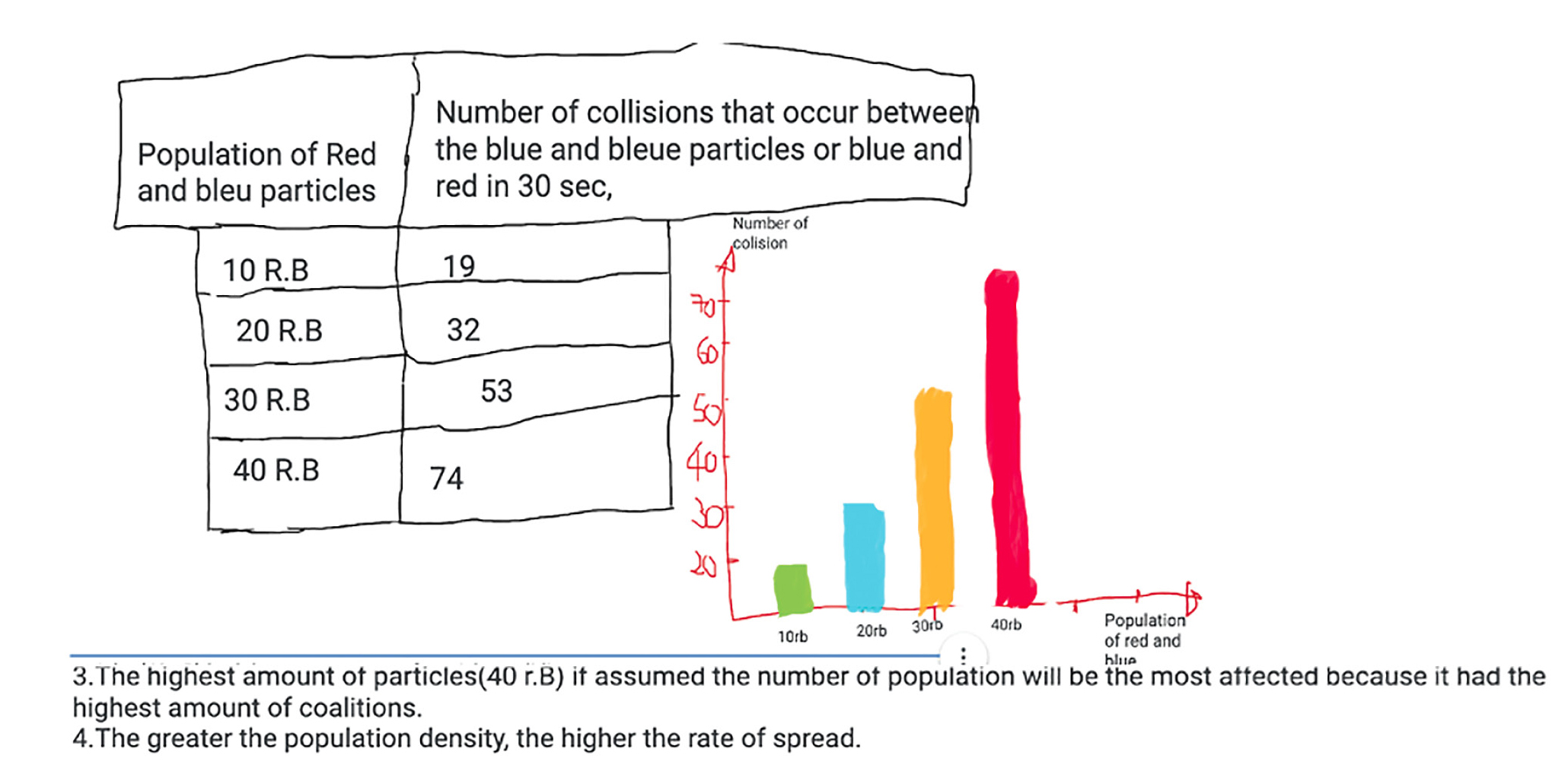
Particles in the atmosphere move randomly, and the movement of viruses is no different. It is therefore expected that the rate of spread of the coronavirus should be the same between ethnicities. However, it is far from equal. Instead of just presenting students with data from COVID-19 cases, I have students search for data with a more constructivist approach to inquiry. Working in pairs to gather data from computer simulations (University of Colorado’s PhET and DataUSA) students were able to identify significant differences in the rate of spread of COVID-19 between races and explain the inequities and disparities surfaced by the COVID-19 pandemic.
Engage
Students do a whole-class brainstorm on the different races and ethnicities in America, then use their inquiry skills and current conceptions on diffusion to investigate population density and the rate of spread of the coronavirus. Mimicking the spread of coronavirus by diffusion of particulate matter in the air, students use an interactive simulation platform (PhET) to depict the relationship between population density and COVID cases. Students set up charts on their Jamboard frames (synchronous learning workspaces) for recording data from the simulation, which provides a visual representation of how particles move and collide. We begin the discussion with the prompt, “Assuming that the number of collisions represents the actual contact with a COVID-19 infected person, what population would have the most infected individuals?”
Students accurately connect a higher rate of spread of the coronavirus to a high population density. I chime in, explaining that communities of color live in traditional homes with a pedigree of relationships, making it unlikely to implement social distancing rules. Additionally, for Hispanics, there are often many members and multiple generations in a single household, compared to just a couple of household members in White homes.
Asking thoughtful questions to provoke even more interest, I get students to synthesize their information and share it with the whole class. I facilitate this activity by having students take turns in sharing their responses out loud. To ensure students are hands-on and minds-on, I ask one other student to restate or summarize what the previous student had said. I do not intervene as a facilitator to add ideas about inequity until each student is done with this series, so that they can see the mind-blowing inequities for themselves.
Explore the factual underpinnings
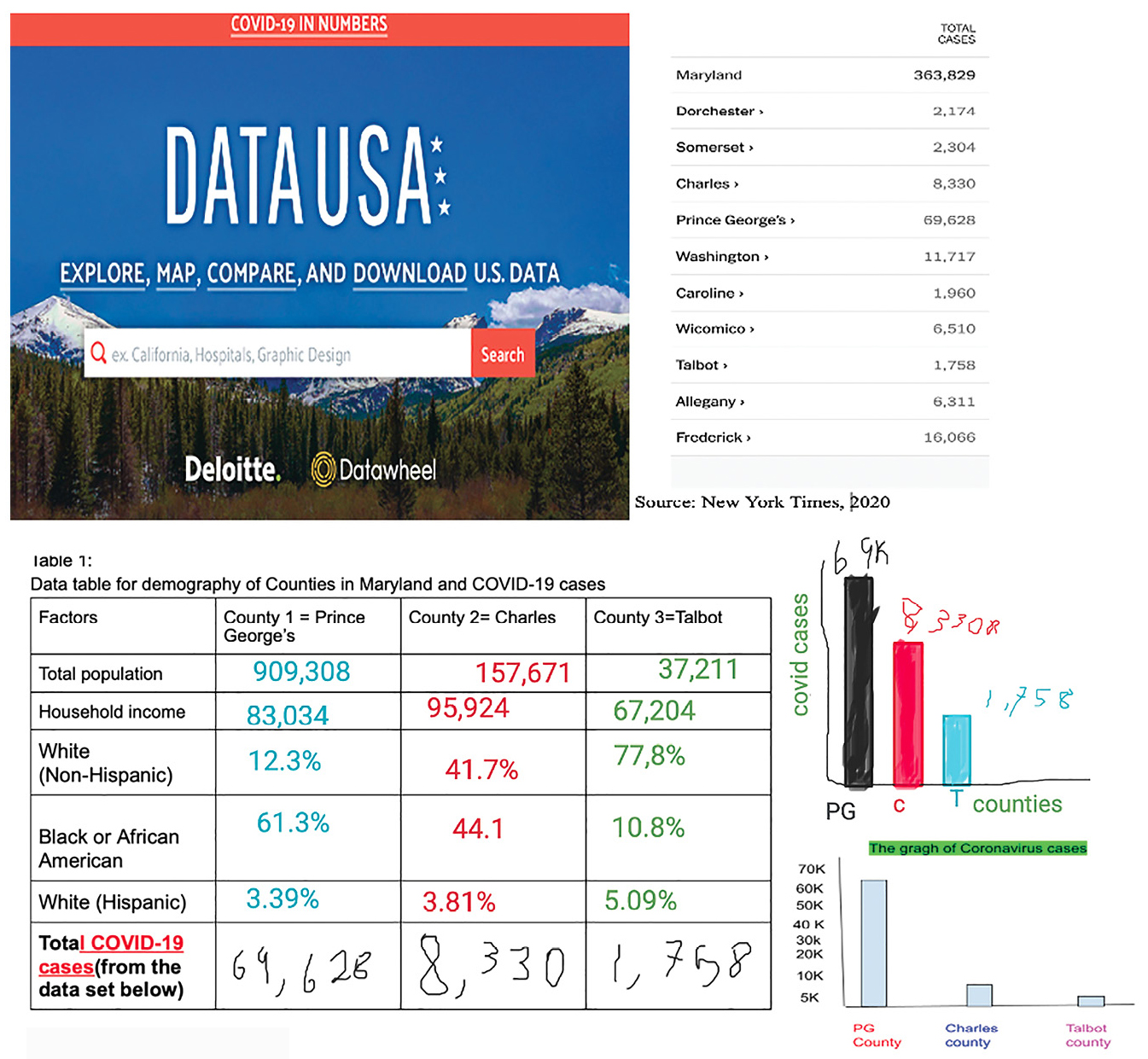
Students use their inquiry skills to search for data they need to make valid conclusions. I then share the link to the data site (datausa.io), where the students search for pertinent data. While students surf around the website. I draw their attention to data and its significance. I show them the focal variables: counties, total population, percentage of Whites, percentage of Blacks, percentage of Hispanics, and the number of COVID-19 cases.
I then model how the students will complete the data chart and support the students in collecting data and structuring their work to include the number of cases for our chosen counties in Maryland. I encourage students to include even more counties in their charts so as to paint a broader picture of inequities that have surfaced.
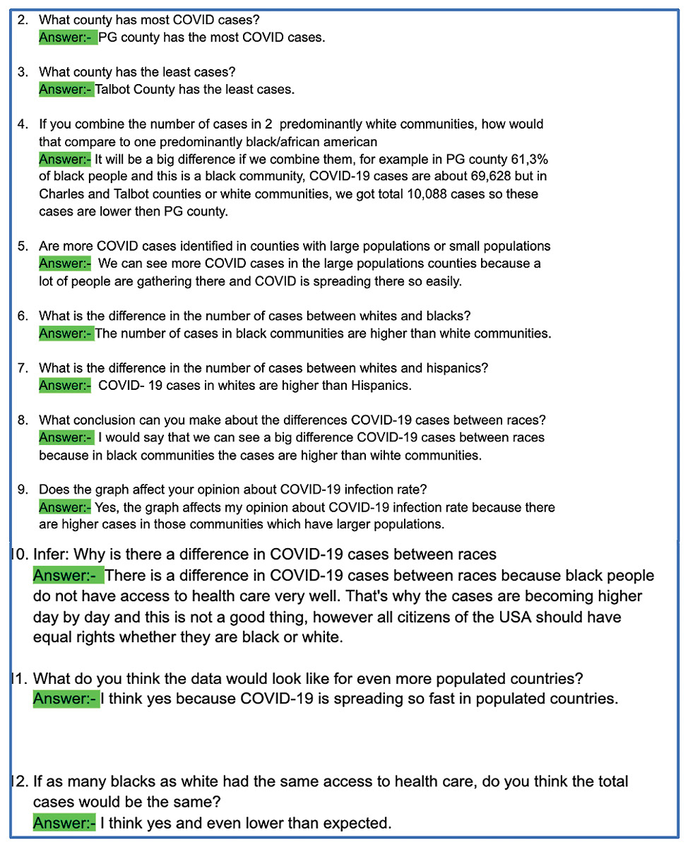
After students gather their data, they draw bar graphs to show disparities in the number of COVID-19 cases. I remind students that every graph is supposed to have a title, to ensure they follow science rules. Students’ charts should show the different counties and the number of COVID-19 cases. Once students finish up with their charts and graphs, I check their Jamboard frames to ensure that they are ready to get started with their data analysis piece. The investigation starts with the question: “If you combine the number of cases in two predominantly White counties, how would that compare to one predominantly Black/African American county?”
Analysis prompts:
Graph it: Draw a bar graph to represent total coronavirus cases in the counties.
- What county has the most COVID cases?
- What county has the least cases?
- If you combine the number of cases in two predominantly white communities, how would that compare to one mostly Black/African American?
- Are more COVID cases identified in counties with large populations or small populations?
- What is the difference in the number of cases between Whites and Blacks?
- What is the difference in the number of cases between Whites and Hispanics?
- What conclusion can you make about the differences between COVID-19 cases between races?
- Does the graph affect your opinion about the COVID-19 infection rate?
- Infer: Why is there a difference in COVID-19 cases between races?
- What do you think the data would look like for even more populated countries?
- If as many Blacks as Whites had the same access to health care, do you think the total cases would be the same?
- Why is there a difference in the number of cases between races?
Explain and Elaborate
Health equity: The nuanced picture painted
I guide students’ explanations and chime in where necessary. Students explain that Talbot County, which is predominantly White, has far fewer COVID cases than Prince George’s County, which has a predominantly Black population (Talbot County had 1,748 COVID cases compared to 69,628 cases in Prince George’s County, April, 2020). These figures mirror disparities across the nation.
As more people of color are affected by the coronavirus, disparities that exist across racial lines in the United States are being dramatically exposed. For example, issues such as inequitable access to transportation, health insurance, quality healthcare, and comfortable housing have been further illuminated by the pandemic. Limited access to quality healthcare over time has led to heart disease, obesity, and diabetes. Due to these underlying conditions, most Blacks and Hispanics have suffered higher death rates than Whites during the pandemic (Ford 2020).
Students spend the next 40 minutes analyzing their data and graphs as prompted. I click from one Jamboard frame to the next, ensuring that the students complete all questions as they see the disparities highlighted by COVID-19, and ultimately come to the conclusion that there are inequities. These prompts are presented in Figure 2.
Students take turns discussing their results with the entire class. I let students have interactive conversations that are robust enough to deepen their understanding of the concept of inequities surfaced by COVID-19. Then I save their work from the synchronous lesson to Google Classroom—our G-suite—where they can log on anytime for review.
Extension: Inequities in financial resilience
To produce a comprehensive visual that harmonizes data with reasoning, I also share inequities in financial resilience that have surfaced due to COVID with students (Figure 3). Using students’ analysis as a springboard, I lead class discussions on differential impacts of COVID related to financial resilience. A large percentage of Hispanics and Blacks lost their jobs, whereas the percentage of Whites was much smaller. Many Hispanics and Blacks do not have enough funds in their savings to cover health emergencies, not to mention affordable housing or appropriate nutrition, further amplifying existing socioeconomic disparities that exist between races.
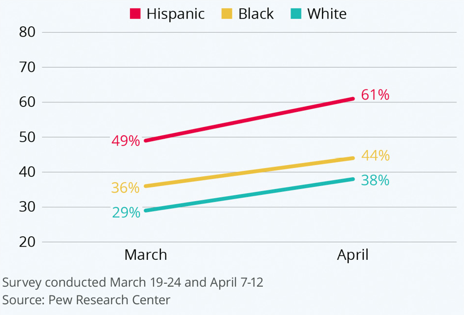
Consequently, it follows that the number of Blacks and Hispanics with acute difficulties paying their bills or mortgages increased sharply compared to Whites. Therefore, it is only logical that psychological and mental stress is most prevalent among Hispanics who cannot meet with basic needs. “That is just unfair,” one student mentions. It is likened to double jeopardy that the individuals have to deal with coronavirus’s weighty impact simultaneously with mental/behavioral trauma. Students answer these data analysis questions on their Jamboard frames (Figure 4):
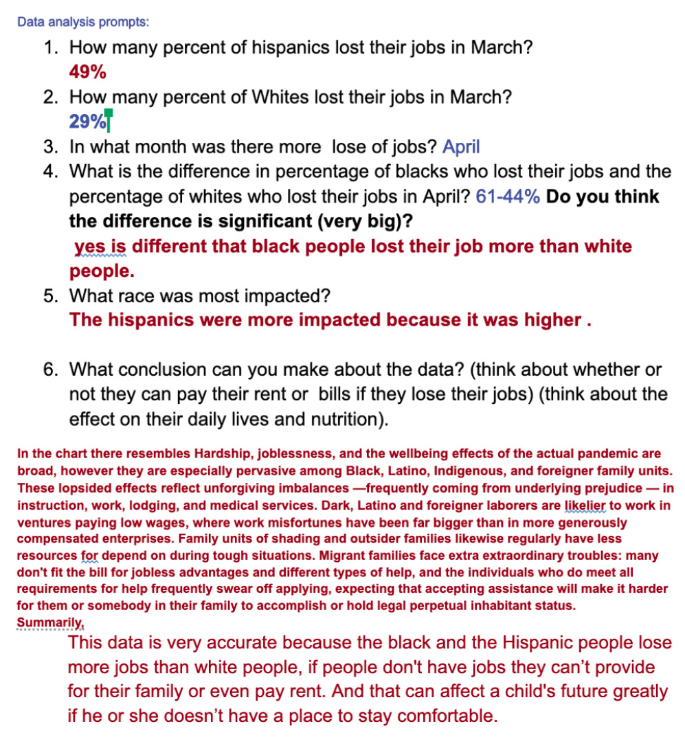
- How many percent of Hispanics lost their jobs in March?
- How many percent of Whites lost their jobs in March?
- In what month was there a higher loss of jobs?
- What is the difference in the percentage of job loss between Blacks and Whites who lost their job? Do you think the difference is significant (notable/huge)?
- What race was most impacted?
- What conclusion can you make about the data? (think about whether or not they can pay their rent or bills if they lost their jobs) (think about the effect on their daily lives and nutrition).
Evaluation
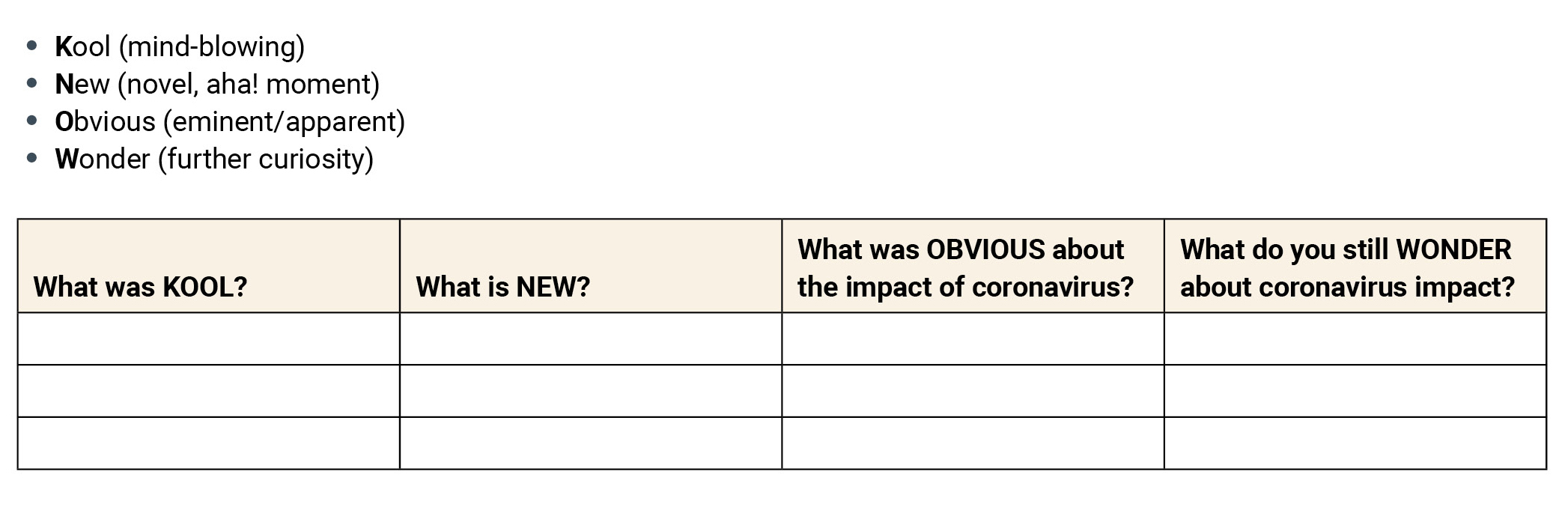
Students write what aha! moment they have about the inequities that have surfaced following their analysis of the data. Furthermore, students state what is obvious from the data analysis and outline their next line of curiosity. The KNOWledge chart is a graphic organizer to “re-present” their thoughts, and reiterate what aspects of the data were understood (see Table 1).
Conclusion
COVID-19 has debunked the myth that we have racial, health, and financial equity. This article focuses on some inequities that have surfaced due to the coronavirus pandemic; racial, health, and financial resilience inequities. The activities and questions are teacher-developed, and wrapped around data obtained from websites such as DataUSA. Students are intentionally engaged in learning about the inequities as they take complete ownership of learning and responsibility in collecting and analyzing data from simulation and data websites.
These students were actively constructing knowledge through an inquiry about the disparities across various factors of demography and financial lines. It was interesting for both the students and me to learn that the borderline between races is broad and at its fringes are even disturbing, lingering impediments which, for the meantime, are yet to be understood. ■
Online Connections
https://www.statista.com/chart/21642/racial-inequality-covid/
https://laist.com/2020/05/21/the_striking_racial_divide_in_how_covid-19_has_hit_nursing_homes.php
Claudette Tebeck (clteb1@morgan.edu) is a doctoral student at Morgan State University in Baltimore, MD, and a science teacher in Prince George’s County, MD, public schools.
5E Equity Inquiry Research High School